Hi @area49.
You can achieve 2 columns down to phone screen.
See photos.
Hi @apswoodwork,
Thank you for your feedback!
I have already played around with this function as well.
For text this would indeed be the way to go.
However, there is a one big difference, with these columns I cannot have different background colours for each column (at least I have not figured out a way to do that).
And that is unfortunately one of the main points of the overall layout of the website.
I might be able to achieve this using HTML bricks, but then I would have do pretty much everything in HTML bricks.
I know, I should have checked that earlier.
Typical case of making the mistake not to have all break points in mind when you are building your first site in Blocs, I guess.
I have several blocks, some only visible at certain breakpoints. This makes it easier for me to define the content on different screen sizes. I find phone news are more towards cleaner info, and larger platforms are keener on image as well as content. Mainly my footer.
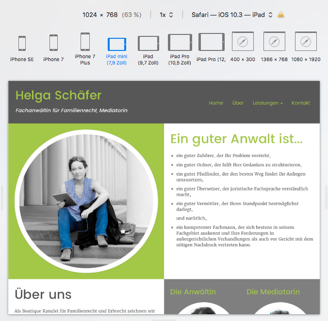
Hello @Norm,
I do not understand why the bloc displays the columns below each other in tablet view.
I am sure there is/was a reason for it…
However, looking at the desktop version in the Responsive Design mode of Safari, the website would look fine on an iPad with just a screen resolution of 1024 x 768.
Is there a way to have the bloc display the columns in tablet view the same as in desktop view?
Pleeease!
Here is a screenshot of Safari.
Not sure what you’re asking. The breakpoint for Bloc’s Mobile is 767px wide(bootstrap 3 standard breakpoint). The iPad would not go to mobile even if flipped vertically. [quote=“area49, post:1, topic:2230”]
My old Kindle Fire has a screen resolution of 1920 x 1200 pixels
[/quote]
Are you sure that is right? The current fire HD 10 inch has 1920 x 1200 px, many of the older Fire’s have 1024 x 600. The image of your fire above looks as if it is displaying vertically, did you try Horizontal?
Here is a list of Kindle tablet specs:
Hi @area49,
As you have experienced the full Bootstrap 3 grid system and its related features are not yet present in Blocs.
But if it helps for your reference, and this discussion as a whole. The following are the present Breakpoints / Media Queries used by Blocs. You will find them at the bottom of the exported “style.css” to explore further.
@media (max-width: 1024px){}
@media (max-width: 992px) and (min-width: 768px){}
@media only screen and (min-device-width : 768px) and (max-device-width : 1024px) and (orientation : landscape) {}
@media (max-width: 991px){}
@media (max-width: 767px){}
@media (max-width: 400px){}
And this is the present structure you get with the mentioned approaches above:
<!-- Main container -->
<div class="page-container">
<!-- // ------------------------------------------------------------------------------------------------- // -->
<!-- This is the First Basic Bloc, single row set to two columns and set to not stack Tablet and Mobile -->
<!-- // ------------------------------------------------------------------------------------------------- // -->
<!-- bloc-0 -->
<div class="bloc" id="bloc-0">
	<div class="container bloc-lg">
		<div class="row">
			<div class="col-xs-6">
			<!-- * If set to stacked it becomes -->
			<!-- <div class="col-md-6 col-sm-12 col-xs-6"> -->
			</div>
			<div class="col-xs-6">
			<!-- * If set to stacked it becomes -->
			<!-- <div class="col-md-6 col-sm-12 col-xs-6"> -->
			</div>
		</div>
	</div>
</div>
<!-- bloc-0 END -->
<!-- Bloc Group -->
<div class='bloc-group'>
<!-- // ------------------------------------------------------------------------------------------------- // -->
<!-- This is the Second Basic Bloc, default two rows and two columns -->
<!-- // ------------------------------------------------------------------------------------------------- // -->
<!-- bloc-1 -->
<div class="bloc" id="bloc-1">
	<div class="container bloc-lg">
		<div class="row">
			<div class="col-sm-12">
			</div>
		</div>
	</div>
</div>
<!-- bloc-1 END -->
<!-- bloc-2 -->
<div class="bloc" id="bloc-2">
	<div class="container bloc-lg">
		<div class="row">
			<div class="col-sm-12">
			</div>
		</div>
	</div>
</div>
<!-- bloc-2 END -->
</div>
<!-- Bloc Group END -->
For additional reference, this discussion has been talked about in similar fashion previously:
In both those two threads I posted some additional related info.
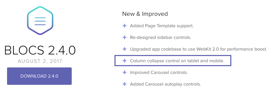
With Blocs 2.4.0, it brought “Column collapse control on tablet and mobile”

But again, as you have experienced the full Bootstrap 3 grid system and its related features are not yet present in Blocs.
So only @norm could provide insight as to if or when they will be - or if a future Blocs version with Bootstrap 4 will have access to it’s entire grid system. Certainly when Blocs gets to Bootstrap 4 and it’s use of FlexBox and many other enhancements to the grid system it will help users if fully implemented in Blocs. As would the more complete grid system of Bootstrap 3 presently, along with more structure Blocs, etc.,
I am sure things will continue to improve with Blocs in these areas and others eventually.
I’m interested to know, what part of the Bootstrap 3 grid system would allow you to specifically target iPad landscape but not effect the desktop break point?
Edit: I think I may have misunderstood the general question in the thread (still not sure), but are you referring to having the ability to set the stacking order of columns on desktop as being a feature that would address this issue?
The breakpoints in Blocs are based on 3 width sizes, just like the ones in Bootstrap 3. Rather than refer to these as widths such as 768px, we refer to them as mobile, tablet and desktop as this is their general intention based on the Bootstrap 3 docs and it makes it a little easier to understand for beginners.
As you have discovered there are times when tablets can have the same width dimensions as desktops which means the desktop layout will show rather than the tablet one. This is because when the site loads, it thinks “hey this is a desktop width, we have room to show the desktop layout”. So it does.
The Bootstrap 3 layout framework is not actualy aware of the device but generalises based on width, which covers about 80% of the zillions of screen sizes.
Bootstrap 4 slightly improves on this, with the addition of a new breakpoint (Blocs 3 will support Bootstrap 4).
But in general Blocs and Bootstrap 3 are not aware of the actual device (as there are too many to track) and more aware of the screen width.
I hope that helps explain why this happens.
Fully justified question. It is a Kindle Fire HDX (2013) which indeed has a screen resolution of 1920 x 1200.
Blocs and bootstrap are both new to me and I want to understand how it works.
From what I have gathered, on a tablet with such a high resolution the two column (desktop) view should be displayed. What I see, is the one column (mobile) view.
This is why I was wondering wether it has something to do with me using the two column structure bloc group and wether it might be something that is/was intended to work this way, therefore two columns for desktop, one column for tablet and mobile (the tablet preview within Blocs displays only one column).
That is very interesting reading material. But it is such a lot!
I will try to work my way through all that over the weekend (if the family permits).
@Norm
My question(-s) in a nutshell:
Is the two column structure bloc group I am using (see first screen shot in this thread),
intended to display
Oh I see, my apologies.
The Bloc Group collapses like that for tablet and mobile by design. There are currently no ways to control that, but it’s maybe a potential future control for grouped Blocs.
BTW I’d highly recommend reading up on Bootstrap 3 and 4, when you have time, Blocs uses this framework to generate sites.
@area49 FYI A quick Google search reveals that the Fire HDX is 2560 x 1600 which is a big desktop in computer display terms. Even 1920 x 1200 is a desktop sized display. The original iPad is 1024 x 768 so in landscape it is 768 x 1024 and hence the “tablet” media screen size of 768px.
The terms mobile, tablet and desktop are quite misleading when considering screen size. It’s much better to deal with actual px screen widths.
This is a good point, I think there is room for improvement here, even if it’s just in the Blocs docs for now.
Norm,
Glad to hear that Blocs3 will support bootstrap 4, that’s exciting news. I’ve been working with the alpha version (just testing nothing in production) for over a year and there’s lots of great new features.
Are you planning on using all 5 device types (4 breakpoints)?
What’s your thoughts on the conversion path between BS3 and BS4?
I’m assuming you would need to continue supporting bootstrap 3 for old projects.
@area49,
What is strange to me is that on your Fire (1920 x 1200) why it’s not going to the desktop view. Your screenshots of Safari in iPad mode shows the stacking is working.
Do you have an URL to the site?
Don’t have a lot of experience with kindle fires, and their silk browsers. It does function a bit differently with split browser architecture .
I know Amazon had a major make over of silk a few years back, don’t know if you’re running the latest update.
Yes all 4 BS4 breakpoints will be supported in Blocs 3. I’m not sure what’s going to happen with old files (BS3). Blocs 3 may be BS 4 only but have the option to upgrade old files to BS4.
I had the same idea that the Silk browser might be the culprit.
To test that, I just installed Chrome on my Kindle Fire HDX.
It took me a while as Amazon does not like it, but eventually I managed to go through with the installation and take a look at the website in Chrome.
Unfortunately I get the same result. I can only see the one column-view for small devices (tablet view) even though the screen resolution of the Kindle is 1920x1200.
If you have an iPad or another tablet, could you take a quick look and tell me wether you see two columns (desktop view)?
Here ist the URL:
www.hs.area49.eu
And here the log-in:
ID: blocsapp
password: blocsapp
I am not familiar with the Fire HDX device but be careful not to confuse px and pt. E.g. the Retina iPad has a resolution of 1536x2048 but this is dealt with at a logical resolution of 768x1024 or also described as 768pt x 1024pt.
That’s strange, you’re top row, has 2 columns on my iPad 3 horizontal, and stacks when held vertically. Just like your image from Safari above.
Let me sum that up.
@teefers
Your iPad 3 has a resolution of 1536px x 2048px and a logical resolution of 768 x 1024.
In landscape it shows two columns next to each other (that is good news!),
in portrait it shows them below each other.
@webdeersign
My Kindle has a screen resolution of 1200px x 1920px.
I have not found a value for the logical size, but according to the Amazon developer site it has a scale factor of 2.0.
That translates in a logical resolution of 600 x 960, if I understand it correctly.
Playing around with the width of the browser on my Mac, I found out that the 2 column bloc group collapses at a width of 991px.
The two column brick I am using in one of the blocs still displays 2 columns next to each other down to a width of 768px.
Looking at the style.css of the site I can see a breakpoint/media query with 991px
@media (max-width: 991px)
{
.container{width:100%;}
.b-parallax{background-attachment:scroll;}
.page-container, #hero-bloc{overflow-x: hidden;position: relative;} /* Prevent unwanted side scroll on mobile */
.bloc-group, .bloc-group .bloc{display:block;width:100%;}
.bloc-tile-2 .container, .bloc-tile-3 .container, .bloc-tile-4 .container{padding-left: 10px;padding-right: 10px;}
}
Here it says “.bloc-group, .bloc-group .bloc{display:block;width:100%;”
After I changed the value from 991px to 900px, the two columns of this blocs-group are displayed next to each other when in landscape view (they are still stacked when in portrait).
Landscape view on my Kindle ist now as I would expect it to be.
Thanks once again to all of you for your help and feedback!
That was fun!