Found this link that gives you some good information on device screen size and dpi along with some other useful info.
1 Like

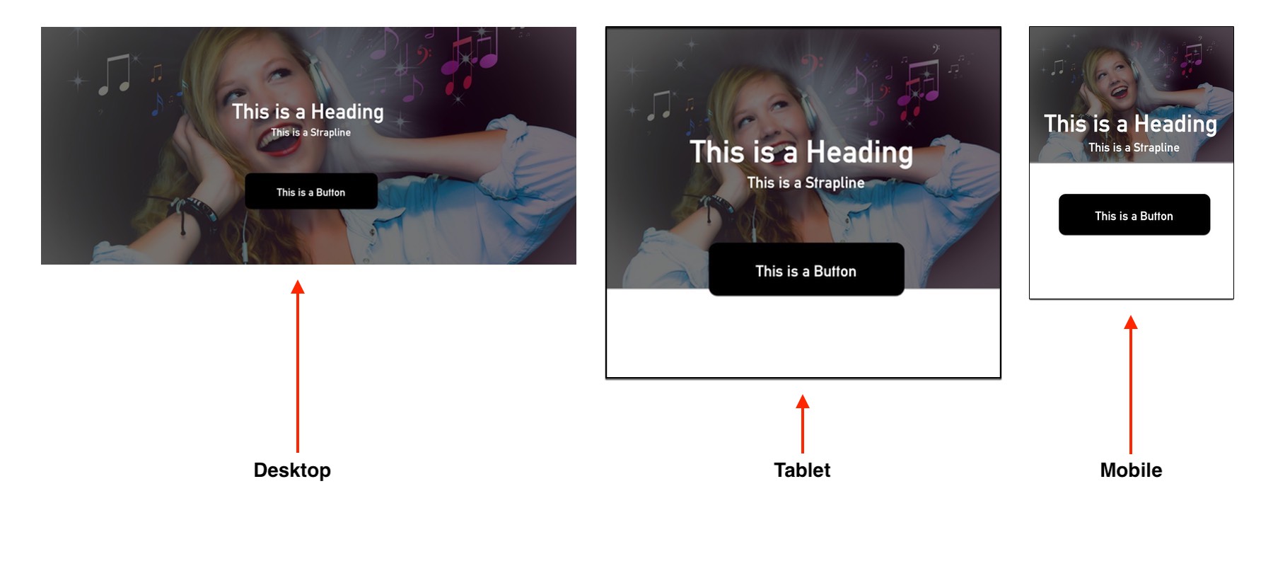
Cheers se7en, this is what I am trying to achieve using the same image, but my brain is mush,just need a tut on how to get it to look this way.
Cheers
Chris
I only need to get one image to look the same in screen - tablet - phone, I have messed around with custom classes but I am obviously buggering something up, I dont need thousands of breakpoints for all devices in the world,perhaps my wording has been wrong, dont know but if someone has achieved this like the image above, please instruct, I will buy you a virtual pint 
Im going to give you the power to add them yourself 
2 Likes
Guess its not possible then OH 
Careful with that approach however, as the array is vastly and largely non-Apple. 
1 Like
Has anybody made a website like the image I showed,I know it is possible to have one image fit on all devices,but I am damned if I know how to implement it,I have tried all sorts and it is really pissing me off,any help would be really appreacited.
Cheers
Chris
@se7en well I have a image of a band that I would like to add in a block under the navigation,I have chosen a block from the structure menu that has a row I can place a logo in,the band image will be on the background of the structure block and I would like to see it appear exactly the same in tablet and mobile view,at the moment I am on my phone so I can’t look at it in my computer,I bought this app as the person I am doing the site for also bought this app but is struggling to get his head around it, It looks fine in tablet and mobile view but screen view is cut off so I have to add padding to the screen image,this in turn makes the tablet and mobile view expand also,I have made custom classes but I am missing a simple thing and all I need is what to do to get the image to appear in all three modes,so for example the image you posted above,how would I achieve to get that image to fit in screen - tablet - mobile view,I hope this helps ?
to get what i got i put the first bloc under the struture tab in the global area, look at appearance on the block info for padding i have none-0px , width edge to edge, and no background image.
now i click my single element bloc tool near the top next to the arrow on the right of the screen.
has a square with a cross sign in it from that i chose the image element and place it in the global bloc over the one above.
make sure your picture is big enough to cover the entire width of the biggest screen you want it on i use single resolution because i dont have a retina screen. appearance alignment center. change nothing else but make a custom class for that img name it what you want.
in the custom class section make the width dimension 100 %. thats it i am sure there is other ways but thats how i got it to stay center and stretch full width and shrink while staying the same ratio on whatever you veiw it on.
only problem is i am having no luck putting anything on top of the image . maybe someone has a idea here i will look though some websites people have posted and find somehing similar and make some inquiries
@se7en Cheers Tim, I will give this a shot, looks like I may have to use some coding to get it to flow better, thank you for your help mate 
Still no joy with this issue
Any luck with this? I am having the same problem…
Hi there!
try to fix it with Photoshop, you can read about it on FixThePhoto
Hi Se7en, you’ve achieved what I’ve been trying to do for a while, but my efforts haven’t produce the desire scaling effects. would you mind going over the above stated instruction again but in Blocs 3?
Cheers
Hi Chris, did you ever get some light shed on how to achieve the flawless Background Image resize? I’ve been trying to achieve the same effect with no success, getting help on this as proven to be a task in it self.
Cheers
Up help on this someone please 
Sorry peeps,I didn’t resolve this 
@Chris What you have to understand about background images is that they fill the bloc in which they are placed. If you have a landscape image, the height of the image will generally be the deciding factor in deciding how the image gets placed - in other words, the image will tend to fill the height of the bloc and any excess width will be cropped by the width of the viewing device. If you think about this logically, this makes perfect sense.
In a desktop page, the bloc will generally be a landscape orientated rectangle. Therefore, the image will display mostly at full width. However, as the viewing device gets narrower, less of the image will be visible on each side. This is because the orientation of the bloc has changed. If the background image simply rescaled, it would no longer fill the bloc - it would just reduce proportionately - just like a normal image bric. This will create other problems, depending on the content of the bloc.
The height of a bloc is determined by the content you place in it and the padding that you apply to the bloc as a whole. This may cause the bloc to be more portrait orientated as it gets longer to accommodate the content. When this happens, the background image enlarges to fill the height of the bloc, which means less of the left and right of the image is visible. If you had a situation where the background image simply scaled, you could end up with white space under the image. See the example below:
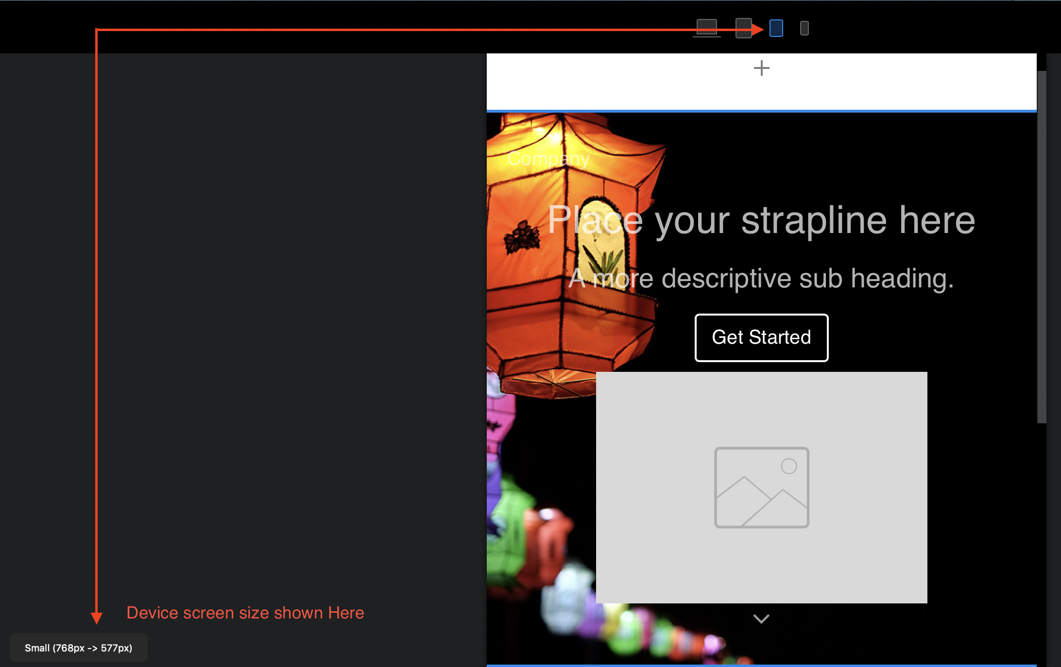
In view of the this effect, it is usually better to make 3 or 4 image variants, each suited to a particular device. Because mobiles and tablets have a fixed width (as opposed to desktops and laptops where the browser window can be adjusted in size) making alternative images for mobile devices is fairly simple. You can get the dimensions of each device screen from Blocs app itself. Just select a device from the top of the interface, and see the dimensions at the bottom of the interface:
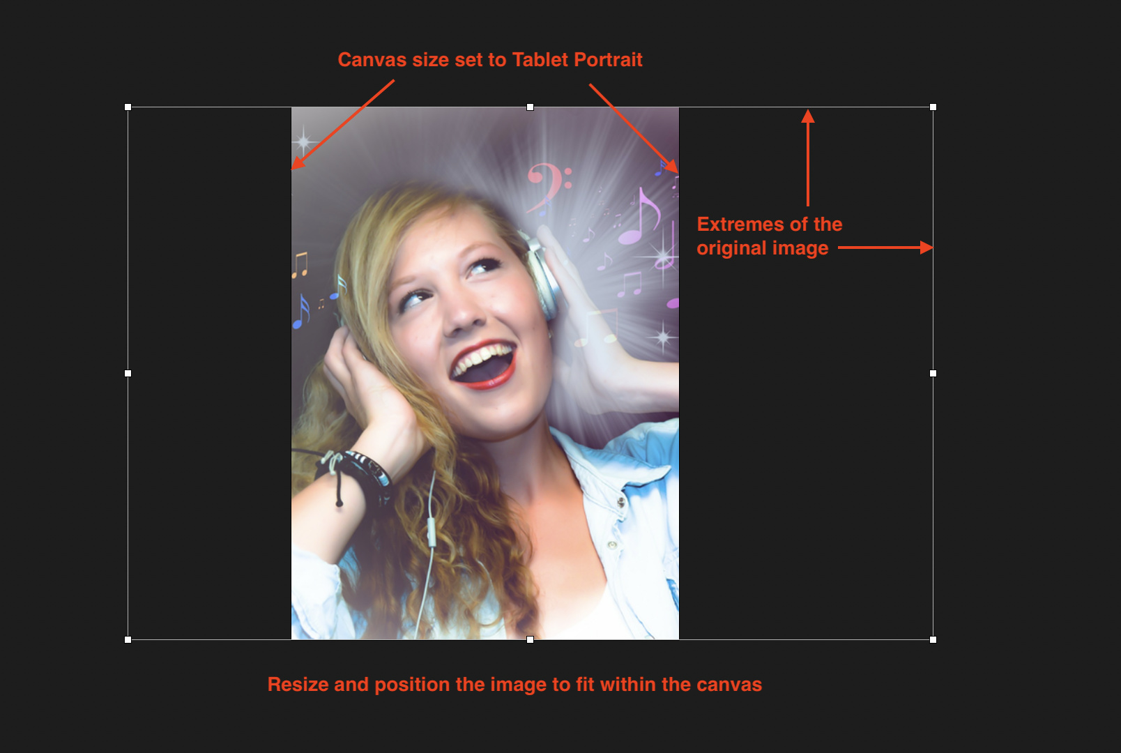
Now, open your image editing application and create a new image canvas the size of the device you’re creating for. Import your chosen image and scale it to fit the height of the canvas. Then move the image from side to side so that the main subject area appears in the centre of the canvas. In the example below, I created a canvas 577 x 768 pixels (small device portrait).
Now export the new image and use this as the background for the small device variant of your Blocs project. To do this, duplicate the original desktop bloc and replace the background image with this new one. What you will notice (if you set the image to fill the bloc) is that you will see a much enlarged partial image as the background. However, if you switch to the small device layout, you will notice that it fits perfectly.
All you then have to do is make the duplicated bloc visible ONLY on the small device variant. You do this by checking the visibility options in the properties panel. You will also have to do the same on your desktop variant by making it visible ONLY on the desktop variant. Repeat this process for the other device variants. Duplicate the bloc and change the background image, and then set the visibility options.
3 Likes