Hey guys, i just launched a new website for a ecclesiastical institution.
With some points I’m not happy. But it was the wish of the customer. All your comments are welcome.
3 Likes
@RME the first menu dropdown I’m getting 404 error page not found on everything in that dropdown.
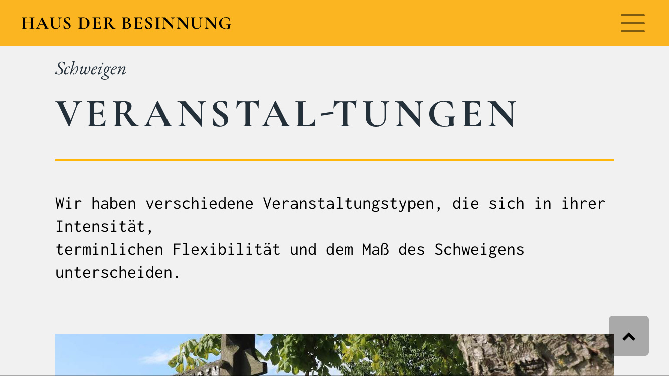
I really don’t like the yellow used. It’s look to dull (dark hue) for yellow. I much prefer using a brighter yellow, just think it pops more. Also better light to dark contrast for reading.
In the first page under programs, it sure seems the dates(?) row could either be shorter or two colums on desktop.
I"m not sure what your client wanted that you didn’t like but it’s something we just have to accept. I’ve been there a lot of my last project. It turned out good and the client was very happy but I had some other choices I thought worked better. It can be frustrating for sure.
Still, it’s a nice website…would’nt expect anything different from you.
casey
1 Like
it works now. thanks.
it is an accordion. i need the space for the content inside.
thanks for your opinion. i understand this. but this is the color of the church :-/
1 Like
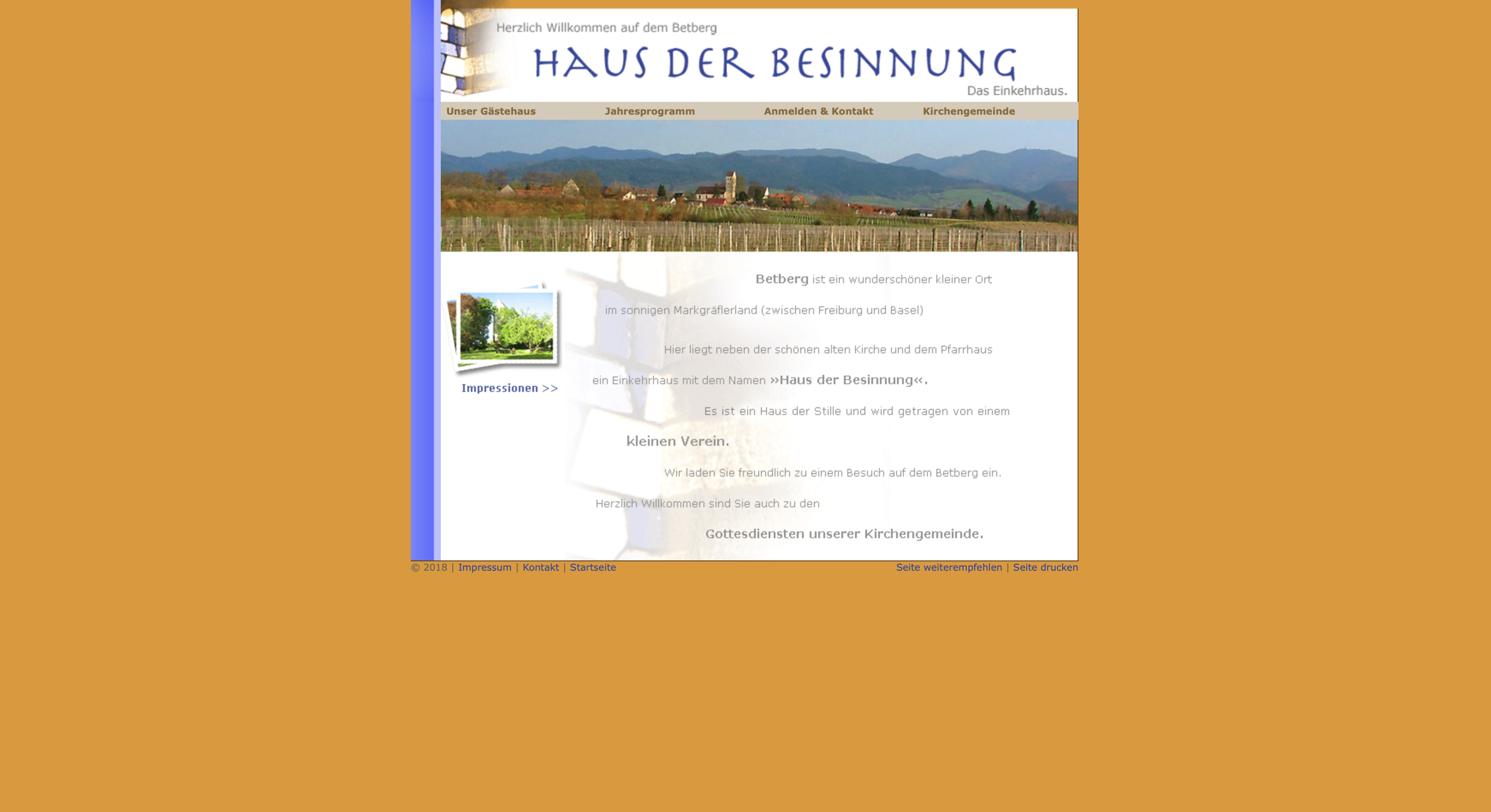
 this was the old website
Wow, the new one is beautiful. Best yellow I’ve ever seen…
Good work.
casey
2 Likes


1 Like
Hi Ralf @RME
My 2 cents:
Probably a lot of work done here, however, far down in my favourite list of the sites you’ve shared so far. I understand that your client may be the culprit here.
Viewed site on iPhone.
Not sure if it is the body font choice, line height or white spacing but I find it difficult to read through. Some subtitles seem too small to read and the difference with titles is confusing, especially with seeing the subtitles and buttons before the animated titles (updated: not the same sequence of animations on desktop)
Paragraph break issue here after “Intensität”:
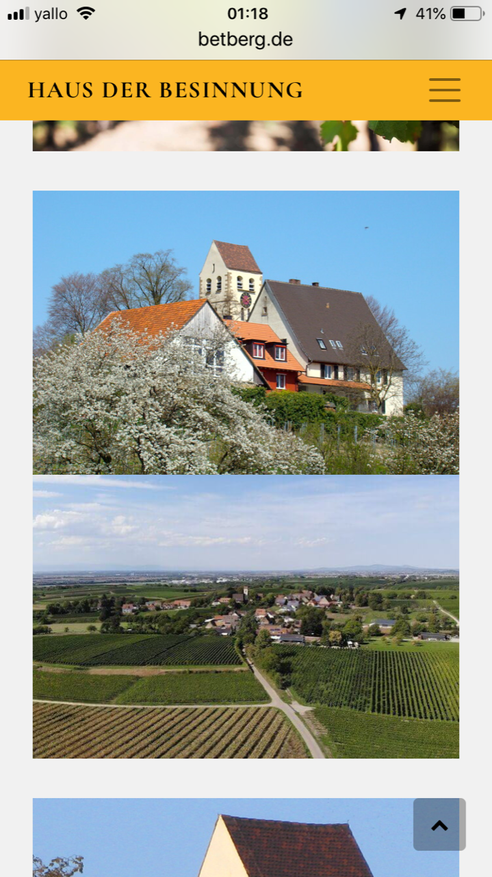
Missing padding between images here:
Bullet points second lines and below could be indented for better readability.
Now I have just looked at the site on a desktop, much much better, however, still find the fonts not helping readability and line character count too big. ( 10 Tips On Typography in Web Design | by Nick Babich | UX Planet )
Personally I would not have done better considering the subject ![]()
MDS
Hey @MDS thanks for your opinion.I understand everything what you said. You are right. This is the reason, why i did make some changes and use new font family.
Hope it is better now.
Hi @RME
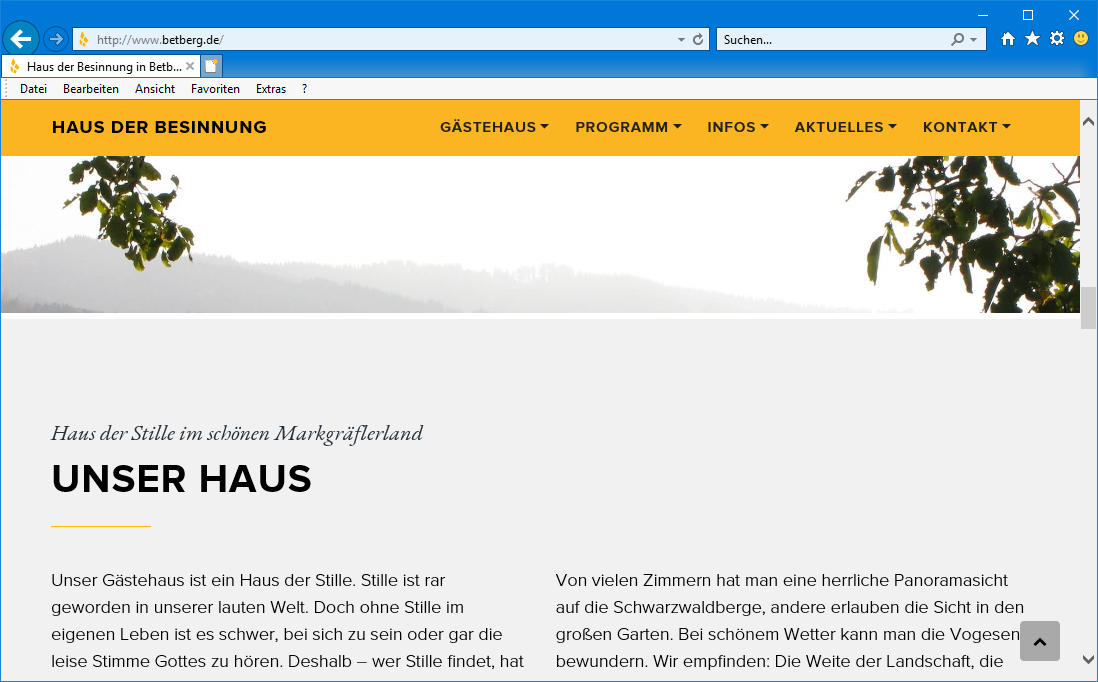
nice page … but you also have white lines in your design …only to see on a windows IE11 …
tom
What a difference using a new font makes, it changes the feel of the whole site. Nice!
casey
1 Like
yes that’s true. i thought i use a “retro” font because the customer is very very conservative. But it wasn’t the right choice. Now i´m feeling better.
1 Like
thanks. that’s not good. i think it is the bug in Blocs 3 
yes … there are much more lines between the blocs …not only after images …
I have send a support ticket …
not good … hope the client use firefox 
tom
you can use a class and set top minus 10 px and bottom minus 10 px on each block …so the withe lines not visible … do you use a background color on the main settings ? or each block ?
ok, but this should be not the solution. sorry, i use a color on the main settings.
no, not a solution … when you don’t use a gradient color and each site use the same color than you can put the background color on the main settings …then the lines are not to see … but my page for example use a gradient background  so that not works.
I you want to try it I can check for you on windows if you want. … but I can’t promise that helps … but I think
tom
the best solution is, delete IE
3 Likes
Hi Ralf @RME
It always easy to critic someone’s work but at time’s not that easy to receive them.
Appreciate you have taken into consideration my remarks which were given in a constructive spirit.
As @casey1823 wrote, what a difference with the new font. The site is now way up in my favourite list of the sites you’ve built. 
MDS
2 Likes