Hi to all,
Well, here’s the latest version following all your comments.
Any constructive comments are more than welcomed.
Thank you in advance.
Cheers
Phil
Hi to all,
Well, here’s the latest version following all your comments.
Any constructive comments are more than welcomed.
Thank you in advance.
Cheers
Phil
I think it’s a big improvement. One thing I did notice, the top nav menu links jump as you mouse over them. You might have something a little different on the hover state beside color and underline. Looks like might me letter spacing?
Nice work
Casey
@casey1823 thanks again just modified the hover appearance and some other stuff. Always little bits an pieces.
@pauland took into consideration your first comments (apart from the old fashioned logo animation). Any further comments on the modifications ? Thanks in advance.
Cheers
Phil
Hi there 
@webplus @DinaxCharles @Creative @KBConcepts @Tom2 @greenskin @HMM
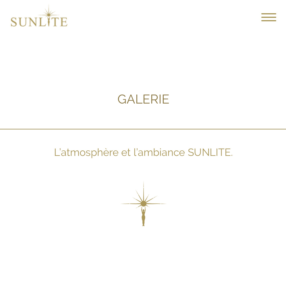
You have all kindly previsously taken some time to comment on my site and now you can see the updated/modified version.
Your further comments are greatly appreciated. Thank you for your help.
Cheers,
Phil
It’s looking very good, though perhaps a little too much animation for my taste. I did notice an odd graphic glitch at desktop size at the bottom of the home page.
Thank you @Flashman for your comments. Can you say on which device and browser you see this glitch ?
Thanks for having taken the time to comment.
Cheers,
Phil
Safari on my Mac Pro computer with a 23" display. When I make the browser window narrower so it is like a tablet or mobile the problem goes away.
Ok will check that. Thanks again.
I was looking at your new site on the mobile devices and I think it could use a little work with some of the spacing and horizontal lines.
On the desktop the lines look ok, (not my taste) but maybe shorten them up. When you go to the mobile site it shows them edge to edge and it really plays havoc with figuring our what goes together. Here’s an example.
Casey
Thank you @casey1823. You’re right still some work with mobile optimization. It appears that the view in Blocs in sometimes quite different from reality. Will get that modified as well. Thanks again.
Hi Phil, couldn’t find my original comment, but I do remember the comment about the logo animation and I haven’t changed my mind! Maybe I deleted it because I sometimes do if the OP remains silent and seems not to engage with my view.
As for the rest of the site, too much animation still.
To be fair I feel uncomfortable with the site because it’s hard to tell what’s being offered. The ethos/ambience is being hyped hugely at the expense of a clear explanation of what is being offered. I originally thought it was close to being some mystic experience with cult-like traits and psychonanlysis, but then I looked at the team and see it’s closer to a Spa and various beauty treatments.
I don’t feel that the hyping of the logo and the ethos/experience is going to work well for anyone, but I may be wrong.
Sorry to be so critical, but if I just spoke at this stage about the minor matter of the website functionality it would do you a disservice. I’m sure the client has requested this kind of hype but I think they’ll pay for it in a lack of take-up because they’ve hidden the real offering so well.
![]()
BTW, if anyone else thinks this is an incorrect view of the site - please express a contrary view - not to have an argument, but to give phil some perspective that goes beyond just animations, logos and css issues.
Hi Paul @pauland
Here’s your initial comment :
First let me say that I have engaged in replying to you and we have had more than one back in forth replies and that’s why I mentioned there was no need to comment again on the logo animation because you already had mentioned your dislike. I have also taken into consideration your comments since some of the modifications were made following those.
Please note that I always reply to all who comment whether their critics are positive or negative.
Posting this website on the forum is mainly to obtain comments on the design itself while the content and purpose of the site is more in the hands of the client. I however do agree that we are to drive the client to have both head in the same direction.
Well that’s a interessting stretch… I do find it strange however that it’s the team details that made you think perhaps differently and apparently not the texts under the various offerrings.
May I ask whether or not you speak French ? Indeed, I do believe the texts are self-explanatory when understood. Perhaps, I am wrong…
No need to be sorry for being so critical. Like I said in the previous topic/post, it is impossible to please everyone and that is not the original objective anyway. I am just looking for some contructive comments from which I can build upon and improve. I am not sure there is much here that will help further though…
As you may have noticed, the site does not appear to have been widely disliked.
Cheers
Phil
PS: Would be interessting to view one of your sites if you would like to share with all of us. Maybe that could be a way to help us improve our designs… I have not seen one yet.
Absolutely.
I wasn’t going to mention my wider reservation about the site, so I stuck to the good practice stuff that’s true regardless of any other considerations.
Very badly. I lived outside Paris for just over six months. I am a superb French speaker when drunk. I let Google translate turn the site to English. I think this is a case where your content intends to convey a certain sense of what the site is about, but that didn’t work for me as you would have wished it to.
People generally don’t go beyond the basics when reviewing a site as part of a community - you can say I’m opinionated where others may not be. In this case I’m not so receptive to the content hype than the target audience may be.
I don’t base my views on what other do or do not comment about. The truth is that what I think doesn’t matter that much, for any particular site the target audience will decide if this is a good site or not ( or more accurately if the site and underlying business is good).
I am comfortable with my view and I understand why others may have not expressed similar views.
Well, I’m sure you can find plenty to talk about with my sites, I have plenty of bad site design decisions hidden in cupboards. The important thing to understand about my websites is that whether they are good or bad doesn’t make anyone else’s website better or worse, so I invite you to engage with regard to the comments and whether that is helpful or not.
I don’t expect my websites to be helping people improve their designs - they are run of the mill in many ways, but the clients are very happy. I have listed a few in past posts, whether you’ve seen those or not.
What you will not see with these websites is the starting position. Some clients have virtually no content to work with and some want to recreate a competitor’s site that was bad five years ago.
Anyway, no more comments from me.
Paul
In no particular order…
[http://www.solveconsulting.ca/]
[http://www.drsallymartin.co.uk/]
[http://www.liberate-uk.com/]
[http://www.ipauland.com/]
[http://www.techengineering.co.uk/]
[http://www.bundleservicesltd.co.uk/]
[https://www.bristolchildpsychologypractice.co.uk]
[https://www.danmitchellcomedy.co.uk]
[http://www.ipauland.com/clients/celikhandyman/]
[http://www.festive365.co.uk]
Hi Paul,
Indeed, there would be plenty to say but this is not the right the place.
Anyway, thanks for you personal review.
Cheers,
Phil
Excellent!
Was that entire website built with Blocs or did you add a little code tweaking?
Thank you @KBConcepts. Apart from the old fashioned logo animation  everything was built using Blocs and classes. Since I have been using Blocs I have discovered that basically there is no limit to one’s imagination, just a bit of time, thought and workaround.
Would be happy to share if there is something in particular you are interested in.
Cheers,
Phil
Thank you very much I still learning how to manipulate Blocs.
I’m really interested in the cool parallaxing/animation you did. I’ve not learn that kind of fine tuning.
Beautiful site, just modify the spaces of the sections getting more spaced, I think they would look better, good work… 

Thank you @DinaxCharles your comment is greatly appreciated. Will review the spacing accordingly.
Cheers,
Phil