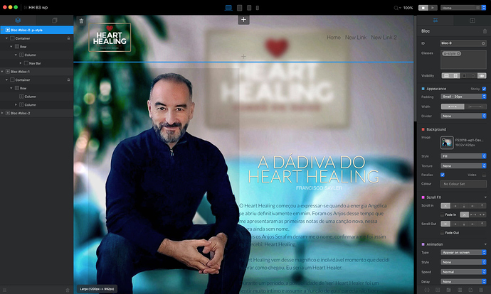
It seems that B3 didn’t yet solve the control of Tablet Landscape.
If I do not want the tablet to play/show the desktop version how can I do it?
How can I customise the visibility for Tablet Landscape?
The main problem here is that tablets come in so many sizes now and this is partly decided by the chosen browser, but also influenced by screen pixel width, so the lines between different device types have become blurred.
The best option is to test this at all the breakpoints and also with Solis if you have that as well, since this integrates directly with Blocs, so you can see results immediately as you make adjustments.
That will show you 95% of the answers, but it’s still possible to find some particular devices or browsers where a website doesn’t look exactly how you expected and this will be the same for other design apps as well. There are too many variables that we cannot control.
EDIT: This is also why the breakpoints were changed from desktop, tablet and mobile to LG, MD, SM and XS. The old device type labels have become meaningless.
I had a similar issue which is unresolved. I’ll have to just play around with it. My only option is to make everything slightly smaller on Desktop and Tablets so it fits better in Landscape for Tablet and Phones.
That’s right Flash but that isn’t also valid for the myriad of desktop, laptop and mobile versions?
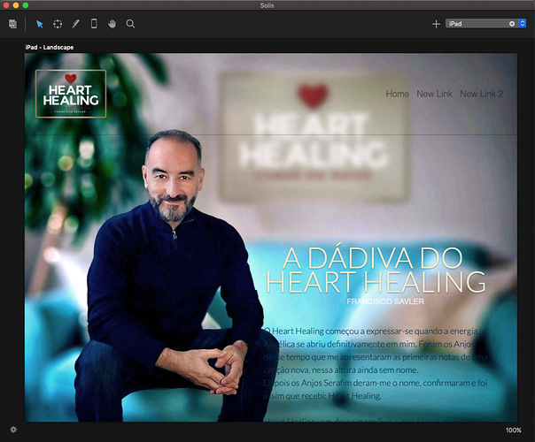
Solis is a great help but is not an accurate app in terms of visualisation, as shown in the following picture.
My real problem is this. My page, in my new site, has two blocks. The top block is for navigation and the second one is general.
I use the same image for the background and in both blocks apply a parallax effect. So the image do not move and the text on the right scroll down as the user read it.
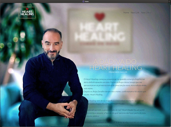
I like this design. I have take the photo thinking in this design and looks very nice on desktop version, however my iPad (9.7 inch) read this desktop version and deform it design to a not nice look as you could see in the follow screenshots.
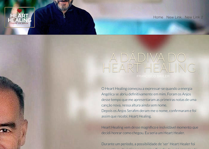
So I would like to know how to avoid tablet landscape read the desktop version. iPad landscape do not read the parallax effect and turns the page very strange for the user, as shown in the following picture.
Previously I also have done a version for each of the displays in B2 and work well except iPad landscape.
Any help on this?
Francisco
Blocs project
Desktop
Solis (iPad Landscape shows the parallax effect but this is the true visualisation on an iPad)
iPad (Chrome)
Like I explained before the key problem here is not actually device type. It’s screen resolution and you might well find that a tablet with a Retina display has a larger pixel count than a non Retina desktop display.
Have you tried using using visibility options, so that you serve up different sized images depending on the user’s device?
Yes I did.
I am afraid that I have to drop down this design so i couldn’t save it properly in Blocs.
If you want to send me the project file with the image I can try to take a look tomorrow and see if I have any luck.
Thank you so much Flash.
I am going to send you a working progress project. That means I am wornking on it to find a solution or an alternative process tomado it.
How can I send it?
Just click on my profile name in this thread and click the message option, then attach the project, along with any images. I don’t think I’ll need other resources like fonts.


