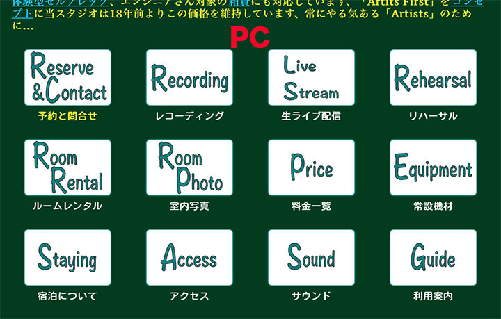
On my web, buttons are lined up in 4 horizontal rows on a PC, and when displayed on an iPhone, they are lined up in 1 vertical row. Is it possible to display this in 2 horizontal rows? If you change the column of the mobile display, the PC display will also change, is this not possible?


Thank you, you can change the setting for each display, I will try.
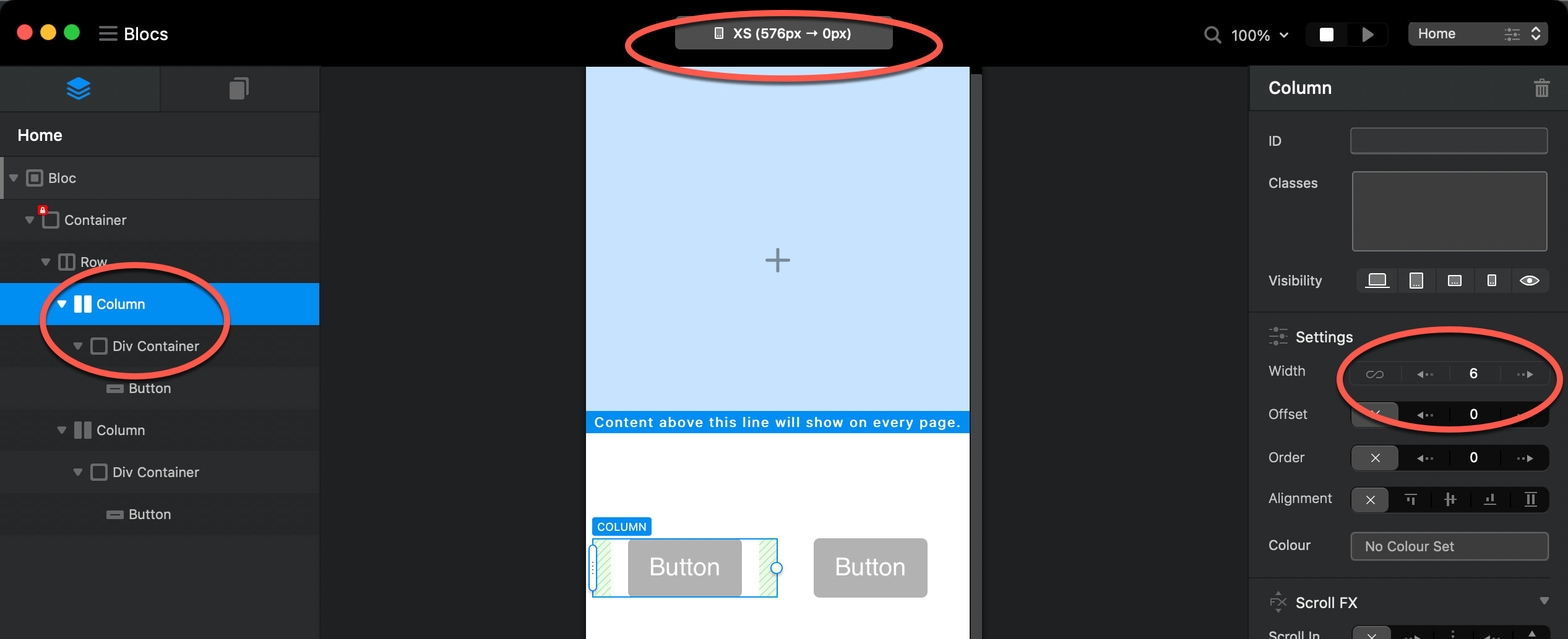
Is it basically necessary to place “DVI” in advance when placing an image ?, I did not place DVI on the image button, because the character position could not be placed well with respect to the image is
No, that’s not necessary. See below:
1 Like
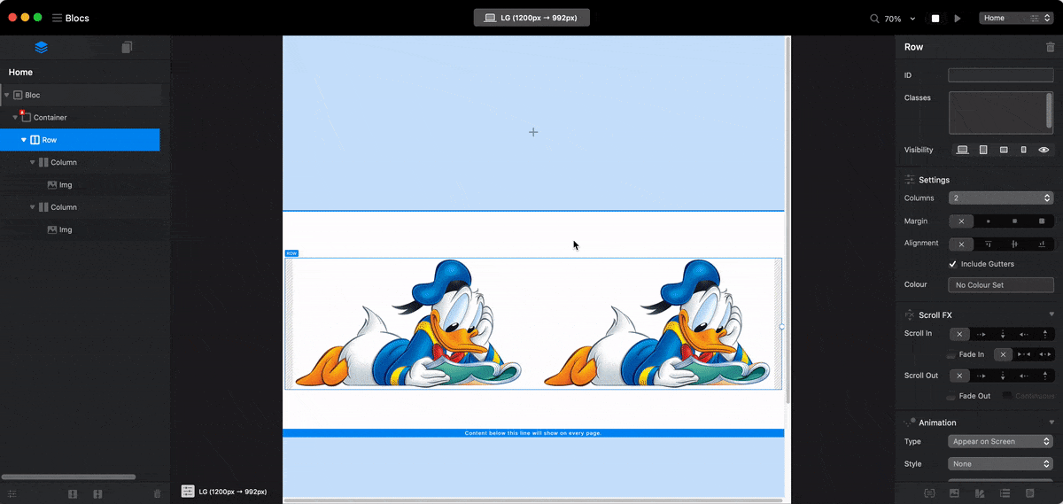
Oh, does it work so smoothly? , DVI isn’t required, I don’t get this stable behavior, is it a high spec pc, I’m a 2012 iMac i7, I’ll review the details later, thank you  ♂, There are times when it works like this, but there are some that can be changed and some that can not be changed even though it is a button of the same shape, there are cases where it moves up to the upper stage and there are cases where it does not move up, it is very unstable, OS Is Mojave 10.14
I remember mobile first. Set mobile, tablet then desktop.
Watch the brilliant videos @Eldar has done, shows these basic layouts perfectly.
Once you do it, you will find it easy.
Good luck!
1 Like