Hi blocs professionals!
How do I align the caption area with the bottom edge of the carousel and alter the width of the caption area to match the width of the carousel?
Thank you very much for helping me out here! It’s very much appreciated.
Hi blocs professionals!
How do I align the caption area with the bottom edge of the carousel and alter the width of the caption area to match the width of the carousel?
Thank you very much for helping me out here! It’s very much appreciated.
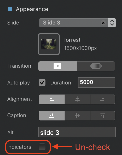
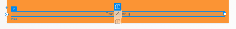
Once you’ve created your carousel and dropped a text bric into each caption Area, do the following:
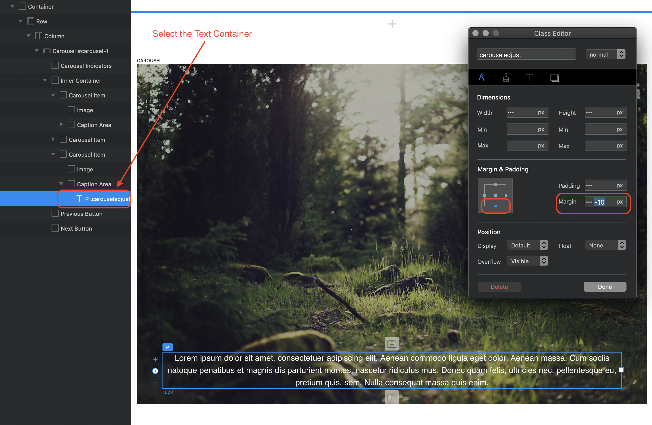
Select the text container (usually a paragraph) and create a custom class (name it something like carousel-adjust). Open the class editor and go to the metrics tab.
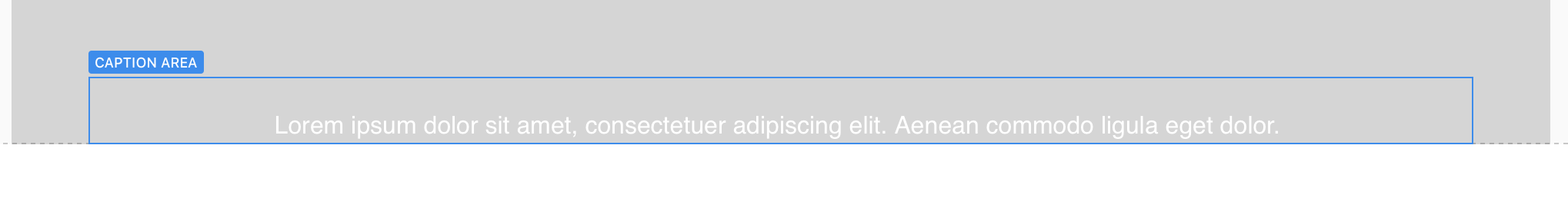
Select the bottom margin and apply a negative number to move the text down. (remember to turn off indicators so that the indicators don’t show up under the text).
Next, select the right and left margins and apply a negative number to increase the width of the text container.
Save, and then switch to the other slides and apply the same class to their respective text containers.
Thank you very much! 
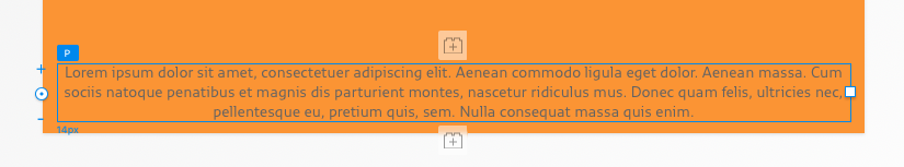
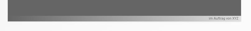
It works pretty well as long as there are several lines of text:
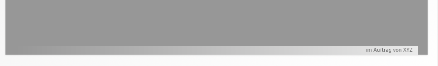
But if I’ve got only one line can’t move the area further down than that:
What am I doing wrong?
Best whishes and thanks for your effort!
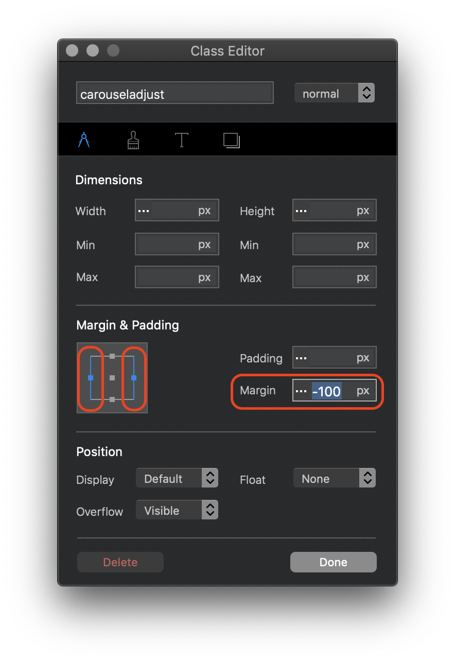
The method I described moves the text to the bottom of the caption area. If you want to move the actual caption area, apply the negative margins to that instead of the paragraph text. This will allow you to get right to the bottom of the image - even below it if required.
Thanks! 
That works.
I’ve adjusted the classes for two viewports, and everything works fine.
But it doesn’t work in sizes inbetween viewports as it seems.
Viewport 1:
Inbetween viewports:
Any idea is very much appreciated. 
I built several websites with Muse. And if I remember correctly there was no dynamic movement of elements inbetween different viewports. Instead the design snaped from one version straight to the other depending on the window’s size. Why ist blocs doing it? Is there a default setting that needs adjustment?
Merci and best whishes!
When you create custom classes on certain objects, they tend to lose their responsiveness - they become fixed at specific viewports. (i.e. they become adaptive). This shouldn’t be a major problem because only desktop and laptops allow users the ability of adjusting the size of the bowser window. Tablets and smartphones have a fixed size browser window so will always show the version of the object designed for its size. People who regularly use a desktop/laptop browser will well understand that changing the browser size will cause some websites to distort content, therefore, they will tend find an optimum size that they are happy with. I really don’t think it’s such a major issue.
It’ probably just my perfectionism talking. 
(Had gotten used to Muse’s elegant solution to hide the in-between stages. …)
Thank you very much for your help and input! 
Have a nice weekend!