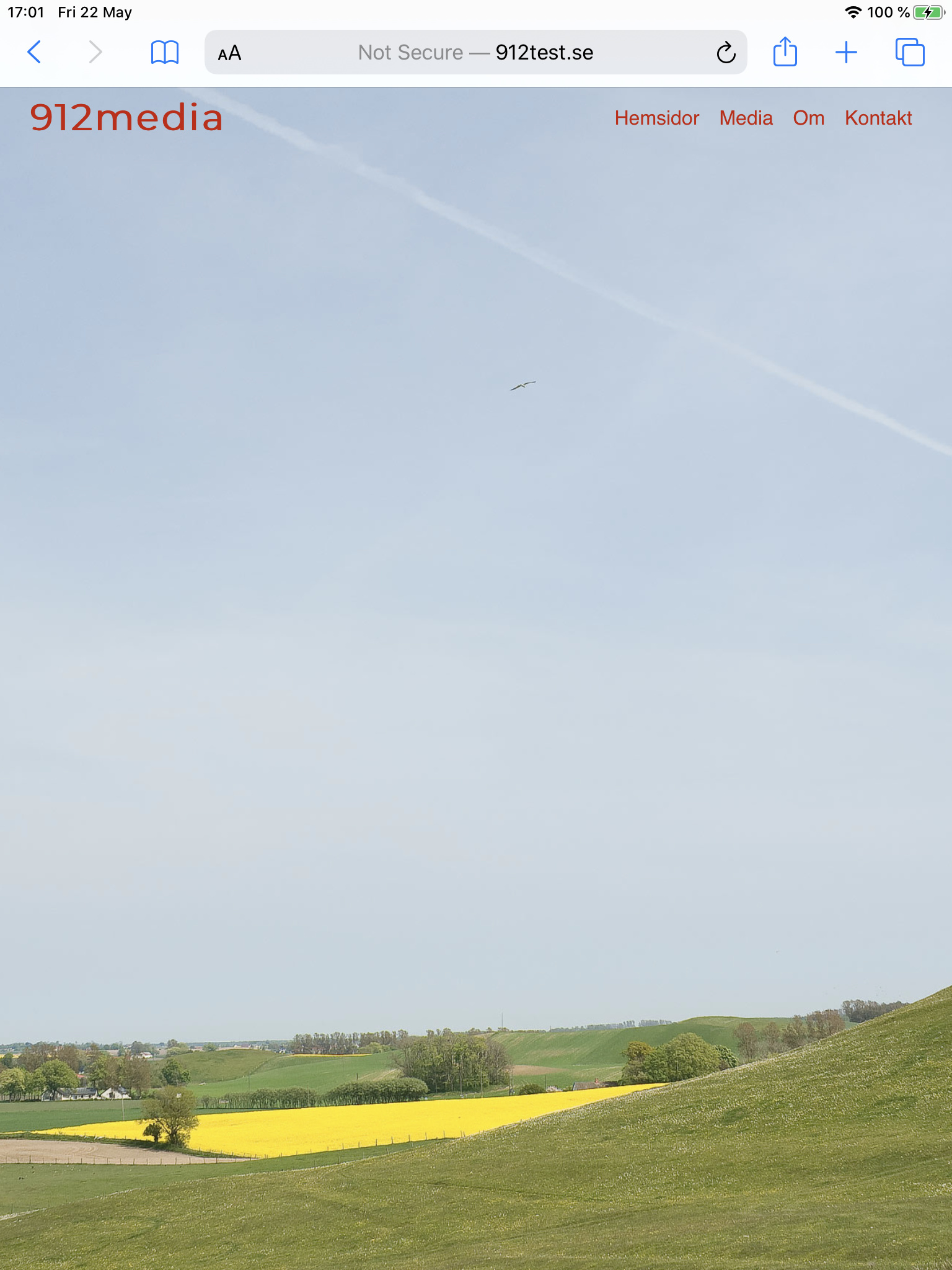
I have set the background image to 100 % height. It has worked all the time during the design process as I have wanted, looking at it in Safari design view for different devices. Uploaded to server it works great on all devices I have except iPad 9,7". I have several Macs, one Windows, the iPad, no iPhone but two Androids. On the iPad I have to scroll to see the whole page.
Anyone who knows what the problem might bee and what I can do?
http://www.912test.se
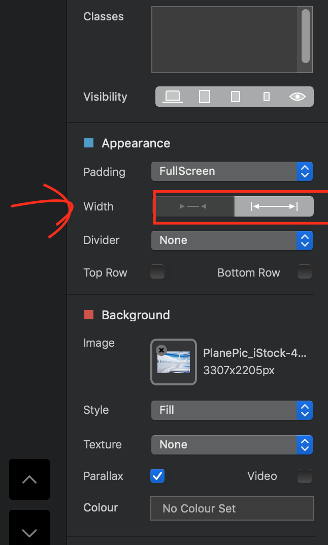
Hi @Herbex, I just looked on Safari on my Mac and could see white stripes to the left and right, have a check of the settings, I’ve attached a screenshot from a full background image I’m working on, and I found the red outlined part was causing me similar problems.
Thanks, but I want to have it that way since I want the hight to be consistent. On the computer there will be white stripes, on the iPad and Phone the picture will be cropped. But it should always be full hight.


And if you turn it around and have it the iPad in standing position?
Ah, sorry. I misunderstood. don’t think I can be of any more help here, but best of luck.
What I do is, on desktop use the image as a background on the bric and set as fill. But in other breakpoints set the background via style with 100% height and with another optimized image.
On my case, if I set 100% width I get the image vertically short on some resolutions (ipad landscape), and if I set 100% height the oposite.
Using the fill feature you get the entire bloc with image, at least you could give a more squared aspect to your image and then it will fill great
Thanks a lot. I can see what it is now. I have the tab bar open, you have not. When I close the tab bar it looks okey. I don’t know how most people do, but I guess I have to accept that it is like this. Thank you very much for the help.
1 Like
Thanks! I have experimented with that somewhat. I haven’t 100 % control with the fill option I think. It crops differently. But then, every picture is different. With some pictures that would work just fine. I will experiment more with that on my next site. Thanks for the tip.
Thank you!
Seem to be quite clear: the size of the page content is bigger than iPad screen container.