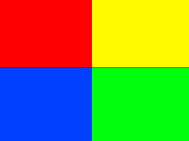
iam stumped so decided to ask the community. looking at using 2x blocs with 50% width for tablet view as shown in image but finding it impossible to implement in blocs. tried various float left and right in class editor with no joy so just wondered if anybody has beed able to achieve this
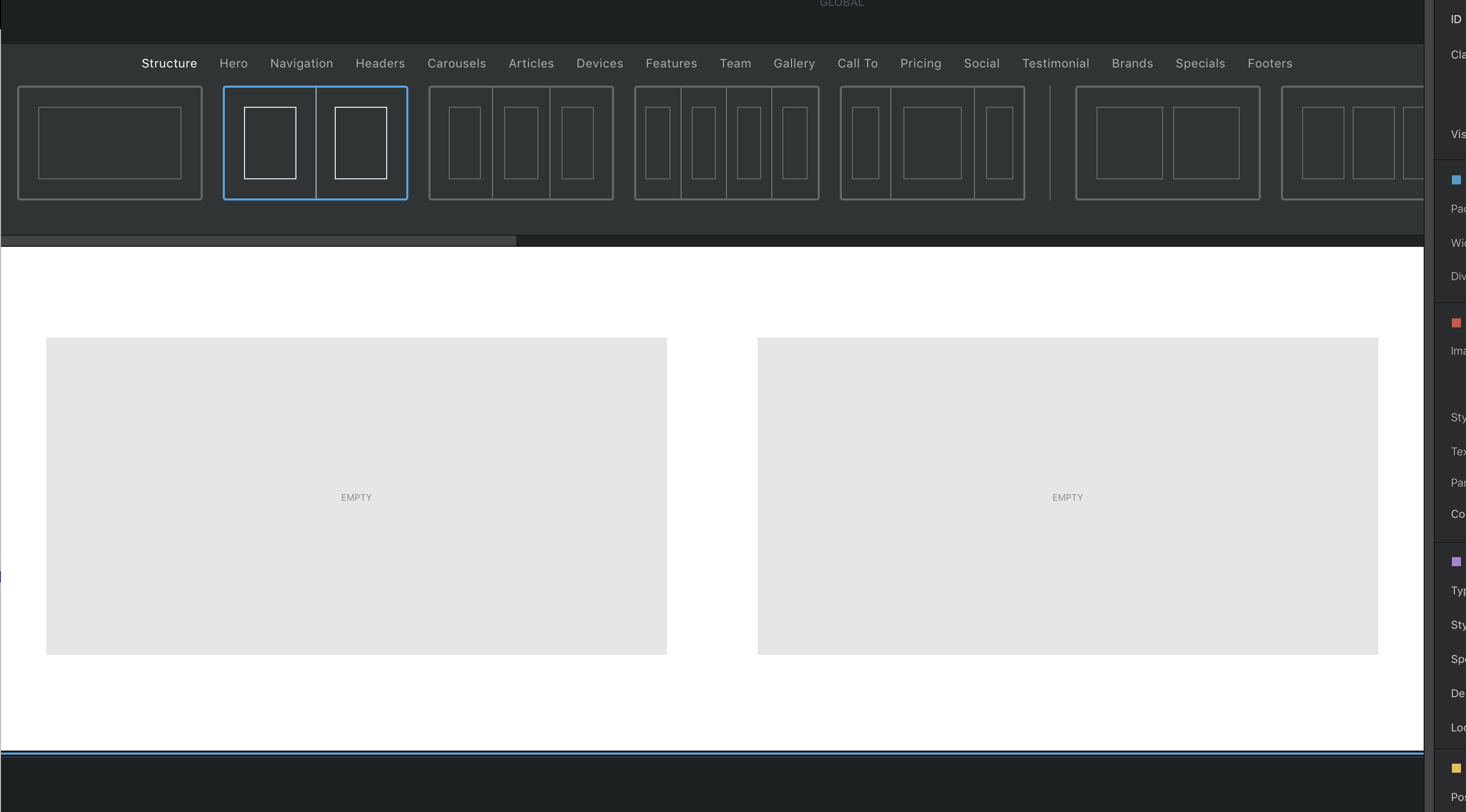
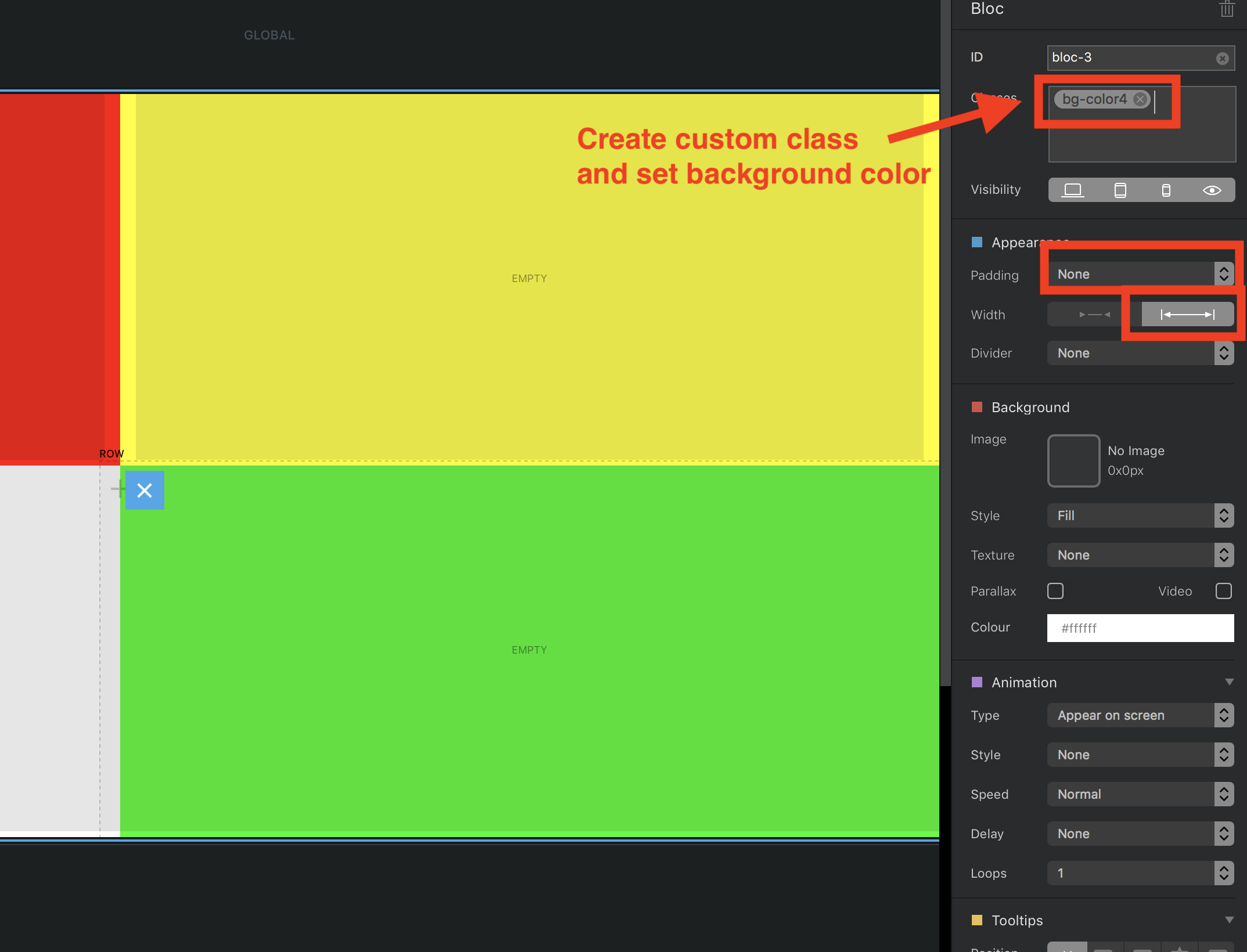
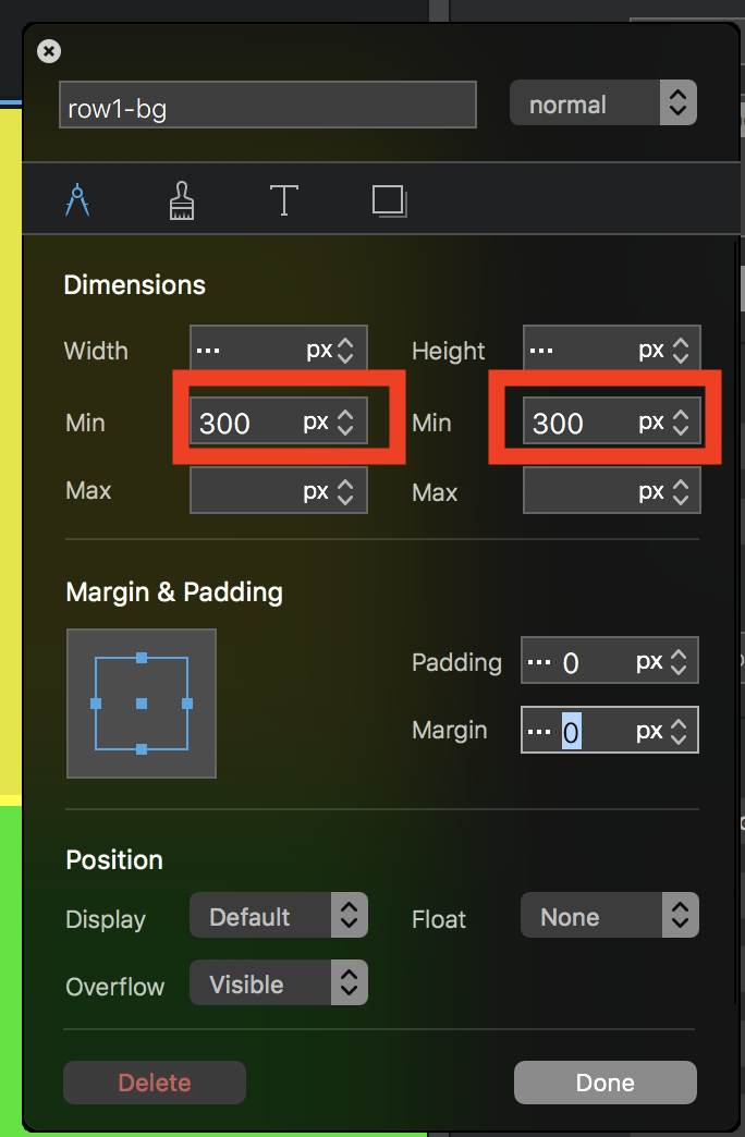
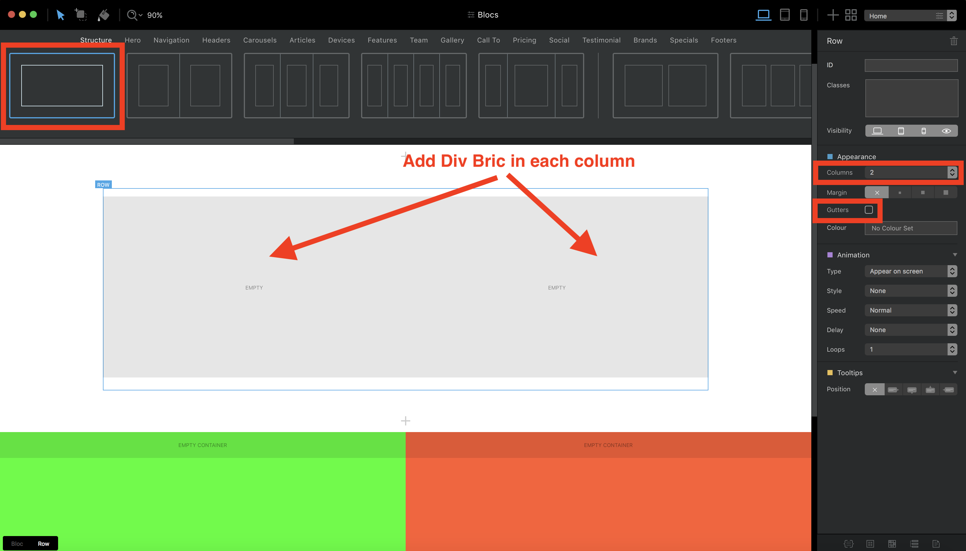
Hello, you can use 2 two colum brics and set then there the background with each time a custom class. If you don’t put any content inside you have also to define a minimum width and heigh.
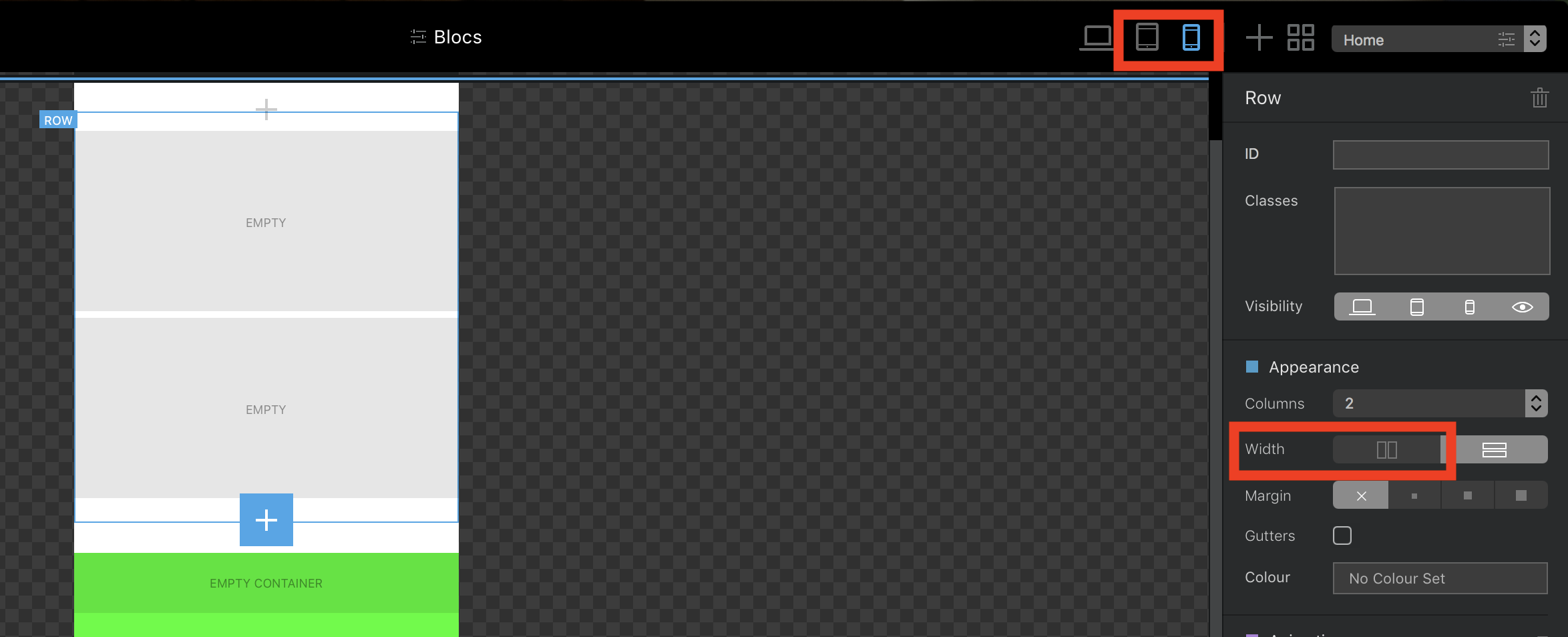
When selecting the tablet or phone mode on top right you have in the right column of the blocsapp an option to say it the column should be side by side or each under the other.