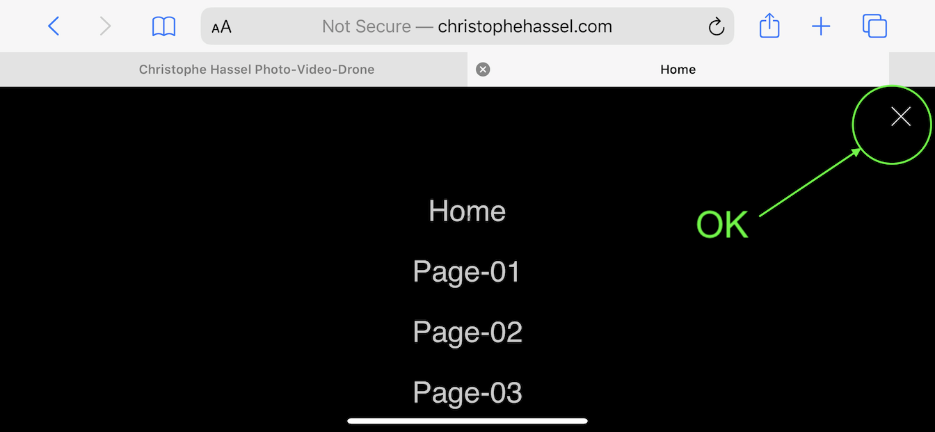
On my iPhone 8+, in portrait mode I initially see the hero image. When I scroll down, I get a sticky translucent hamburger menu at top of the screen. Clicking the hamburger gives me the full menu and I’m able to exit using X button.
In landscape mode and from the Hero image, when I scroll down I do see the hamburger menu right below the Hero, but it’s not sticky and it scrolls out of view if I scroll further down. When the hamburger is in view, if I click it does show the full menu and the X does work.
Something seems messed up with your navigation in portrait vs landscape views. Maybe try rebuilding the navigation and see if works OK after that?
Thank you for your feedback. I wanted to have the sticky translucent hamburger menu in portrait mode, but not in landscape mode, this is not a bug (2 diff menus, one showing in portrait, one in landscape).
I think the issue is only happening on really wide mobile screens. The iPhone 8+ is the same size as the 11 pro max, I think, but the screen is a bit bigger…?
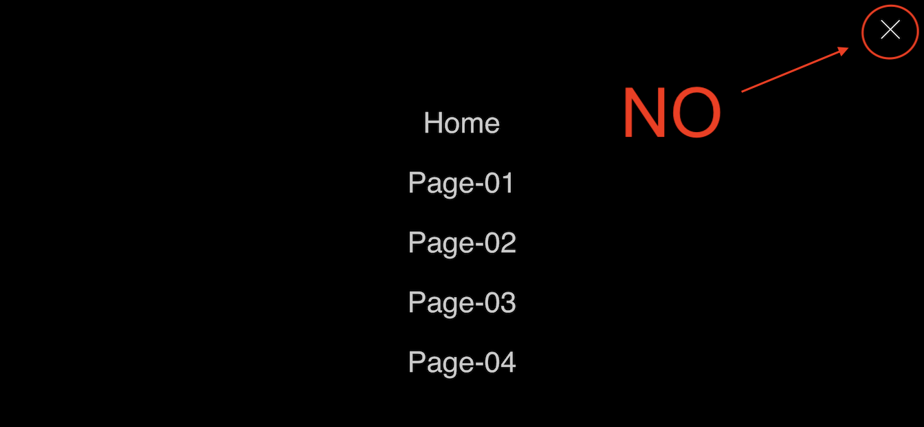
I have tried on a brand new project from scratch and the Close X button doesn’t work in landscape mode with a Hamburger Full Screen Menu.
Totally fine in Portrait mode tho.
Does anyone else have a iPhone 11 Pro Max, or any other mobile phone about the same size ?
I was able to verify that the anomaly you mentioned also occurs sometimes on iPhone10 (my wife’s). Sometimes the close button worked in landscape view, but most of the time it did not. I couldn’t determine a pattern to the anomaly. I have no good suggestions on how to fix. I noticed you had Lazy Load enabled, so maybe try disabling that and see what happens. I’ve had some weird anomalies using Lazy Load. You could also try enabling/disabling Cache Bust in project prefs to see if that makes any difference.
Btw, below may be the post that @PeteSharp was referring to, but I’m not sure that’s your problem.
Hi @PeteSharp, I did find the post with the code you suggested, I have tried a few days ago but it doesn’t do anything on my phone.
I also had a look on this website medium.com
As @pruthe said, I’m not sure if this is the same problem, I don’t understand why it does that… I’ve tried both ways in landscape mode and it’s still the same…
Also, the close button works when the tool bar is on, but doesn’t work without…
For what it’s worth, I tried the same tests of your web page in landscape mode with Firefox and MS Edge on my wife’s iPhone 10 and the close button worked fine. So maybe it’s a Safari issue?
Thank you for trying @pruthe, Ive also tried with Firefox, MS Edge and Brave. They all work, but they also all have the tool bar on top on the screen. Safari works with the tool bar but not without for some reason…
Mystery…
Think this might explain as its classed as the safe area, would be nice to have the option in landscape for viewport auto instead of cover Designing Websites for iPhone X | WebKit
Thank you @steviemc but I’ve tried already and it doesn’t work unfortunately. I don’t think this is the issue as the close button works when the toolbar is on. (still in the safe area)
I also ran into this problem. One way to get around the problem is to set up Nav Toggle to use Sidebar Menu style and then in Easy Burger bric, set Close Icon Style size to 0. This hides the close icon and requires the user to click outside of sidebar menu area to close the menu. Not the ideal solution, but works for me.
Yeah, I did this on another project, by hiding the close icon on full screen prompting the user to click something on the menu…but rather have the X close icon actually working!
@Norm is this a bug at all? seems to happen all the time and looking back on the group, it seems to be something which is quite common.
Norm, I have reported this as a bug too last night.
I have made 2 small sites in the last few days and both still have the problems that the menu on mobile and even tablet at times will not close when using full screen on close.
The hamburger opens it, but the X in the top right hand corner does not close - keeps flashing back to the menu when clicking.
I understand this is an issue as many people are telling me they have had this for a while - I want to see what you guys are doing to get around it as i have tried everything and I have 2 clients I am telling them there is a fix coming…I hope !!!
I am sure there is a simple work around?
I am just finishing another website this week and on testing its doing it again…Any help will be much appreciated.
As I understand it, it’s because both buttons are on top of each other. You can move one of them, or have one hide and fade back in after the menu closes maybe. Lots of things you can probably do.
That last one is a tick box in my offCanvas bric delayed due to time to focus on it. But it’s not far off I have to make some videos.

 ……if so - a rough idea on launch time??? Cheers!
 delayed due to time to focus on it. But it’s not far off I have to make some videos.