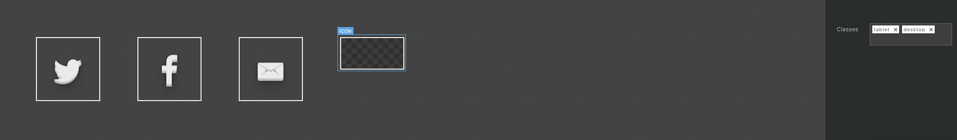
I’m trying to make a simple site, I’ve read the docs about custom classes and I have absolutely no idea on how they work still. I added 2 custom classes to one image and when I add even 1 custom class the image disappears as shown in image above?
The contact icons are perfect for desktop view, but take up the whole screen on mobile, I thought with a custom class I could adjust the images of them and then set the custom class to the tablet/desktop/mobile view.
How do I resize images/buttons or move them around?? I got told this was easy but I’m completely baffled and come from a programming background!
@Brocky120 custom classes are really simple once you have messed with them abit, they are basically layer styles if you come from a graphic design background. You move objects around using margin and padding values. The image may be hiding if you have set the image size to 0 in the class size or display none set.
On a side note, some good video tutorials on custom classes are almost ready, so more info is on route.
I’ve played about for 8 hours today. Just dont seem to get the hang of it. I’m not sure how I select a different layer for desktop/tablet, how do you know which is being used?
Just switch the canvas view using the view controls. The desktop, tablet and mobile controls in the sidebar are used for visibility, the ones you need to control the actual canvas view are located in the main black bar at the top of the window to the right, switching these then editing the class gives you the different results per breakpoint.
I did do that Norm but if I made a Class on an icon in Tablet view called Tablet. The inage would disappear like in the inage in the first post. Do I have to use the padding/margin to being it back? I’ll have another play later
Is there a way to change the parameters for Tablet and Phone? (When the browser decides which to use due to size) My phone seems to follow the Tablet size maybe due to its resolution?!
Getting to know this program in a short time! Like it alot…
The best insight you’re going to find. I’ve learned so much from Eldar from basic stuff to advance. His new tutorial on Mobilization is Awesome! https://eldargezalov.com/blocsmaster/
I am having what i think is the same problem. When I shift to tablet or phone mode and do anything to the layout, to include deleting tthe custom class for full size and adding a custom class to resize for tablet or phone, the changes are also made on the full size page. Very, very frustrating. I thought when we clicked on the tablet or phone view, the changes we make there only apply there. That does not seem to be the case. What am I doing wrong?
 I assume the narrator is you.