
I read that you can adjust a custom class in each breakpoint but I assumed that a custom class is applied once - the reason for a custom class.
I am running 3.0.7 / 10.14.1 OSX
What am I missing?
Thanks in advance.
Rich
I read that you can adjust a custom class in each breakpoint but I assumed that a custom class is applied once - the reason for a custom class.
I am running 3.0.7 / 10.14.1 OSX
What am I missing?
Thanks in advance.
Rich
Hi @etdronehome / Rich
If you create a class with settings in the LG (widest) breakpoint it will keep that all the way down to the XS breakpoint.
But not the other way around.
It will keep settings down from the BP you start from and downwards.
I hope it made some sence 
Cheers / Johny
Thanks Jackerlund
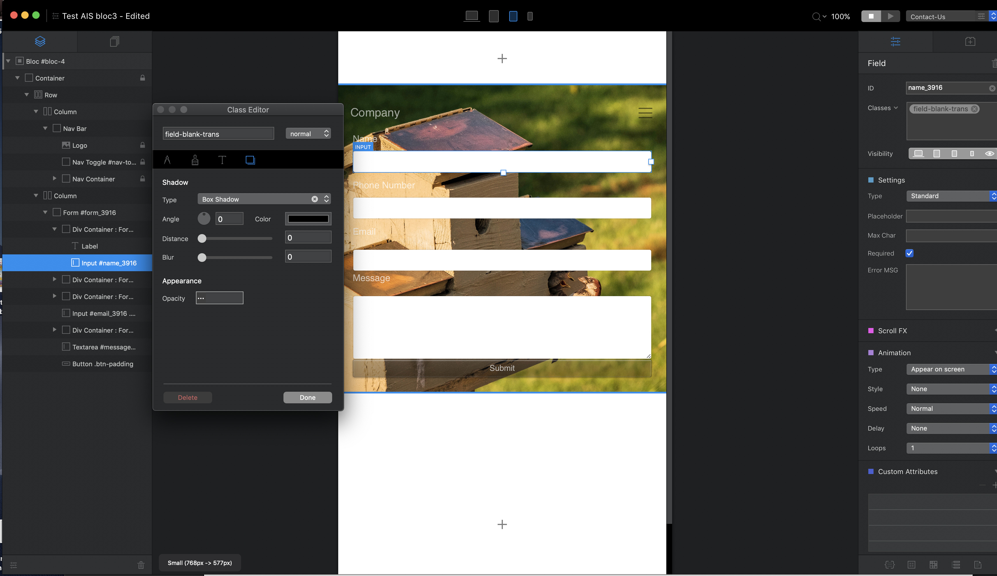
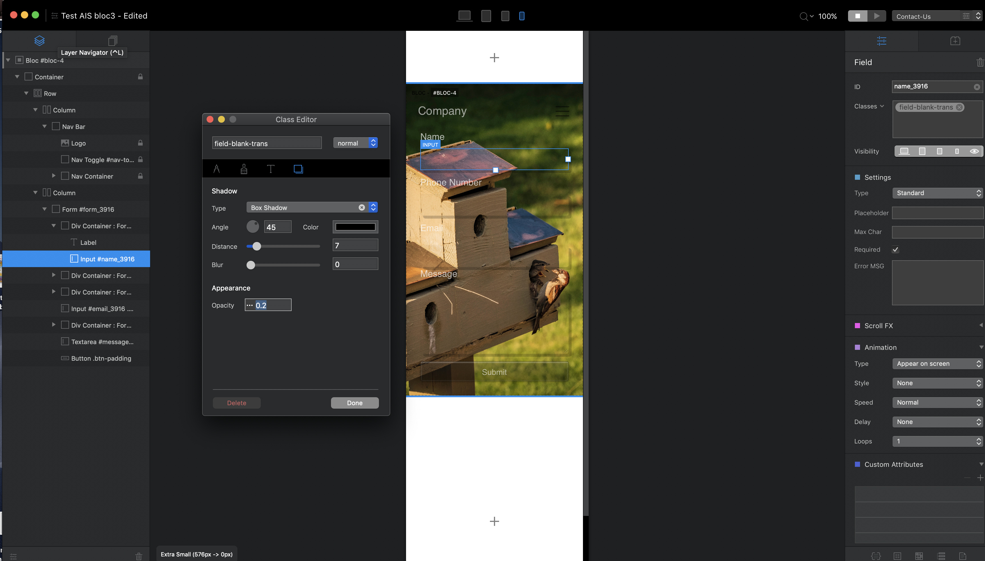
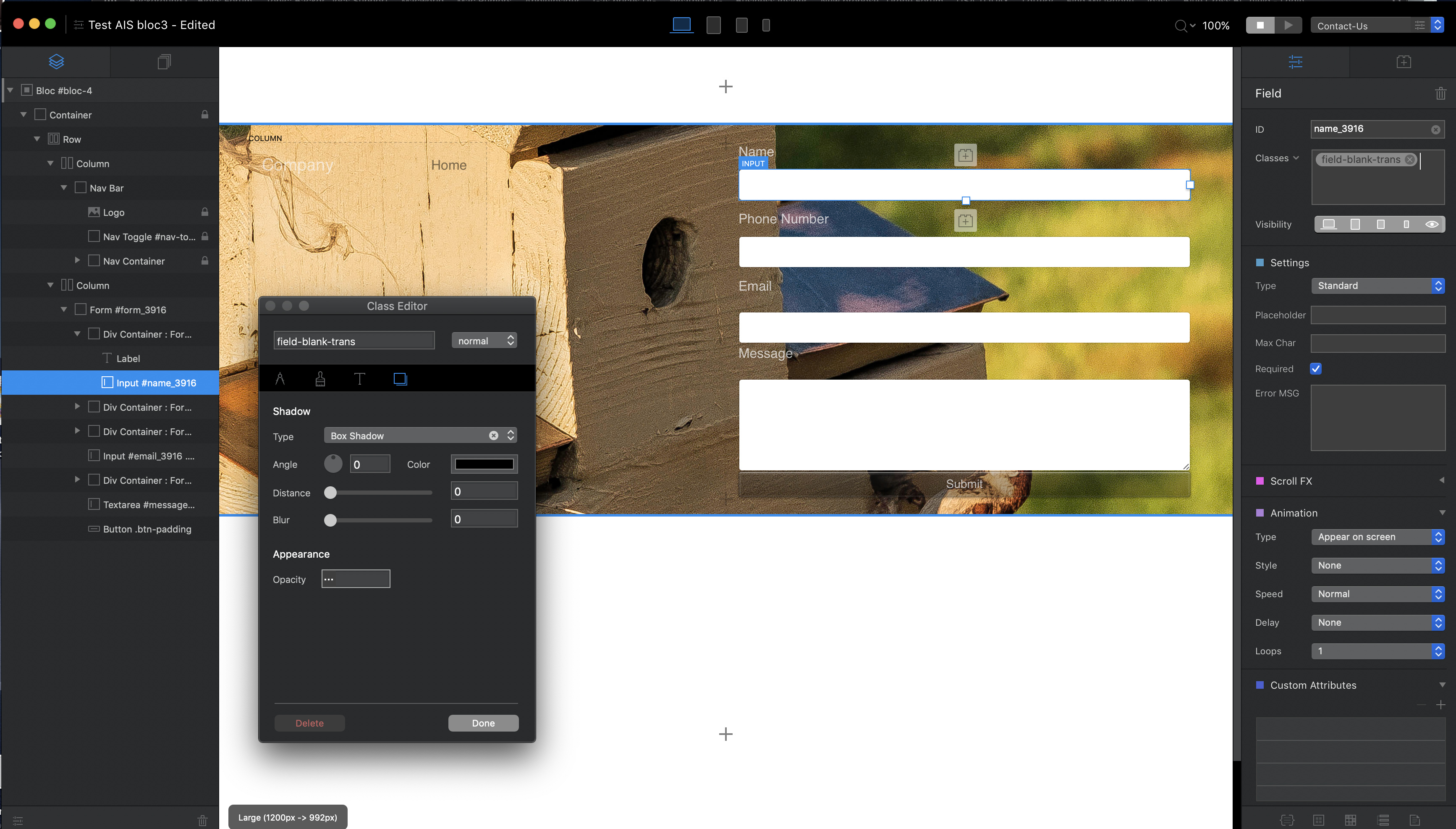
So a custom breakpoint made at the largest breakpoint remains in effect until it encounters the “same class” modified at a smaller breakpoint?
So much for “mobile first design”
Rich
I think the point is that you are supposed to start with the mobile first while designing.
Hi Rich,
I agree that at the moment it is not always consistent with ‘mobile first’ approach. Some things like padding, margins, offset, etc are always mobile first, but when it comes to complex editing in custom classes, I would still recommend starting with a desktop view.
I design everything in desktop view, and when I have to alight something for all breakpoints, I just switch to XS and align that.
Cheers,
Eldar
Before using Blocs I worked with Foundation, which encourages you to take a mobile first approach by always placing mobile options at the front. These are obligatory and automatically inherited at larger sizes unless specifically changed. Should Blocs take the same approach? The order in Blocs is back to front from a graphical perspective.
Flashman
I appreciate your comments. What do you mean - Blocs is back to front from a graphical perspective?
Rich
Simply that when you open Blocs you are presented with the desktop view first from left to right. This then continues in project settings and it seems to be set up in a way that encourages you to work on desktop settings first, whereas Foundation puts mobile first and makes that compulsory. Everything that follows is optional. It’s more comfortable working in desktop mode, but goes against the mobile first approach.
I would sat that Foundation and Bootstrap both adhere to the principle of mobile first but this is not always obvious or translated to apps that create web sites or how users use it.
Most people design at the desktop level allowing for smaller screens in the process, and then adjust for smaller screens which is more or a Desktop first but adjust for mobile afterwards approach.
Where the mobile first is pretty well defined is that what you set something for small mobile (XS), this sexting gets used for all screens bigger than XS, unless this is changed.
So if you set something for XS and then different behaviour for MD, XS and SM will use the XS settings, and MD and LG will use the MD settings.
Therefore I would say that if what Jakerlund is correct, this is the opposite behaviour and not consistent with the rest of Blocs. Maybe @norm could explain a bit more as this needs to be understood fully.
I would say designing from mobile to desktop is the way to go.
Google now uses the mobile version on most sites to rank and at least 50% of visitors are using their mobile device to view a page.
Interesting discussion. I’ve always been more comfortable starting with the desktop version, then tablet and then mobile.
I think the main reason I work like this is that my mobile content is almost always a subset of the desktop and it feels easier to edit content down than expand it.
Of course, none of this matters much if you use a design program to mockup a site (and it’s variants) before using blocsapp. Blocsapp is so easy to use that I suspect many people here don’t use a design program to mockup the site first. I completely get that.
I suspect I’m not alone in the desktop-first feeling, but that goes against the prevailing wind so not so many people speak up.