I have been trying for several days to achieve setting a background image, either as a bg-image proper or using an image bric within a bloc, with text that appears on top of the image which should scale the full viewport width. It is really quite ridiculous to me that I cannot achieve this without, for some unknown reason, having the image scale so that it is too large to fit the bloc and the sides and or bottom are cut off if a bg-image, or it is impossible to get text onto an image bric, although in that case I am able to show the full image without it being cropped.
Why no choice of “contain” on the bg-image style selector??? I’ve tried a hundred and one workarounds to no avail. Very frustrating.
Very basically, yes. I have done it in one of my blocs, but since it is in the middle of the page and with a parallax effect, I don’t need or care to see the whole image on the screen at one time (top and bottom are in some states cropped off). But to achieve both seeing the full image, while scaling the entire width of the browser and also not cropping some of the bottom or top is very difficult, if, that is, I also hope to have the image scale. Otherwise a min-height would do the trick I guess.
So, the example you link to would perhaps do what I need, but I don’t have access to style like that with CSS in blocs . . . or do I? Which was my next question.
Am I looking at custom classes for different screen sizes as my only option here???
Sorry, a little hard for me to follow. You do not want the image to crop, but to be full width of the display area. (the height will vary because websites need to be dynamic for different screen sizes).???
Yes you can copy that example. By adding the class to the text. Call it what ever you like. And then manually adding the CSS by…
Page - > Settings → Add Code, with the drop down menu changed it to Header then copy and paste and edit the CSS you want within tags, eg.
Well, thank you very much for attempting to follow anyway. It looks like you do get what I’m saying. I basically understand, I think, the reason for what is happening, and feel like a little custom CSS can work it out. I’m just getting started with Blocs however and wanted to attempt to do things the “bloc way”. I could painstakingly code things by hand if I had the time, but it’s worth it to me to use a tool like Blocs which should save me a lot of it.
Thank you for the tip on adding CSS. I’ll give it a go and see if I can achieve what I’m looking for.
Yes, Blocs is excellent, but at the time, some CSS properties are not currently in the menu system, which is why to create something more custom you need to add the CSS yourself. Blocs is very flexible that way.
This can be a real challenge (depending on the image), even when coding by hand as browsers can appear at random sizes so the image positioning can still be problematic as not everyone is going to run a browser full screen or however you have yours set by default.
Another solution is to style the text a little give it a shadow that surrounds it but is subtle. It can also help to keep the text popping on top of images.
You can also use the Bloc sidebar texture (darken) option to help the text pop on top of an image.
Trying to explain responsive behavior is hard, but the thing most people miss is that in responsive designs using full screen backgrounds, we are not concerned about the entire image being shown at all times. As a designer we want the subject matter to be visible at all times, but we accept some cropping. it’s a concept that is not new in responsive design. You simply can’t have a background image cover the entire viewport for all screen shapes without some “overflow:hidden” style cropping.
But through clever image composition you can ensure that you subject matter looks good across various screen sizes.
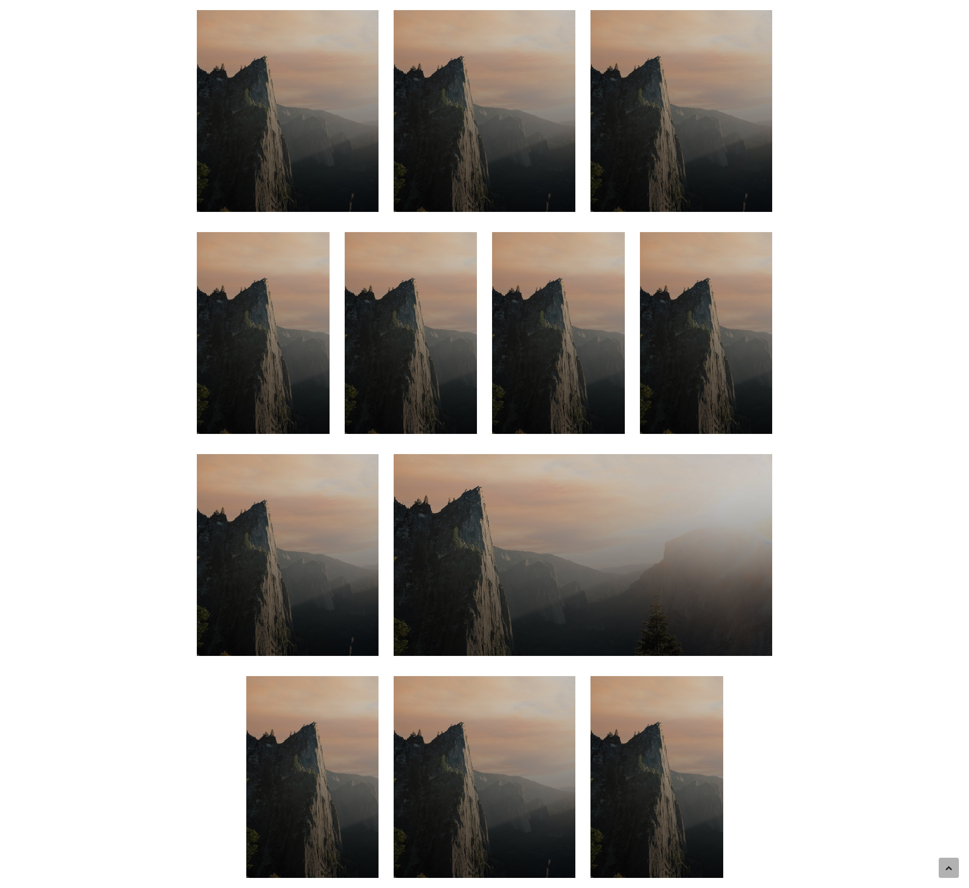
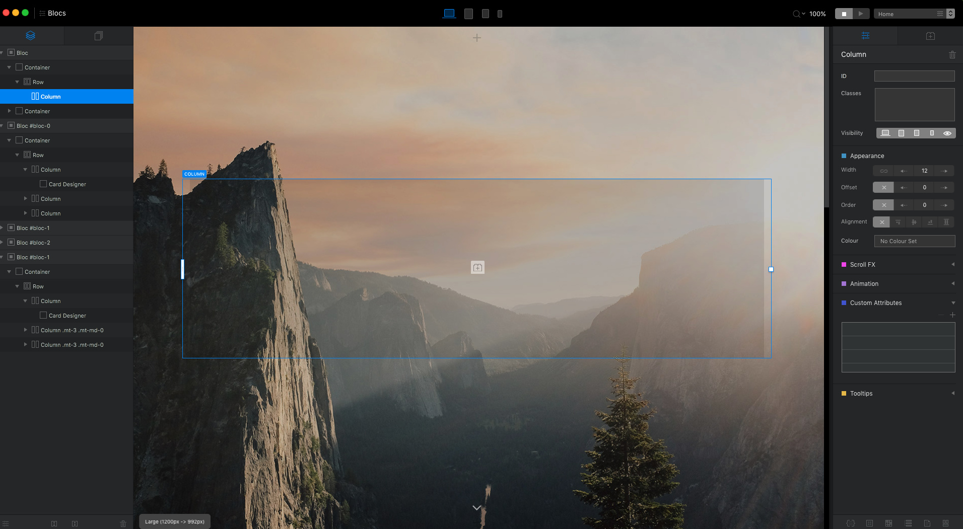
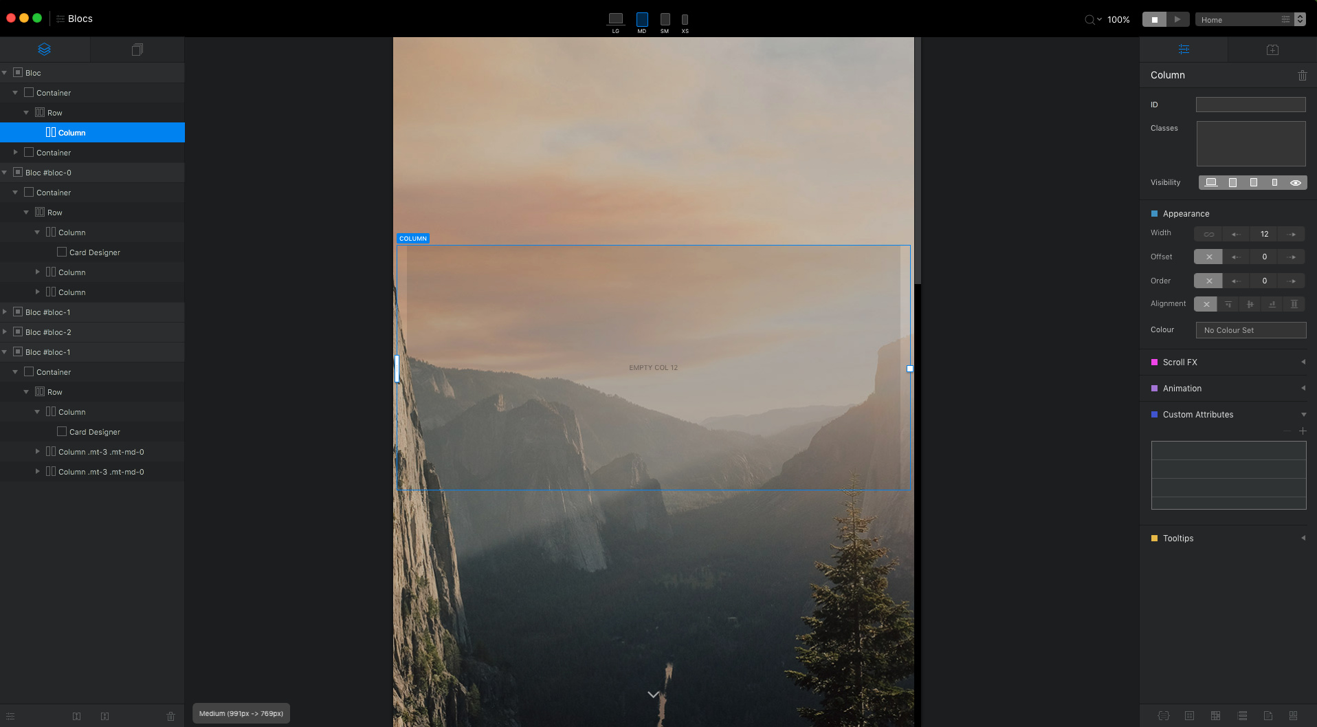
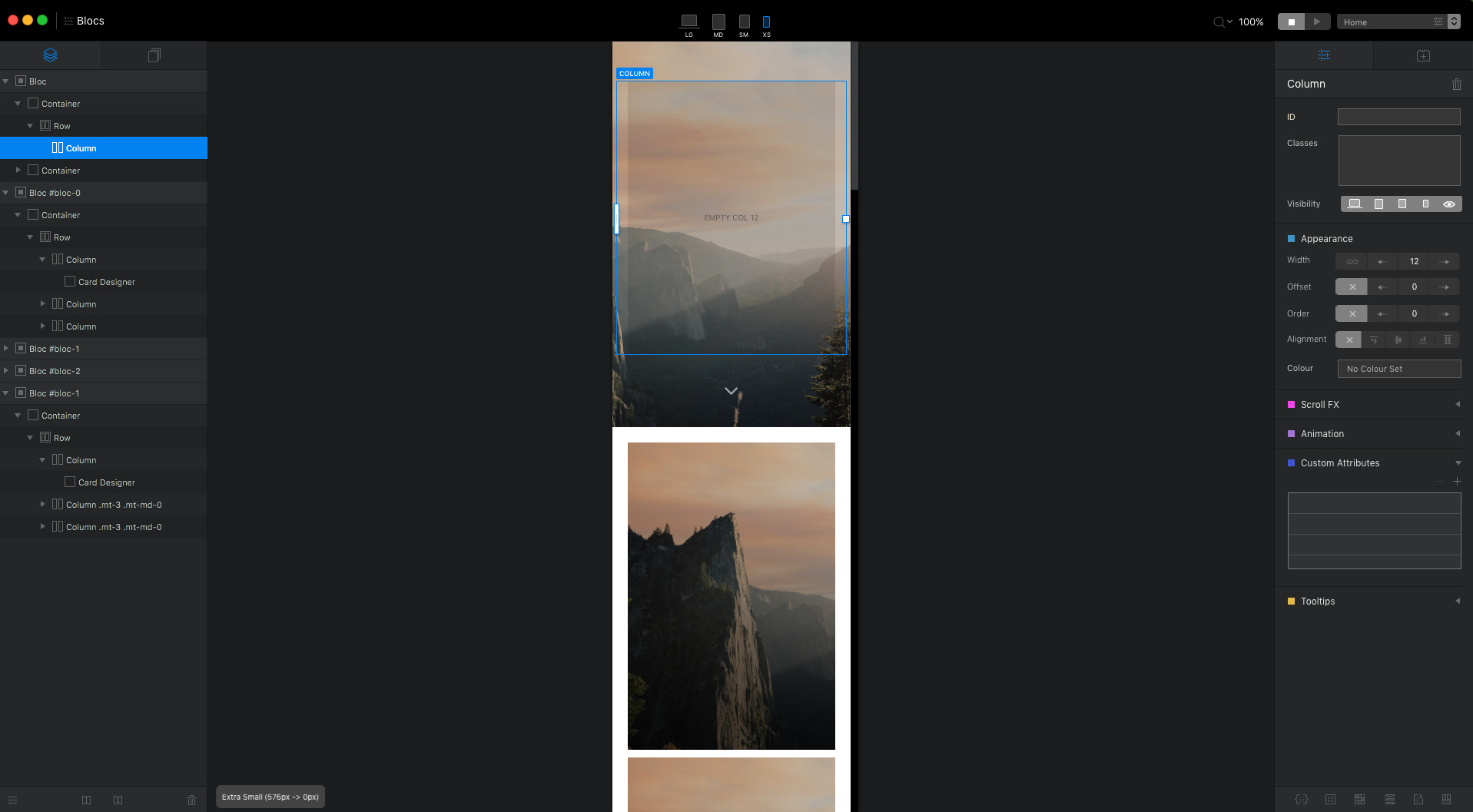
Here’s an example:
Card Designer uses this same technique and helps show the concept quite well. Imagine these are all different screen sizes. Notice the composition of the cards allows them to be meaningful at different sizes.
One nice thing about Card Designer is that you get some control over the image composition inside Blocs. Using this technique for a full screen background requires you to use an image editor as needed to adjust the composition of your image.
Notice that the hero in Blocs using the technique will loose focus on the mountain top at certain screen widths because the mountain is so far to the left (image composition). Card Designer lets you justify the background to compensate for this. The result is a background image that let’s but keep the mountain top in view. So picking the right image with the right composition is important.
Great explanation @Whittfield and you are right. A lot of people struggle to get their head around responsive, explaining it can sometimes be even harder lol.
My understanding is they wanted an image to full the width of the viewport, not necessary the height. So keeping the images dimensions. I personally cant see why you would do this, with few exceptions. For example a card-image.
I’ve actually seen that quite a bit where the hero really isn’t the entire viewport. It’s just a 400px - 500px or so height with full width image. Full-width backgrounds for those can be harder to compose for multiple screen sizes because of their shape.
@Whittfield thanks for taking the time to put an example together. It’s a hard concept to understand with all the variables. You can use different images at different breakpoints to help but really picking the right image to start with is really the key.
I’ve spent a lot of time myself trying to find the best image for a hero type background. Sometimes I just configure the padding and not have the image as a hero type on mobile.