Hello everybody,
I created this site with Blocs as a digital menu for my restaurant.
Any Tip to improve it?
Thank you all and @Norm for blocs.
Hello everybody,
I created this site with Blocs as a digital menu for my restaurant.
Any Tip to improve it?
Thank you all and @Norm for blocs.
Hi @cristian. Well done and blessed I’m not the only one around here who’s in the hospitality business. 
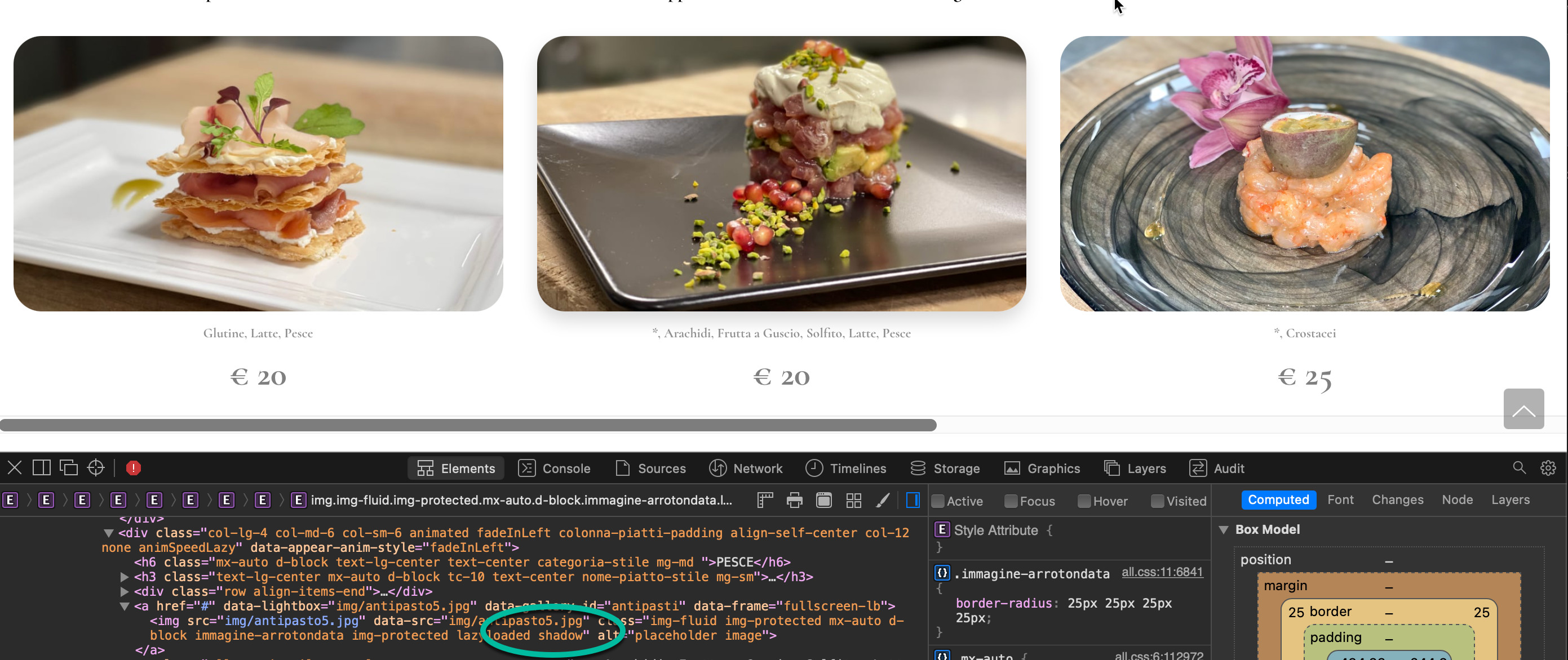
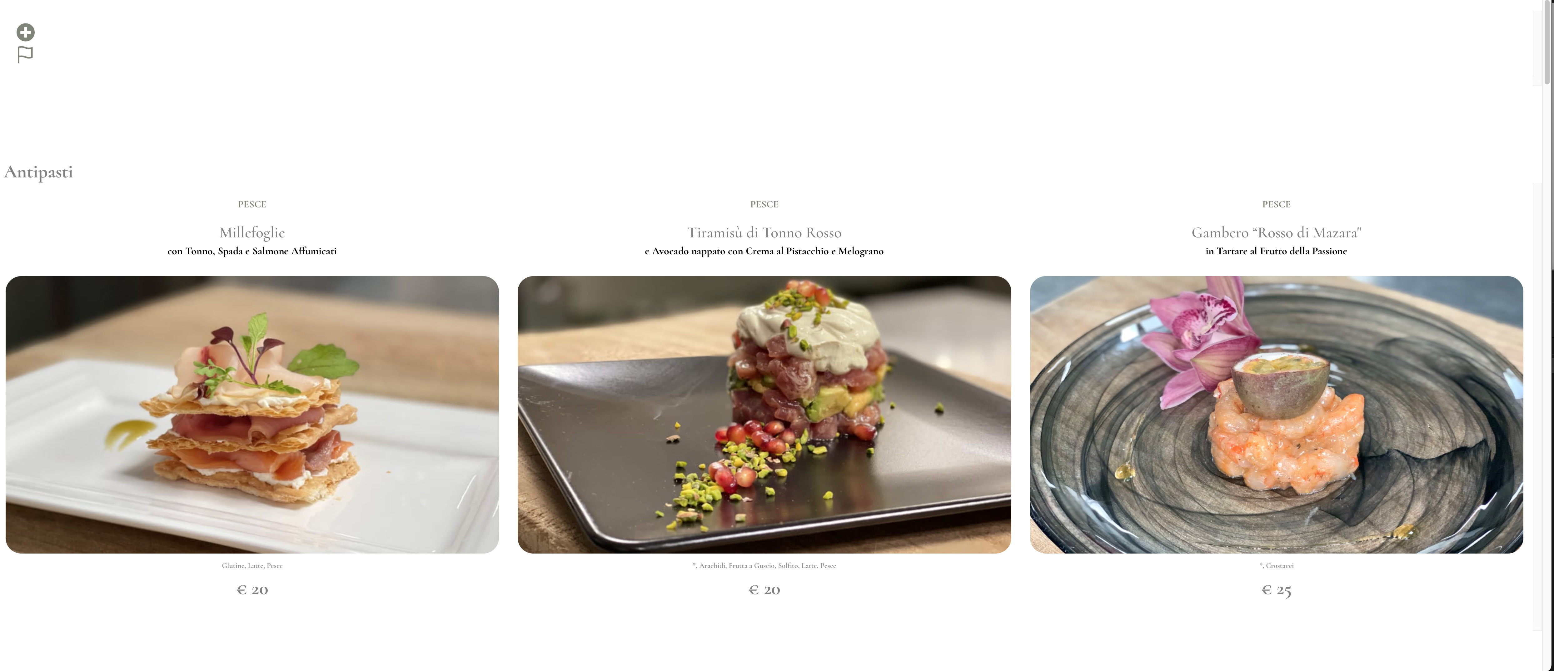
My 2 cents would be: 1. make the header mobile responsive and, 2. Add the class .shadow to your images so they will pop out a bit. As you can see I added the .shadow class to the image in the middle.
Hi,
Nicely clean, a good simple layout,
First thoughts:

Thanks for the advice Gerry, I’ll put it to good use
Hi @TrevReav the site is designed for use on smartphones and tablets, you have to use the trackpad with the PC
Thank you
hi @Bloccali
The font is the one officlae and the same as I use for other sites and marketing.
Thanks for the advice.
So just looking at it on my phone, I’m still only getting maybe ½ second flash of a full screen logo, then it disappears.
It just looks like something is broken to me, and the fact you had to explain it to me could possibly mean it’s not as user friendly as you’d expect (or I’m stupid, which is quite likely).
It’s a very good looking site though once you get past the initial obstacles.
Hi @cristian
Well done on your efforts and great to see different styles and also different uses for web building.
Everyone will have a different view and here are mine, and more people on here with lots more knowledge and experience can offer more/better advice.
Here is my advice, not as a website developer - but as a customer reading the menu.
As @TrevReav has said their seems to be no logo? it flashes on really quick and then disappears. I strongly believe a logo should be on - even if central at the top. You need some form of identification, even thought its a subdomain. Saying its been designed for tablet and mobile - is good, but should be for all devices, your customers might want to have a look before they come out?
As @Jerry has said too make the header responsive.
The images are really really good - and I feel the text above it and below it is letting them down. If I was a customer I would like see it feel as if they all feel as one unit. The smaller text under the image seems too small and lost.
The navigation menu feels hard to follow and does not show clearly how it works - the general user will be confused. I think maybe something like a mega menu would work a lot smarter?
Sliding the food left and right is not very obvious, as web people - we naturally slide things and find things ! but for the average user - this is not obvious.
Good luck though - and great idea to have this as a subdomain - nice work.