let me know what you think. I really struggle with large screens and mobile screen.
the standard viewport of blocs works perfectly but not on 27 inch screens
any tips would be appreciated.
It seems to work OK here on my 32" display. I only looked quickly, but I noticed the instagram section is not centred.
1 Like
Seems to view OK on my 40 inch screen, although text area “Wo - vr - zo
9 - 16 uur” seems to move around a bit when I resize the screen.
Good job!
Super!! Mooi gemaakt!!
1 Like
Nice website, but you must optimize the images, the load time is too long… 
I really like the design of your site, great work!
Pardon my asking, but why are you concerned with how it looks on a 27 inch screen? Also, it’s not a question of the physical size of the monitor screen, but rather the resolution.
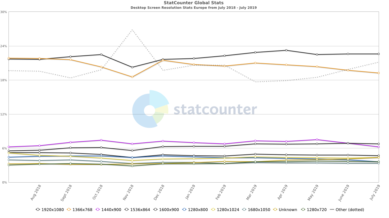
According to Statcounter, last year in Europe 1920x1080 accounted for 22%, 1366x768 accounted for 19%.
A resolution like something for a 27" iMac is ca. 2560x1440. This isn’t even listed in the statistics.
1 Like
thank you!!
the thing is I do my designs on 2x 27" and 2x 24". when I switch between the computers it looks very different tricking me into changing the class values.
with this website specifically where there is no white background it everything seems off on the different screens.