I am using flex box to display some news on my website.
On desktop it work properly but on mobile the text next to the the image does not go underneath the image. Instead, it stays on the right.
How can I have the picture on top and the text underneath it on mobile?
Here are my settings and layout on desktop and what happen on mobile
Desktop Layout

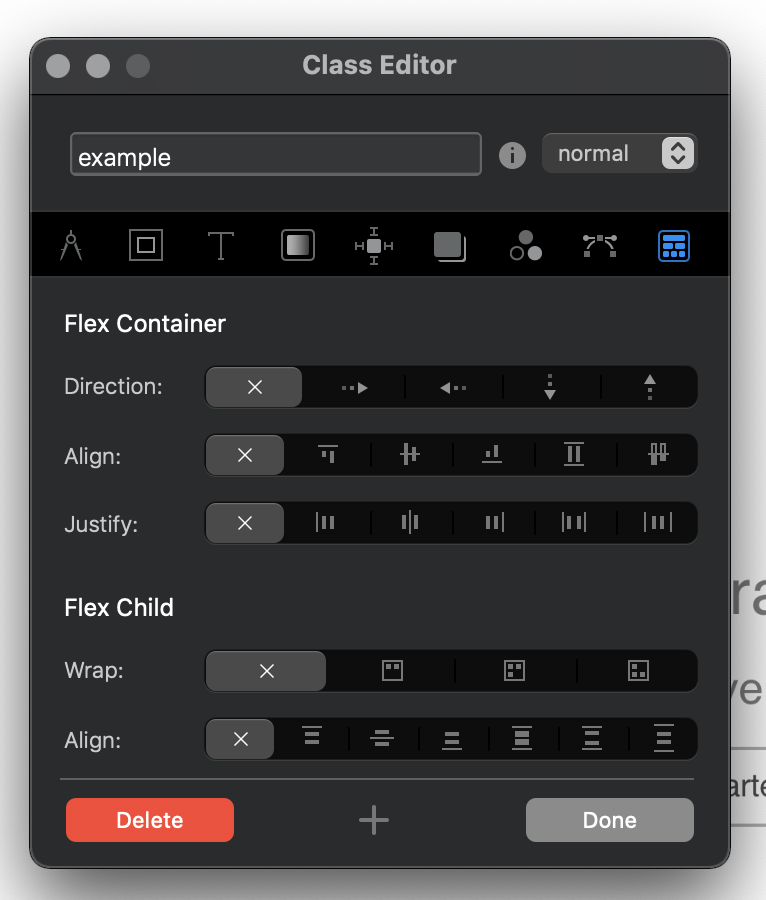
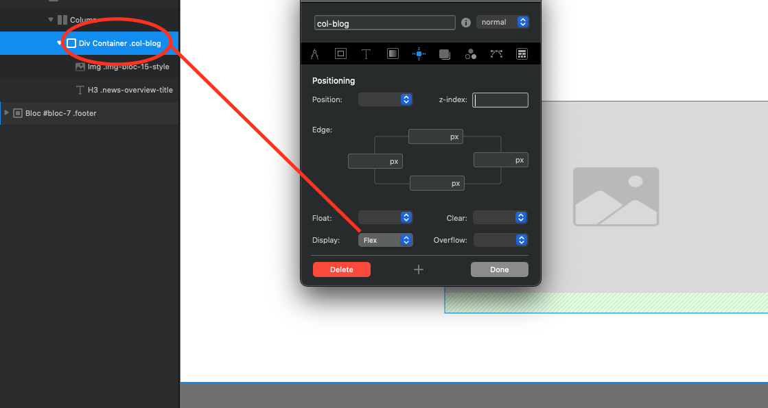
Settings
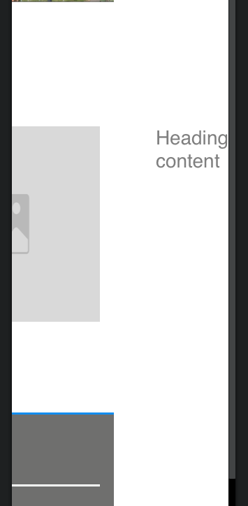
Mobile (issue)
Many thanks in advance