Getting a lot of cool stuff working now, Blocs Plus 4 is a nice upgrade from my previous Blocs 2, thanks @Norm! ![]()
![]()
Trying to figure out why I get this padding/margin left and right for LG and MD, for this global header, being one row, column with 3 divs as flex.
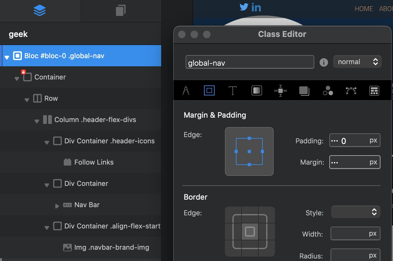
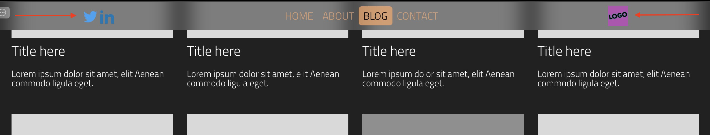
In LG and MD it has this margins:
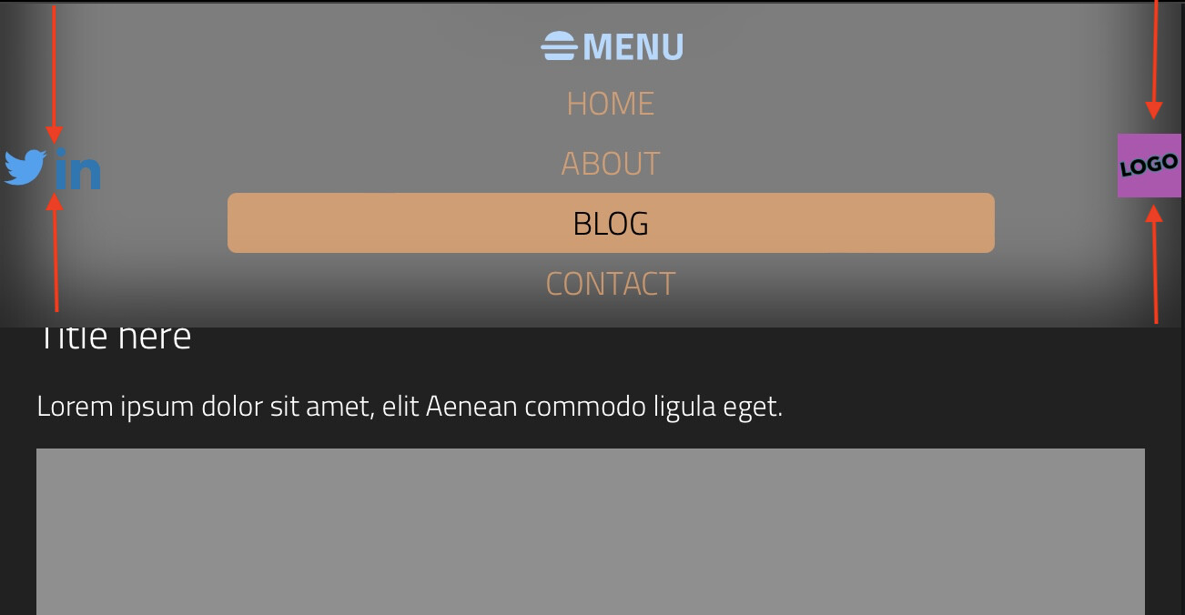
In SM and XS it doesn’t have those margins/that padding, but I have another issue, trying to figure out how to make the social icons and logo stick top-aligned/with the first line of the header. I tried all kinds of stuff to make start at the top/beginning, no luck:
Looks like the margins/padding for the divs are that the flex containers doesn’t expand, but just center in their part of the column/row:
I’m very thankful if anyone has suggestions here. ![]()
Let me know if I should share more details, tried including the most relevant stuff and not too much. Full preview is found at http://127.0.0.1… ![]()
CSS and all these possibilities are awesome, but also able to make my tired head explode ![]() … I think.
… I think. ![]()
Maybe the inspector tells you something I’m not seeing, or that I should share here(?):