Thanks to Pete, (aka. @PeteSharp) using CSS only this expansion transition looks great!
Is anyone willing to help with why the font cannot be adjusted to the breakpoints?
I tried so many options including Media Queries in the CSS and it did nothing.
So grateful for anyone who can chime in.
/* Define the keyframes for the expandFont animation */
    @keyframes expandFont {
      0% {
        font-size: 3rem; /* Start the animation with a font size of 3rem */
      }
      100% {
        font-size: 5rem; /* End the animation with a font size of 5rem */
      }
    }

    /* Style the H1 header */
    h1 {
      color: rgba(165, 15, 15, 1.00); /* Orange font color */
      font-size: 3rem; /* Set the initial font size to 3rem (48px) */
      animation: expandFont 2s cubic-bezier(0.4, 0.0, 0.2, 1) forwards; /* Apply the expandFont animation with a duration of 2 seconds and the custom timing function */
      text-shadow: 2px 2px 5px rgba(0, 0, 255, 1.00); /* Apply a blue text shadow with 50% opacity */
    }
So sorry, I’m not very good at explaining things.
What I noticed is in the predefined breakpoints the font is not adjusting it is staying one large size.
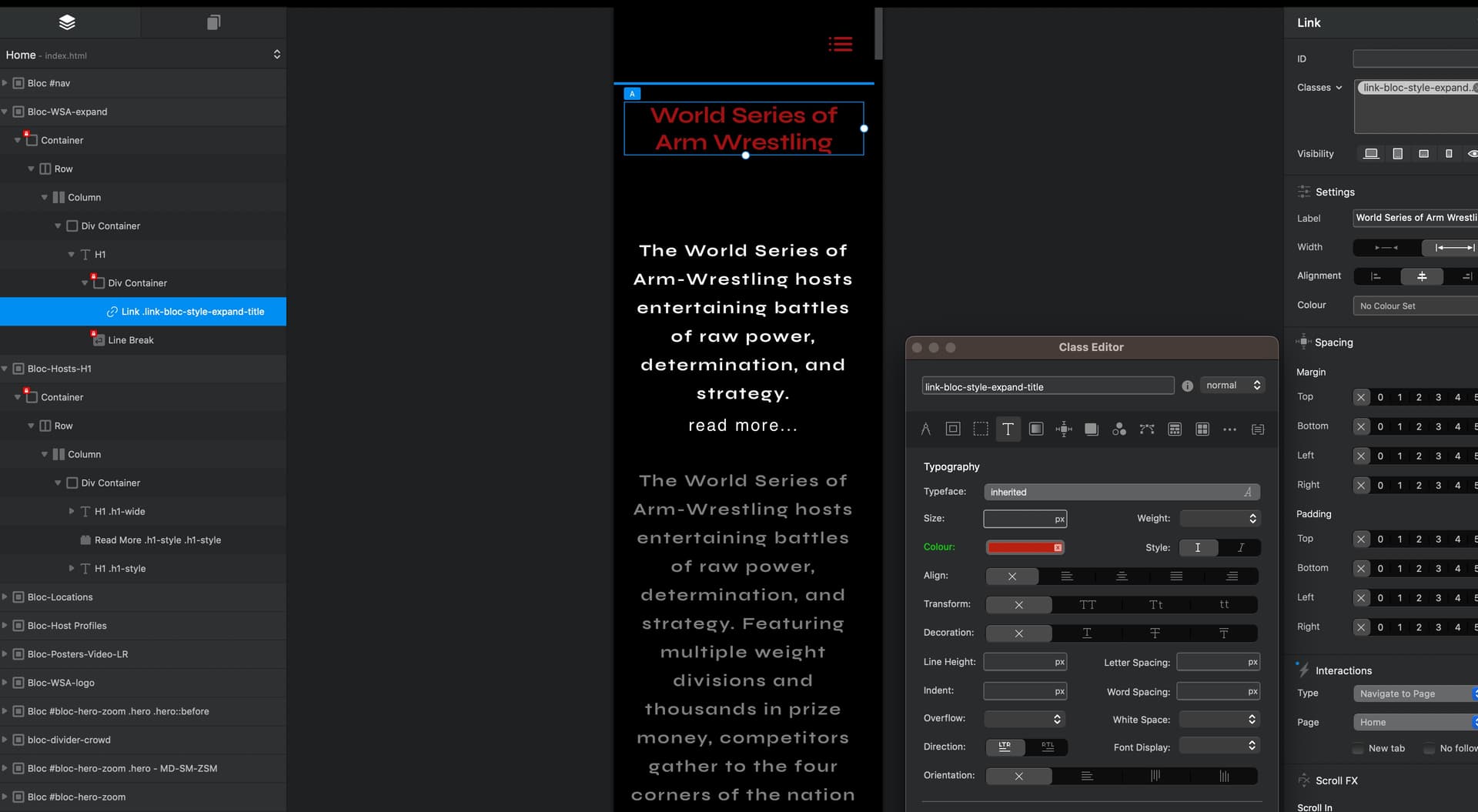
I’m sure the CSS code is overriding any custom class that it put on it. So to be clear I just need the font to be able to adjust per breakpoint in Blocs
I did some research on something I’ve never heard of before. I hope this is what you’re referring to. It look good in CodePen. Now to test it in Blocs… Well ExpandFont and ScaleX did not work.
html section
<!-- html -->
 <div class="my-element">
    <h1>This is a responsive webpage!</h1>
    <!-- Explanation of my-element -->
    <!-- Explanation: This is a container element with the class "my-element" that will hold the content of your webpage. -->
    <!-- End of Hidden Code -->
  </div>
css section
/* styles.css */
body {
  background-color: black; /* Set the background color of the body to black */
  font-family: 'Roboto', sans-serif; /* Set the font family to Roboto */
  font-weight: 400; /* Set the font weight to normal */
  display: flex; /* Use flexbox for the body */
  justify-content: center; /* Horizontally center the content */
  align-items: center; /* Vertically center the content */
  height: 100vw; /* Set the widht of the body to 100% of the viewport height */
  height: 100vh; /* Set the height of the body to 100% of the viewport height */
}

h1 {
  color: rgba(255, 0, 0, 1); /* Set the color of the header to red */
  font-size: 2rem; /* Set the initial font size to 2rem */
  position: relative; /* Enable positioning for the header */
  animation: expandFont 2s ease-in-out forwards; /* Apply the expandFont animation with a duration of 2 seconds */
  transition: text-shadow 0.5s ease-in-out; /* Apply a smooth transition to the text shadow */
}


h1::before {
  content: ''; /* Create an empty pseudo-element */
  position: absolute; /* Position the pseudo-element absolutely */
  top: 0; /* Position the pseudo-element at the top */
  left: 0; /* Position the pseudo-element at the left */
  width: 100%; /* Set the width of the pseudo-element to 100% */
  height: 100%; /* Set the height of the pseudo-element to 100% */
  z-index: -1; /* Place the pseudo-element behind the text */
  transition: text-shadow 0.5s ease-in-out; /* Apply a smooth transition to the text shadow */
}

h1:hover::before {
  text-shadow: 0 0 10px rgba(0, 0, 255, 0.5), 0 0 20px rgba(0, 0, 255, 0.5), 0 0 30px rgba(0, 0, 255, 0.5); /* Set the text shadow with multiple layers */
}

@keyframes expandFont {
  0% {
    font-size: 2rem; /* Set the initial font size of the animation */
    text-shadow: none; /* Set the initial text shadow to none */
  }
  100% {
    font-size: 4rem; /* Set the final font size of the animation */
    text-shadow: 0 0 3px rgba(0, 0, 255, 0.1), 0 0 6px rgba(0, 0, 255, 0.5), 0 0 9px rgba(0, 0, 255, 0.5); /* Set the final text shadow with multiple layers */
      }
}

.my-element h1 {
  transform: scaleX(0.8); /* Initial scaling factor for all breakpoints */
}

@media (min-width: 576px) {
  /* Small breakpoint (576px) */
  .my-element {
    transform: scaleX(0.8); /* Scaling factor for small breakpoint */
  }
}

@media (min-width: 768px) {
  /* Medium breakpoint (768px) */
  .my-element {
    transform: scaleX(1.2); /* Scaling factor for medium breakpoint */
  }
}

@media (min-width: 992px) {
  /* Large breakpoint (992px) */
  .my-element {
    transform: scaleX(1.5); /* Scaling factor for large breakpoint */
  }
}

@media (min-width: 1200px) {
  /* Extra-large breakpoint (1200px) */
  .my-element {
    transform: scaleX(1.8); /* Scaling factor for extra-large breakpoint */
  }
}

@media (min-width: 1400px) {
  /* Custom breakpoint (1400px) */
  .my-element {
    transform: scaleX(2.0); /* Scaling factor for custom breakpoint */
  }
}
