Why is the Hamburger Menu Icon off Center to the Left in the Design Mode as seen in the left image (preview)?
But in the Browser Preview (as seen in the right hand image) it appears as I want. I added a class to get it to center as per Norm.
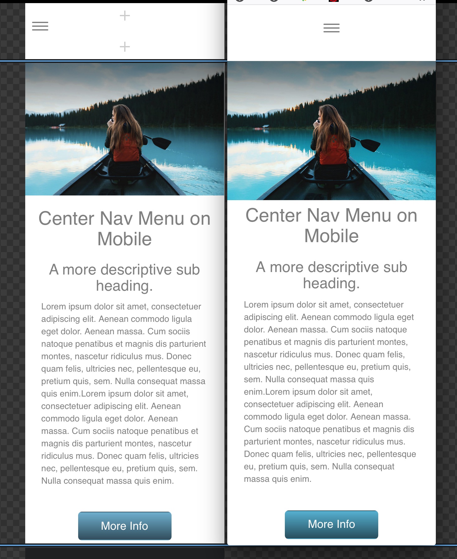
If I had not gone to look at the code in Pinegrow, or similar code editor I would not have been able to find and figure out out to get the link(s) to be centered when the menu drop down opens. There was 15 px of padding on the left that can’t been seen without out going hunting around for it. How can we guess at what’s going on if we can’t see the code? This should be a bit easier for such a normally easy to use app.