hendon52 –
So, I’ve been playing around to gain control of the text/buttons alignments on smaller screens, as indicated in this post, and so I have recreated this same bloc from scratch, but without using the pre-packaged fullscreen bloc.
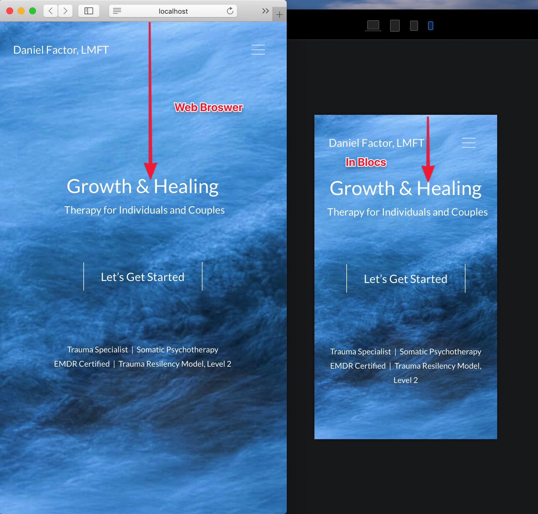
Changing the text size as suggested above for the mobile device isn’t really the issue, as there is no text wrapping occurring.
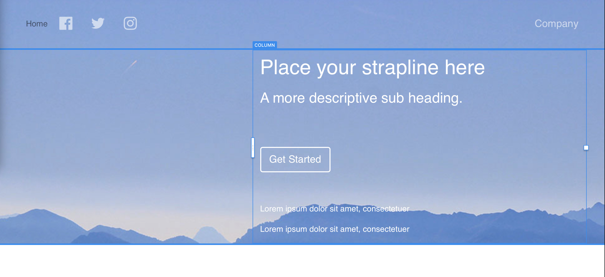
With the recreated bloc, using a basic structure to begin with (not the full screen pre-packaged one) I’ve set it up on the desktop okay, but am running into all kinds of problems on each smaller size screen to make the vertical and horizontal positions for the text/buttons as desired.
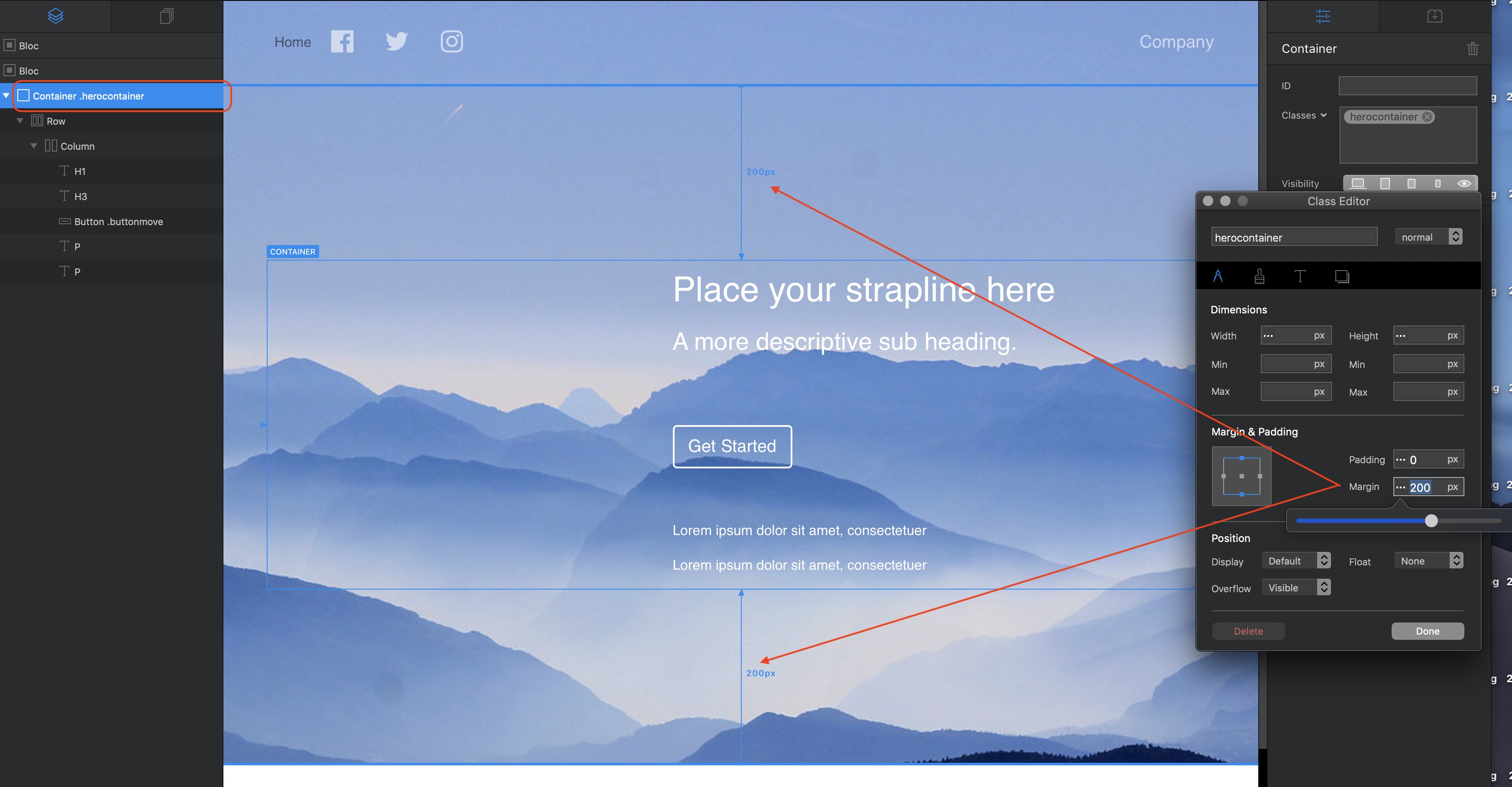
Additionally, I was able to add a row for the navbar above the text/button row, but then needed to use -180 margin to get the nav to the top of the screen, which causes further challenges.
So, here’s (hopefully) a simple question: for the pre-packaged fullscreen bloc, as originally used in my site, how would you override the ‘vertical-centered-alignment’ of the text/buttons so that I can move those elements higher up on mobile device screens?
In other words, override the pre-package ‘vertical centering’ on the smaller devices only.
It appears an !important class is used for the centering screen-alignement on the text/button elements, which a Custom Classe seems to not be able to override.
These are the kinds of challenges pre-packaged blocs creates when you want to adjust them…
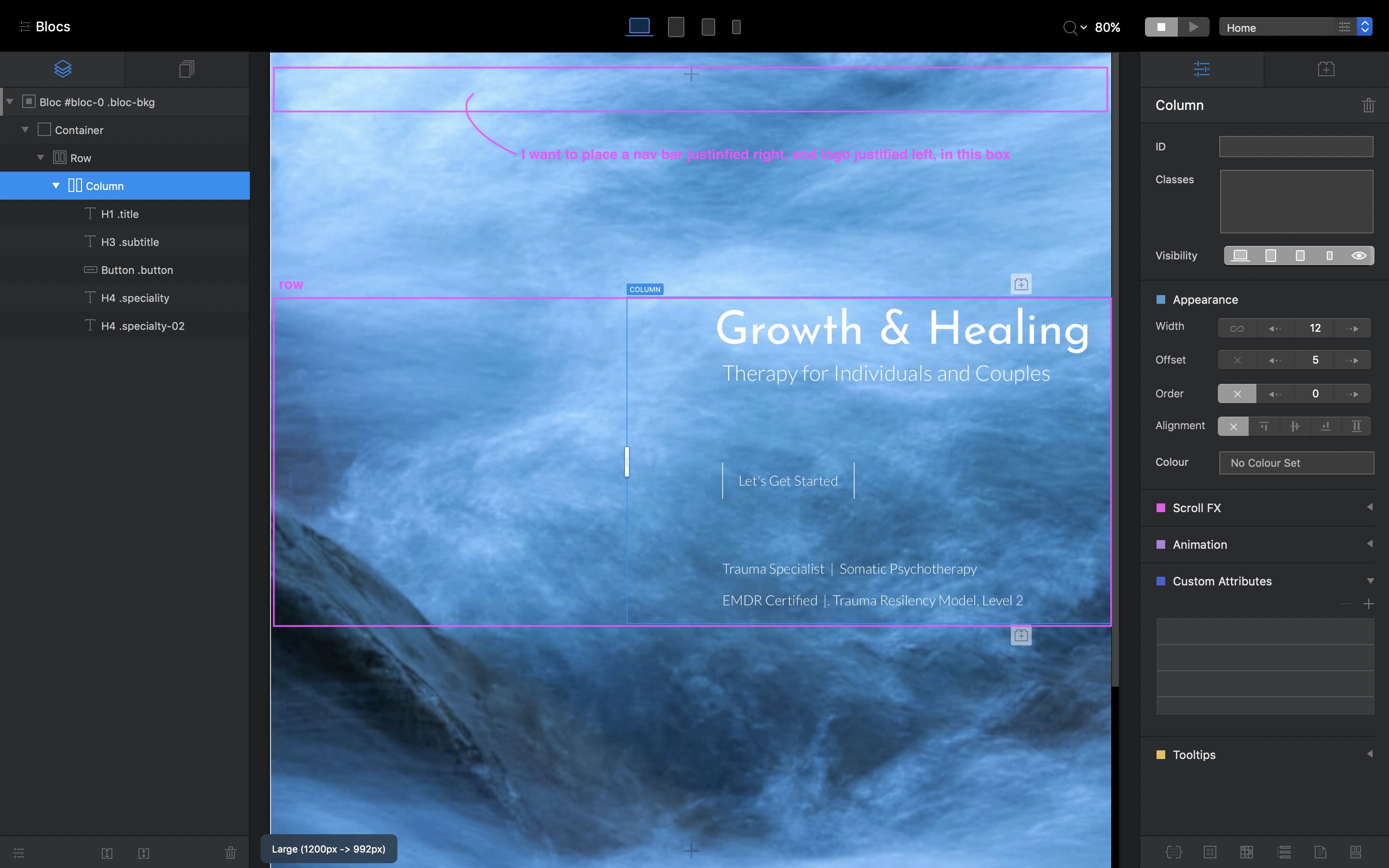
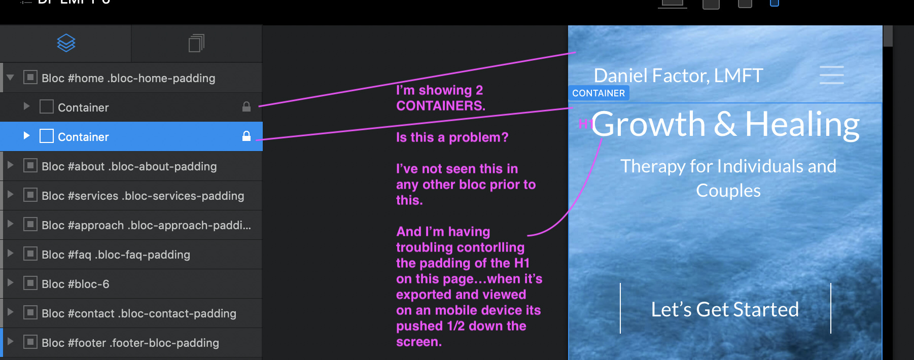
Alternatively, in the recreated bloc shown in the picture below, building it from scratch with the hope that this would provide the most control over both vert/horiz alignment for all elements and on all screen sizes by using custom classes, how would you add the navbar so that it easily aligns to the top?
It doesn’t appear you can add a ‘container’ to separate it from the provided container as shown.
