I just launched http://www.zenmosphere.com and the homepage is not mobile responsive … Every other page is. Any ideas why this is? I do not have any domain forwarding active.
Thanks in advance!
I just launched http://www.zenmosphere.com and the homepage is not mobile responsive … Every other page is. Any ideas why this is? I do not have any domain forwarding active.
Thanks in advance!
Looks responsive to me. Why do you think it’s not responsive?
The page is perfect on the desktop and responds perfectly when the browser width is restricted - it works as expected.
As you have shown, on my iPhone the desktop is scaled to fit.
I’m wondering if you’ve added a widget that interferes with Norms code.
I have a suggestion. Keep a backup of the blocs file and make a site version without any extras. See if that still has a problem. If the problem is gone add back the widgets until you find the culprit.
I’d also suggest trying out websites on a test server, rather than live ( or on live server in a subdirectory ).
Right …
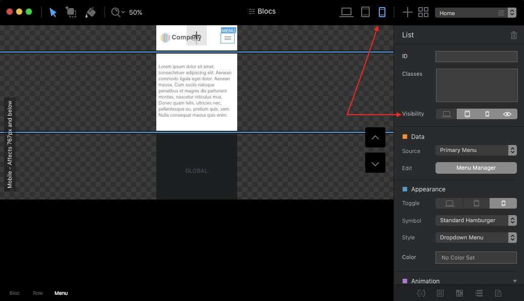
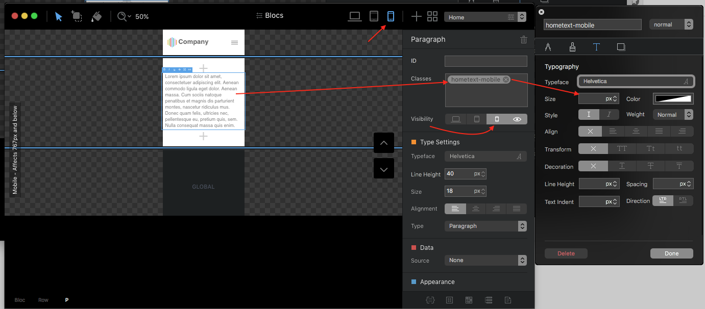
On my iPhone SE the text is also very small and no hamburger.
One possibility would be
to set only a text size and position for the tablet and mobile view in the Classmanager.
The hamburger menu,
you can also activate only for the Tablet and Mobile view.
Perhaps my fast-paced snapshots help.
But on a desktop, there’s no problem, as the browser window is narrowed the correct responsive behaviour is seen.
I really wonder if an add-on script is forcing the page size and causing scaling.
@pauland … for that I am not wise enough.
My described way has worked with me in Blocs …
otherwise I would not have dared to write him here.
hi i have also some problems with my mobile homepage.
every single page is responsive except my homepage.
please help me.
www.kingaudiovisual.nl
Hi, also this thread is more than 2 years old, I have the same problem when exporting a page in Blocs 3.4.5. You can see it here.
In the attached screen capture, you’ll see how it displays in Blocs Preview (correct) with Hamburger menu and adaptative text and image and in the 2nd shot, you see it live on an iPhone. Desktop version is displayed. I can’t figure out why. The strangest is that in Safari Development Adaptative view it is correct whereas in Firefox adaptative mode it is wrong.
Any ides appreciated. Thank you.
Google is not translating your website.
I tried to open this link in 3 different browser, none of them open the site.
Hey @svimic,
I think it is because your header is missing the following meta tag.
<meta name="viewport" content="width=device-width, initial-scale=1.0, viewport-fit=cover">@KBConcepts. You seem to be having trouble opening websites? You commented the same on a thread the other day. I can open the above site just fine. You might have a DNS issue.
You could try turning off your router for a few minutes and turning it back on, it could flush your issue.
I’m running at Gigabit speed, no issues getting 900+ mps.
@PeteSharp Great, thanks. It works 
Any idea why Blocs does not add the necessary and I had (thanks again) to enter it manually ?
Best and cheers.
Just exported the original template I used (Photograph from Eldar) to see if the meta viewport was in the page and it is. So it’s very strange that this meta disappeared from my page.