Question: with blocs we can use a different graphic / template for each device (computer, tablet, smartphone).
But if I wanted to change the graphic / template based on how I use the smartphone, and then horizontally or vertically?
You might be able to achieve something close by setting different background images and changing them for each breakpoint using custom classes. I do this already for Hero blocs, so different images are served depending on the user’s device.
1 Like
Oh, cool @Flashman
I get that you’re super busy I really appreciate the things you take the time to write.
I found this one the most interesting and what I’ve given thought to. I’m not a coder and have been playing with blocks often on for nearly 2 years.
Does one have to know code to achieve what you’re saying?
If not, is this accomplished by duplicating a page than hiding the one if you turn your device horizontally or vice versa?
I have only used this to occupy entire blocs as background images and this can all be done within a single bloc, simply choosing a different background image at each breakpoint. You can see how it works here using Blocs 3.3 Monosnap
@Norm what I have done above does NOT work in 3.4b5. It pulls up the asset manager instead of a finder window, but will not then allow me to select a background image as part of a custom class for a background. Monosnap
1 Like
Thanks for making the video. I’m going to watch it and see if I can figure it out.
Since I can only use Blocs 3.0.0 I’m somewhat limited.
I realized that based on the device it is possible to create various layouts but my question was different. Only for mobile devices (tablets and smartphones) is there the possibility of creating a graphic even when they are horizontal? For the vertical position there is no problems but for the horizontal one? Eh if there was a solution, would it be recognized automatically?
…Or maybe it could be a new feature to be implemented for future versions of Blocs … @Norm this is for you :ghignante:
When you say creating a graphic for horizontal, obviously they will appear, but the question is how they will look.
Being horizontal or vertical is almost irrelevant as far as Blocs or other design apps are concerned, indeed it doesn’t matter if it is a tablet or mobile. See how Blocs doesn’t show any of the devices horizontally:
What matters is pixel width and that is why Blocs doesn’t label breakpoints as mobile, but rather XS or SM. A large top spec iPhone held vertically could be larger than an older device held horizontally.
A website has no way of knowing how a device is being held, so the idea of designing for device types or being held horizontally doesn’t really work in practice. You need to think in terms of pixel screen width and then test on various devices.
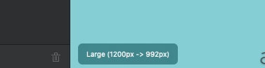
Look at the canvass in Blocs in the editing area at the bottom left and see how the sizes change between different breakpoints:
Large (1200px - 992px)
Medium (991px - 769px)
Small (768px - 577px)
Extra Small (567px - 0px)
2 Likes
You need to Drag the image over to the well.
There are parameters for @media queries that allow you to check the device orientations.
orientation=portrait - applies the @media rules when the browser height is > width.
orientation=landscape - applies the @media rules when the width > height.
eg.
@media screen and (max-width: 680px), screen and (orientation: landscape) and (max-width: 750px) {
***  my styles here ***
}
In saying that, I have never used them, since Bootstrap is responsive in nature, it’s been a non-issue.
1 Like