Good evening, I am trying to pin down the side menu. I mean, I divide the page 20% on the left (menu) and 80% on the right. I want to keep the 20% fixed and the 80% scrollable.
Thank you in advance.
Good evening, I am trying to pin down the side menu. I mean, I divide the page 20% on the left (menu) and 80% on the right. I want to keep the 20% fixed and the 80% scrollable.
Thank you in advance.
Hello @simolivra you can do using bootstrap classes.
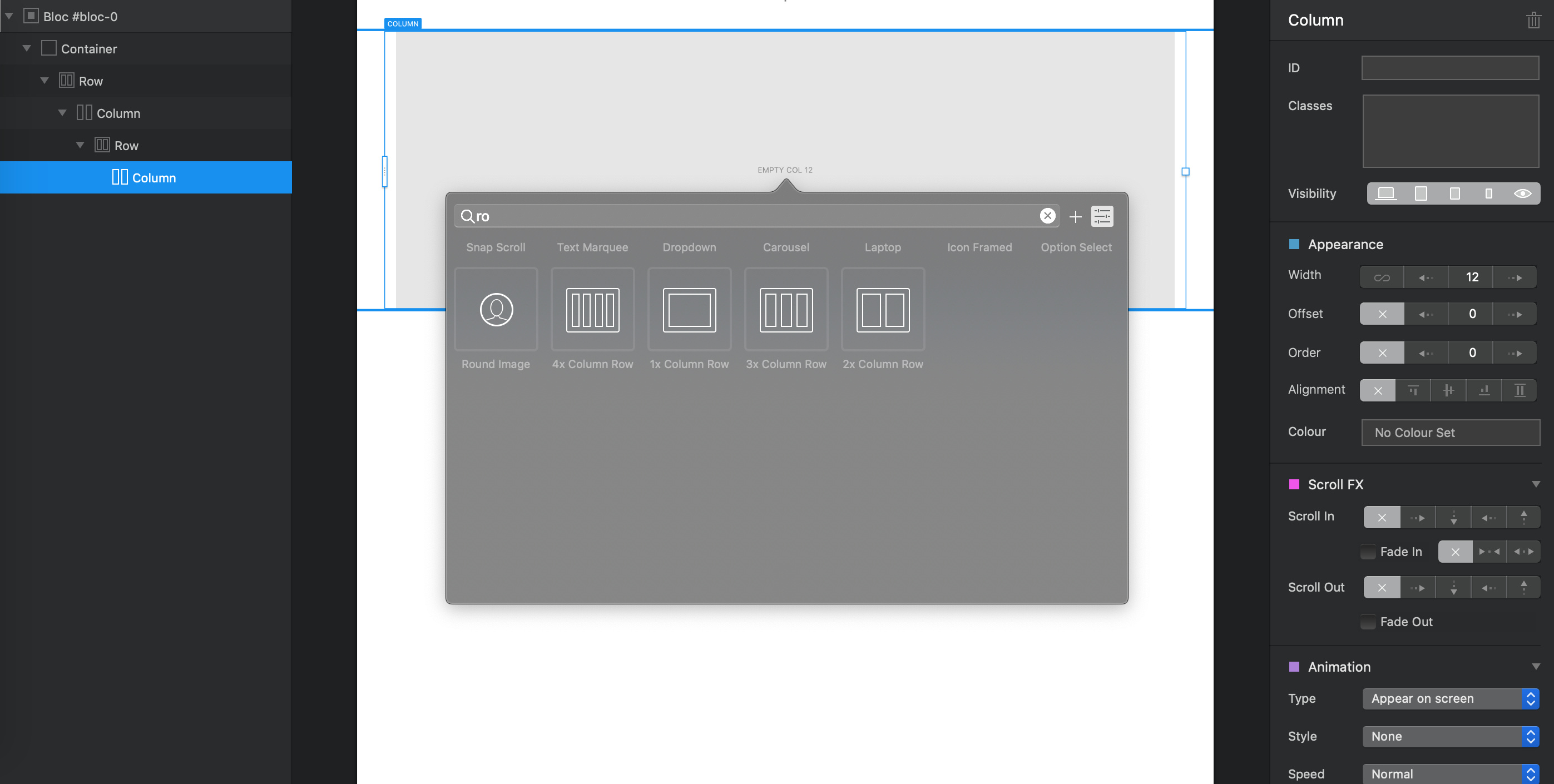
Insert a 2 columns row bric:
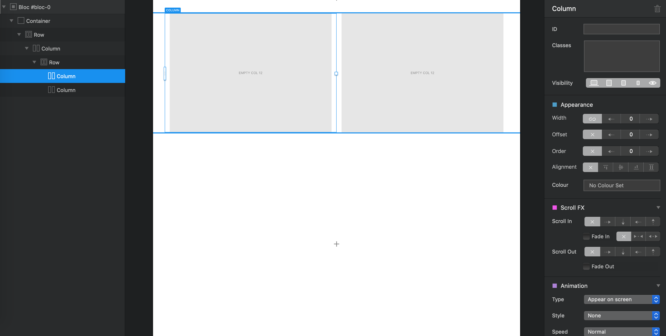
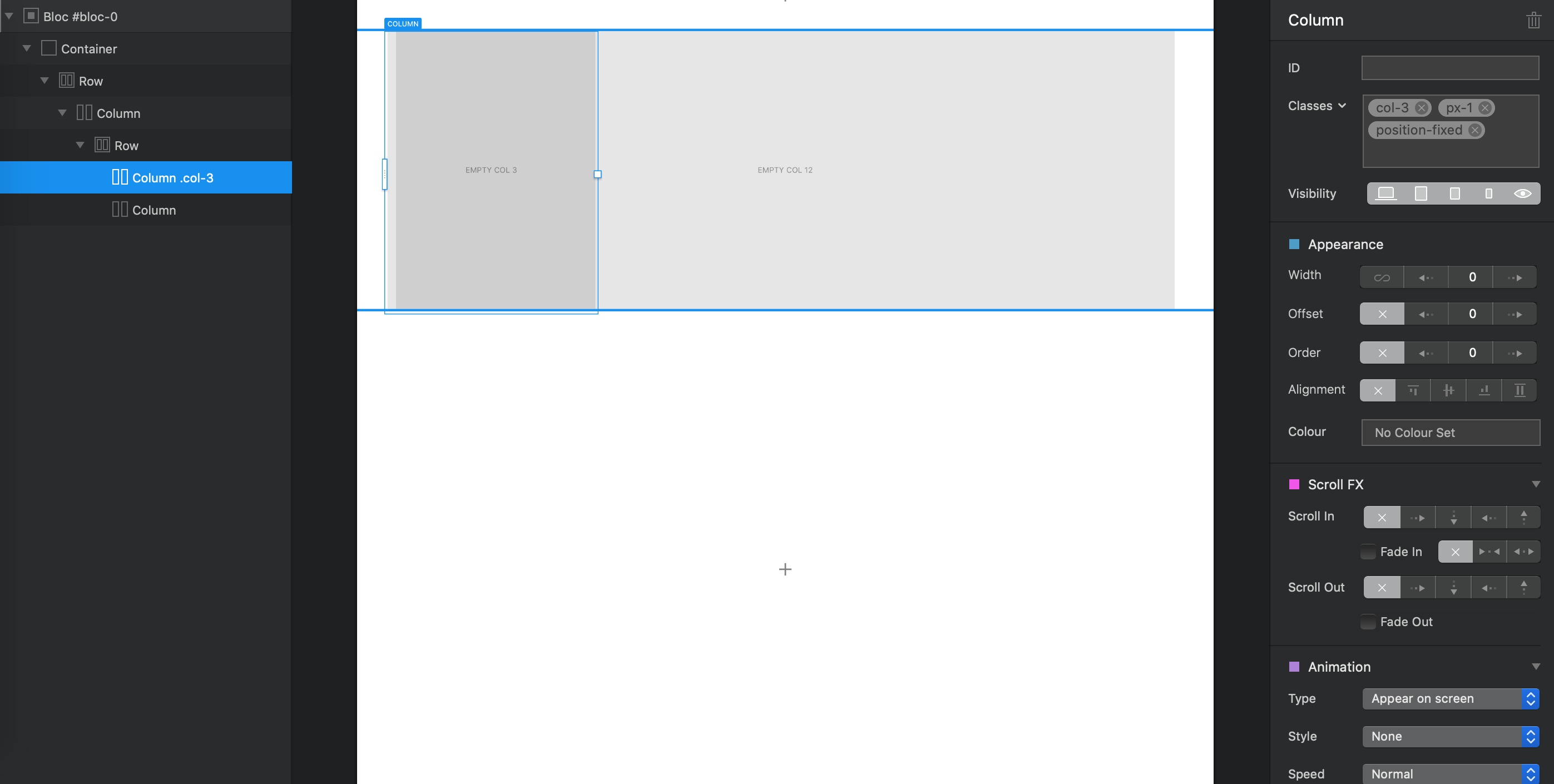
Select the first column (left) in tree panel on the left:
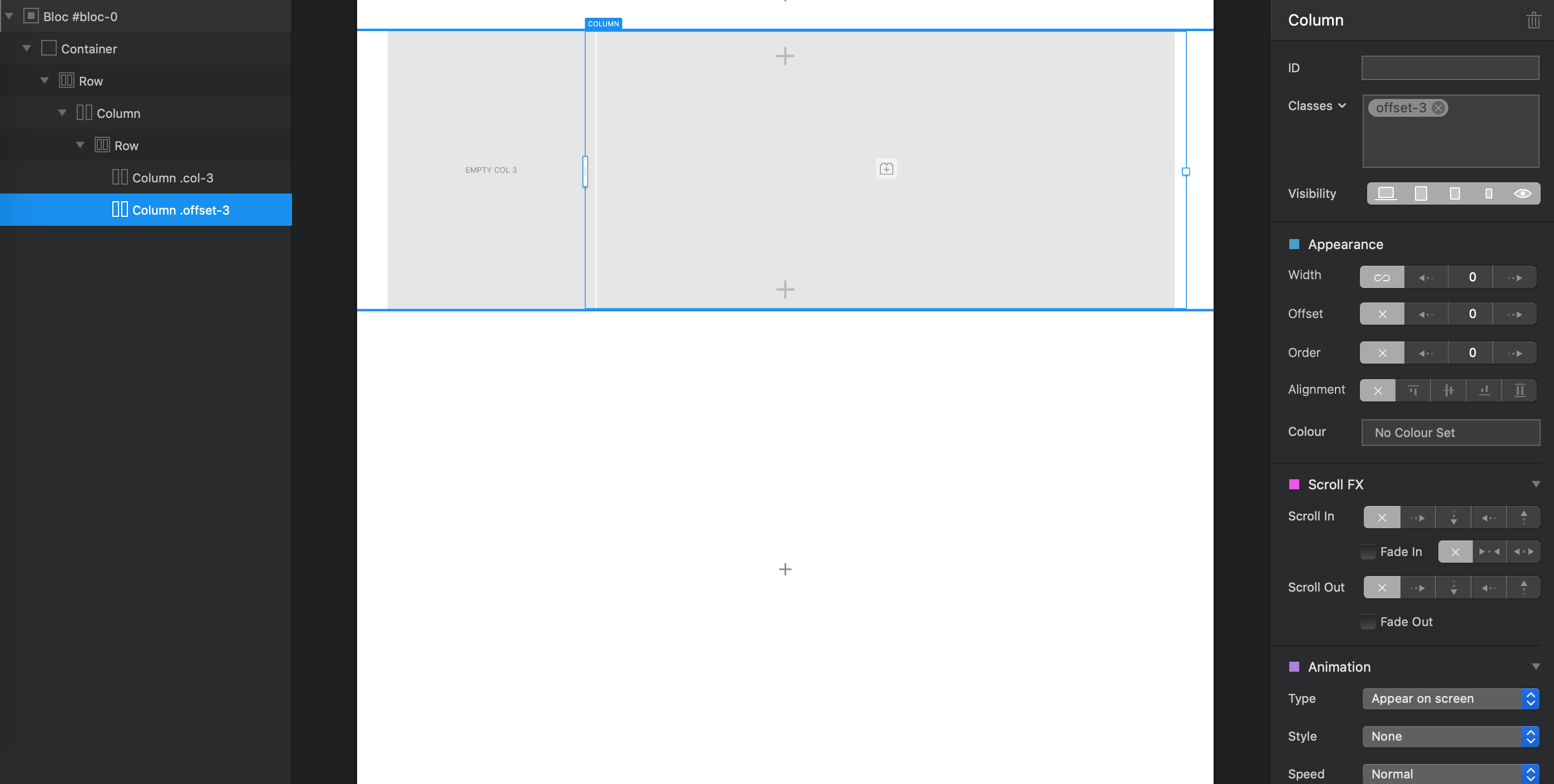
In the right panel under classes add theses 3 classes:
col-3 (size of the width (3/12)
px-1 (The content will be fitted to all width of the column)
position-fixed (Fixed this column to the top)
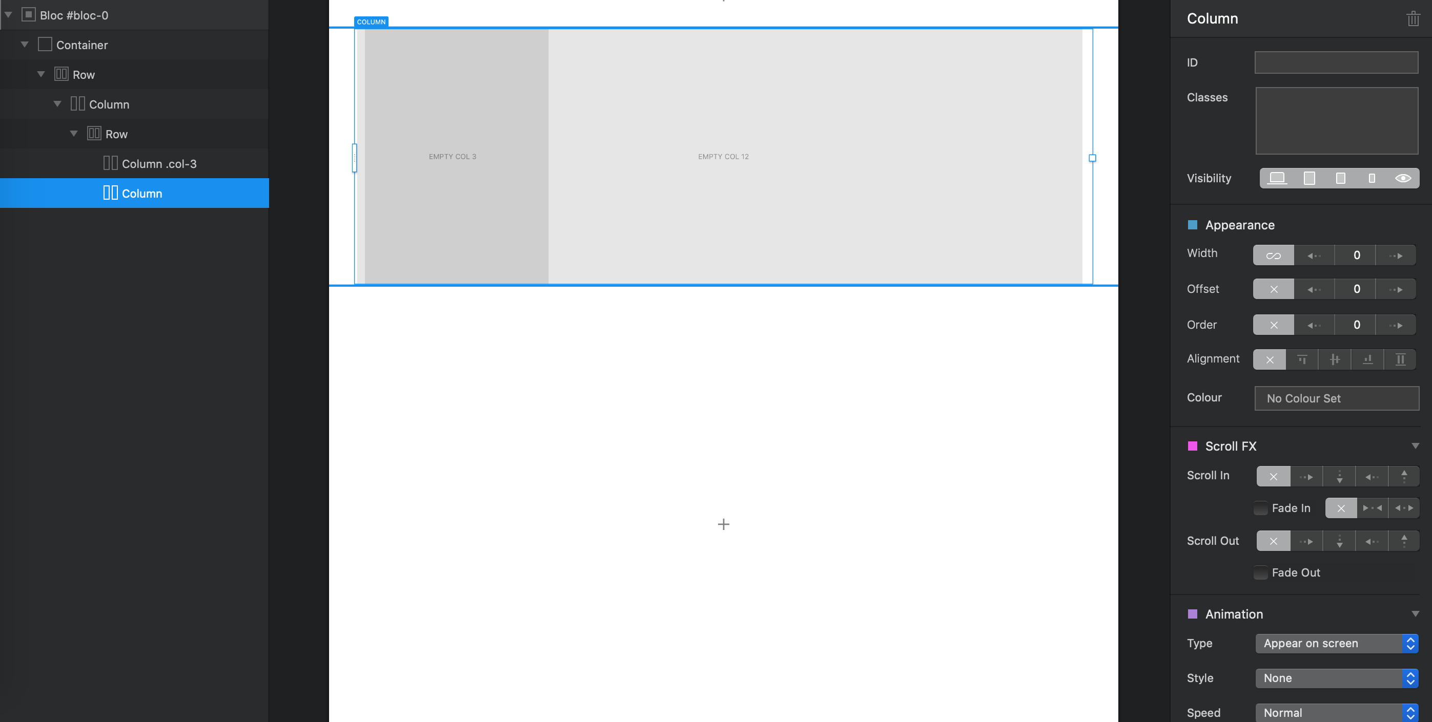
Select the second column (right) in tree panel on the left:
In the right panel under classes add these class:
Then just add content to each column.
Remember that you have to add all your page inside the right column…
Hope it helps you…
Is there a way to use “position-fixed” such that the column in question stays centered in the space between header and footer navs? Right now if you space it so it sits well on the top of a page, it disappears beneath the footer when you scroll to the bottom of the page.