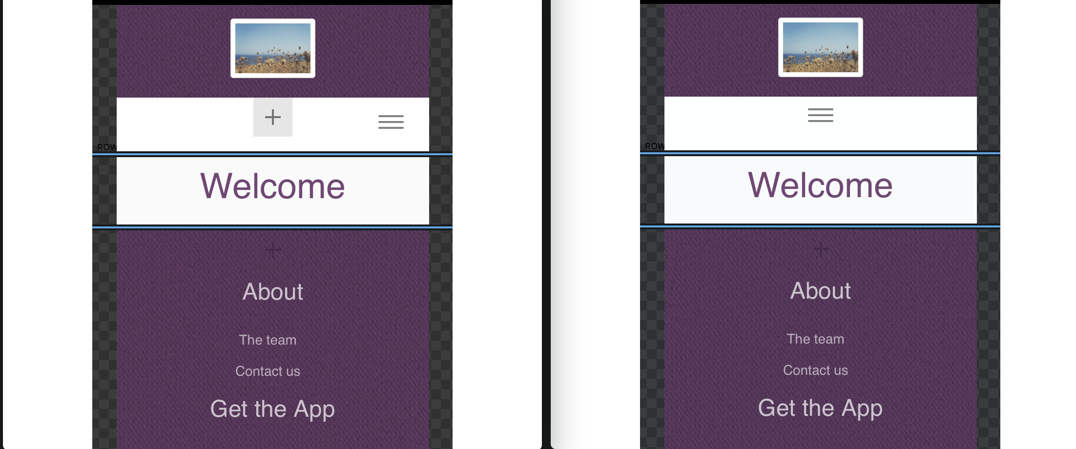
Creating a class and using margins and or percents do not work to center the hamburger. What I want to do is have the design choice to center the menu hamburger icon as in this example.
I think you need to know what the class is to target it?
Am I the only one who wants to center elements on the mobile view?
does not work unfortunately…
In bootstrap the code is “center” margins and percents dont work if you preview in browser and adjust the browser around the mobile size you will see. The menu.
But maybe that specific code you provided does “navbar-toggle”targets the icon only  Why? Can you explain. How would anyone know what the magic words were?
 In other words the hamburger menu slides around as the browser is resized. It is in a different position on different devices. It would be so nice if we could just choose “center” or “Align”

1 Like
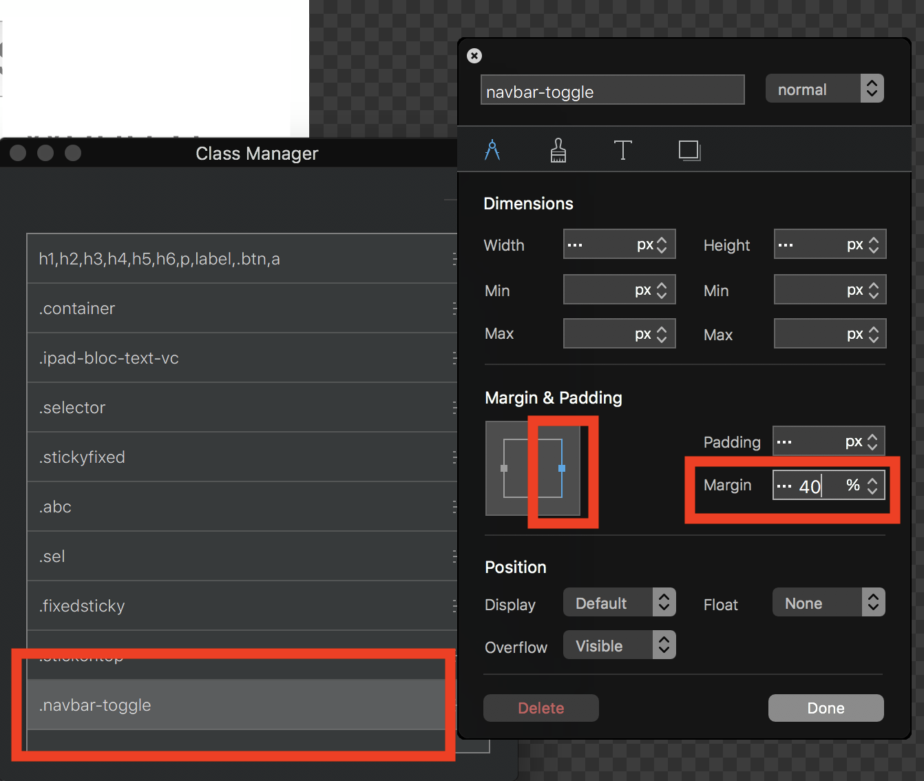
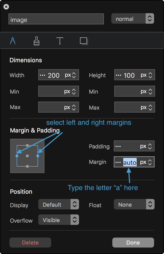
navbar-toggle seems to only affect the menu that drops down from the hamburger menu, so there must be another class name for the icon itself. As regards to getting items to centre, create a custom class and select the right AND left margin in the metrics tab and then type the letter “a” in the margin box. This will automatically align the object to the centre of a block or row.
Thx a bunch…I’ll give this a try. My wife kept looking and telling me to try “auto”…I’ll report back.
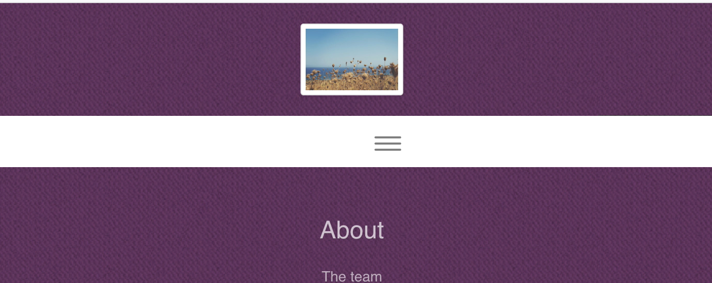
Just tried it on the selecting the hamburger menu icon.
No luck😪

I’m guessing no one knows how to do this?
Please provide a screen shot of your settings and show the hamburger menu icon centered in two or three different windows of various sizes centered…then I know it works because you actually tried it your self.
Show me the class too. .navabar-toggle, etc. I just cant seem to target that little hamburger and move it to center. The “auto” should work too I would of thought but no luck with that.
Thx in advance to the first one to solve this. Again Margins and Padding do not work. Resizing the browser window moves the object off center.
In this case the Hamburger Menu…
Did you actually try this and get the result I described?
No, I didn’t try it because I don’t know what the hamburger menu class is. Given that the hamburger is sitting in a menu container, I would have thought selecting the container and adding a custom class would have done the trick. The problem is that Blocs doesn’t want to keep the menu container selected after moving the mouse out of the menu bloc. So, I guess we have to wait for someone smarter than us to point us in the right direction.
Thanks…this is why I’ve been exporting and opening in Pinegrow or similar to see what the class is. I think it’s .navbar-toggle icon or something but still can’t get it to work even in an outside editor.
Im actually not sure how, I’d need to spend some time fiddling. Having said that, my mind is a sieve at the moment, so I may have already offered help on this before in the forum. Try a search.
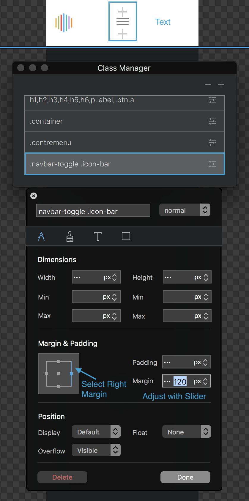
Ok, this works,
Open up the class manager and create a new subclass by selecting toggle menu navigation symbol from the drop-down. This shows up as .navbar-toggle .icon-bar Then make the adjustments shown in the illustration below. If you use the slider to make the adjustment, you will be able to adjust the hamburger position visually.
That won’t be responsive.
Hello,
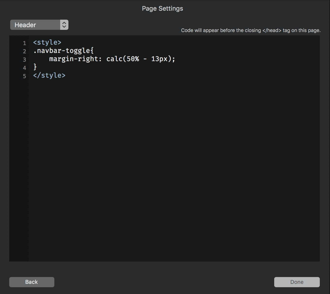
ohh, yes, forgot to remove the icon width, and had a typo in the image obove, should be 50%.
Try this one: Perhaps you must adjust the 13px a little bit.
1 Like
Sort of…but not quite. The whole page went south as in Blocs crashed. I Had to just close and not save.
No one seems to know. How many users are there of Blocs?
I’ve given up at this point. Too much time spent just to center a darn menu icon…unless someone can show it done in an actual online example maybe.
I’ve shown enough images as examples of what the issue is with padding and margins. When someone actually provides an image with the mobile menu icon centered at several different window sizes then I will know it is possible and works.
Right now this is an awful lot of tapping my heels 3 times and saying “there’s no place like home” over and over another Wizard if Oz reference…frustrating…it should be easy. 

 Thx for trying.
Centered navigations are not a feature of Blocs, so when you want to do something that is not a core feature of Blocs you will need to have some knowledge of how the code is structured (preview in browser- right click inspect) and how Bootstrap 3 works regarding it’s navigation element (html and css). With this knowledge you can then implement the required CSS changes via the class manager and class editor.
How to center the navigation toggle.
When you apply a class to a menu it actually gets applied to the menu list container (ul), not the toggle button. In order to style the toggle we need to reference the standard Bootstrap 3 class for the toggle ui-navbar-toggle. In order to center the toggle the easiest way is to use the toggles parent and apply a text align rule to center, this will center the toggle button via its parent.
So Add the following 2 classes via the Class Manager.
ui-navbar-toggle
navbar-header
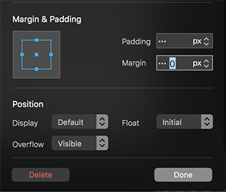
Now we have those added, switch to mobile view mode. Now open and edit the ui-navbar-toggle class by clicking on it in the Class Manager. We need to set its margin to 0 and its float value to initial.
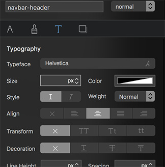
Now open and edit the navbar-header class via the Class Manager, navigate to the text options and apply a center text rule. This will center the ui-navbar-toggle within the navbar-header .
This will produce the following result.
Here is an example project so you can see what I did. Please note in app previewing wont show the changes.
center nav.bloc (729.5 KB)
Blocs and Styling
Blocs is based on the Bootstrap 3 framework and it offers a range of preset layouts, although it’s possible to create your own layouts, the more off the beaten track you wish to go with customization, the more knowledge of how Bootstrap 3 and code works you are going to need.
Centering a navigation toggle button is a simple task, but its not a really common one. If I added buttons for everything, you wouldn’t want to use Blocs, you are here most likely because the UI is easy on the eye, keeping it that way requires only essentials are found in the sidebar, everything else is hidden behind the class layer.
I hope this helps with your frustrations and also gives you a better insight into how customisation in Blocs requires more knowledge depending on what you want to do.
5 Likes
This is why BLOCS will get better and better. You listen to the needs of your customers, although you may have a different understanding of what’s necessary or not. And the best, you provide a solution that works for now! Thanks and keep on your excellent work 
3 Likes
@Juerg, I agree with your comment! I’ve found Norm to be very responsive to questions and the forum community to be robust and active! I always can’t wait for Blocs updates!!!
1 Like
Norm
I have applied this center mobile menu successfully.
I think you know that when adjusting “most” parameters you actually see the visual result as you are doing it.
However when doing this procedure the mobile menu icon etc. does not do anything until you preview it which negates the whole idea of the visual editor.
Is this going to be fixed in the next release? Are there other parameters that don’t give “real time” visual feedback when they are adjusted? It would be nice to know.
When you are designing you don’t dont know if your adjustment did something or not without previewing in a browser. There may be other instances where this occurs but I have not seen it yet. Can you give some insight into this phenomenon? Thanks…