Hey Guys
On version 2.5.1
when turning the iPad in a vertical position, means that the home button is on the bottom, all the banner images becomes blurry and blown up, does anyone knows whats going on,??
Thanks All
Hey Guys
On version 2.5.1
when turning the iPad in a vertical position, means that the home button is on the bottom, all the banner images becomes blurry and blown up, does anyone knows whats going on,??
Thanks All
Try reloading the page when it’s rotated, I’ve not heard of this before.
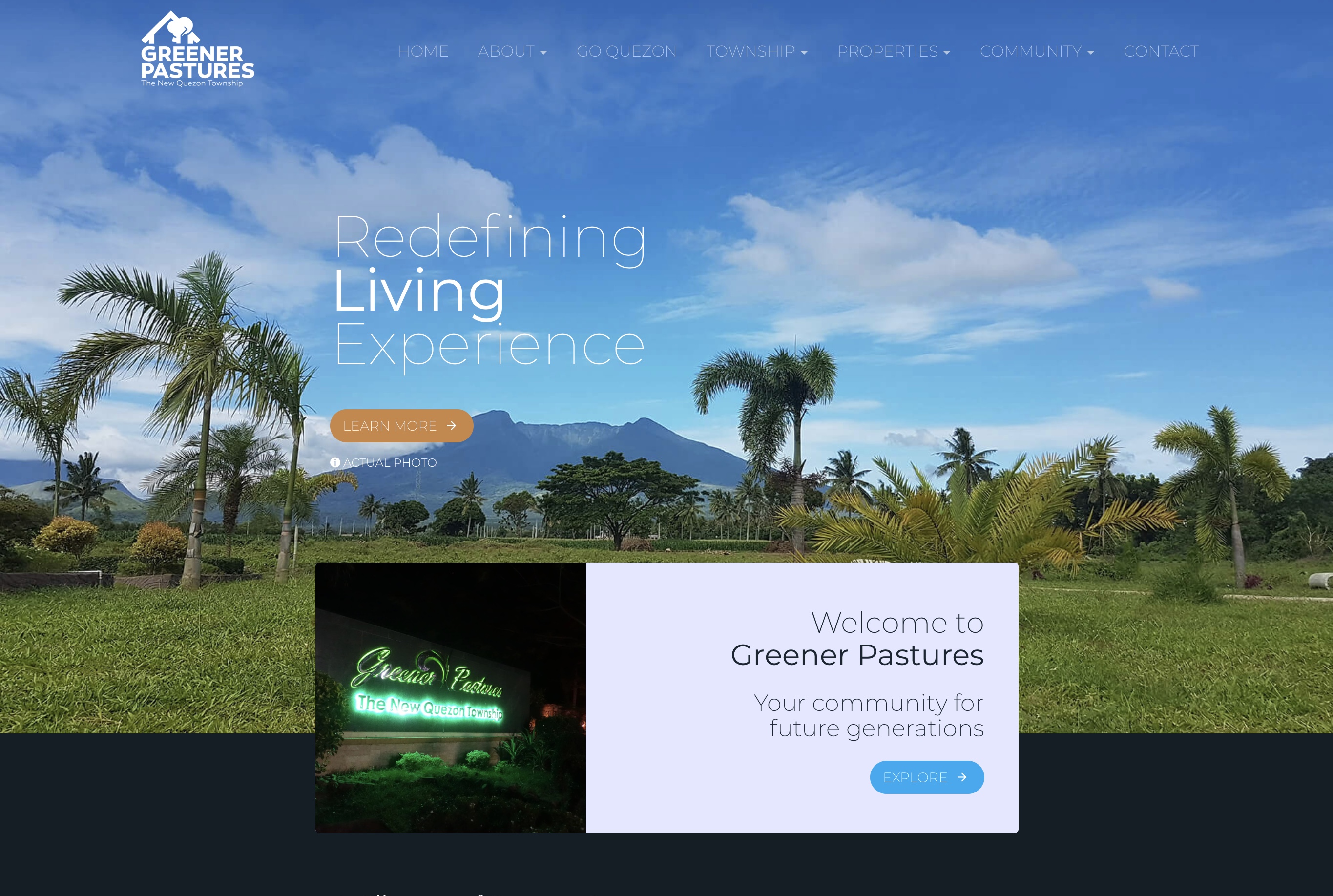
Hi Norm thanks for the quick reply, no the reload didnt help and I tested some other sites first one is here on the forum here is the link
Here are the screen shotes and another example is your very own
http://blocstemplates.com/demo/company/m/
I only tested 2 sites apart from min but on both I got the same bluer so please let me know I’m sure now everyone wants to know.
Thanks again
Just a note: I think it happens only when parallax is enabled I hope it helps
Hi,
I don’t think it’s related to 2.5.1. The Blocs has always behaved this way. And you are right, it is because of the parallax enabled images, which are currently not supported on iOS.
BTW, I have build the company template you mentioned using Blocs 2.3, and then optimised it to 2.4.x I believe.
Yeah the iOS browser blocs it and causes that.
Guess which of those is the vertical one, take your time: slight_smile:
I know this, and I don’t mean to be one of those annoying people that just bash, I truly love blocs app but this is not something you can skim over, it’s a major! Draw Back. Many people like to read in vertical view and “Many” is an understatement.
It looks better in horizontal view if its the IOS why it doesn’t do this in horizontal view? Cant we do something to minimize this blown up image in vertical view? It’s just not proportional the difference between them in vertical view you cant even make out the image it looks like a different page, I would even go as far to say that users might think they are on the wrong website, and leave the site, if you want blocs to reach a professional level that even respectable companies would use then this just cant be a part of blocs it reduces it to a toy that kids might play around with but not for serious users and companies, this is just my suggestion to make this a top priority, I hope im not coming out the wrong way here, Norm you did an amazing job with blocs and I’m so happy i found it, want blocs to be successful because I love using it and I think its a great product that could be one of the best out there.
I also know that in the future this will be fixed, but I think there is an easy fix here something that we are missing and that blocs cad do now with subclasses.
thanks
Ho and one more thing this behavior is not happening on the phone so why does this happen on an Ipad
A phone is also vertical, hmmm…
The quick fix is just don’t use the parallax effect and you won’t have the issue. I appreciate that’s not ideal but it prevents this from happening if you need to get the site live until I can get to the bottom and to see if there is a solution.
To be honest I’m almost tempted to just remove the feature all together as it just causes issues (always has) and it’s due to the mobile browsers blocking the effect.
Blocs currently blocks the effect based on browser width, if it’s below a certain width it stops it using the effect. I’m not entirely sure why your iPad Pro is not being triggered to prevent it, it may be that the css code thinks the dimantions are that of a small laptop and allows the effect but that then gets shut down by ios browser.
If this is the case there maybe no way to fully prevent this without bloating the code in which case I’ll just remove it if the community feel it’s not worth the trouble.
What size is the iPad screen?
Hi Norm I don’t think removing the feature is the best way to go the pluses are far greater than the drawbacks
when the parallax works its like magic, besides we can always turn it off like you said, but I do think that if we look closely we can fix this with subclasses.
ill try to figure it out and I invite anyone that thinks they can crack this before I do, for bragging rights 
Cheers
And my Ipad Size is
Apple 10.5‑inch iPad Pro
Screen Size 12.9-inch
thanks
I read up on this last night again and I have an idea to try I’m not sure it’ll work without effecting small laptops but we can try I’ll get it added to the current beta and republish build 3 to include it to see if it helps.
I’ll update this thread when it’s included 
Great ! Can’t wait
Thank U VM
You had these issues years back with the original iPad, I fixed that up but every time I tried to block out the background fixed on viewports on views that crossover laptop screen sizes it usually end up causes unwanted blocking of the effect on desktop.
I didn’t actually know it was still effecting the iPad pro and in all fairness that was before I saw a screen shot.
It’ll be live soon.
Ok there is a new version of 2.5.1 Build 3, let me know if it prevents the issue, the version of the beta that is downloaded ends with NEW3.
Perhaps I should have added this one "  " on the end also, but the issue is indeed “relative” in the end. I was just passing through don’t mind me. Hopefully @Ofel1 will post back concerning results.
I think you’re right to be suspicious of any fix affecting small laptops too. Apple keeps releasing new iPad resolutions and the newest are bigger so any scheme based on pixel sizes is fraught. The relatively new 10.5" iPad is 2224x1668 pix but the ‘big’ iPad Pros are 2732x2048pix (from iPad Pro - Technical Specifications - Apple (UK)). They have to cross over with small laptops and Chrome books etc.
@Norm I know it’s a hack but most big tablets out there are iPads so could you use a (smaller) resolution based scheme as now but add a specific check for mobile Safari or for iOS?
Thanks, Norm you did it no more blur, great job, I did notice something else it’s not as major and it could be that I’m using it wrong but here the story, when using hero block with a background video, you know that small arrow that you have on the bottom to make it go to the next section of the site well its not doing it when you have a background video but it works when its an image, any idea?