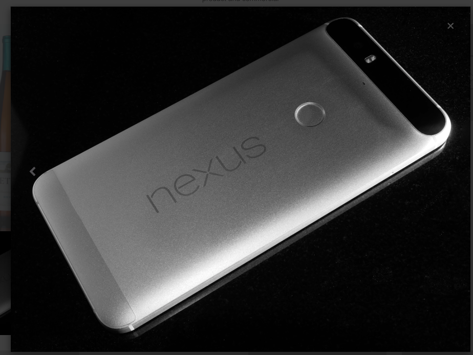
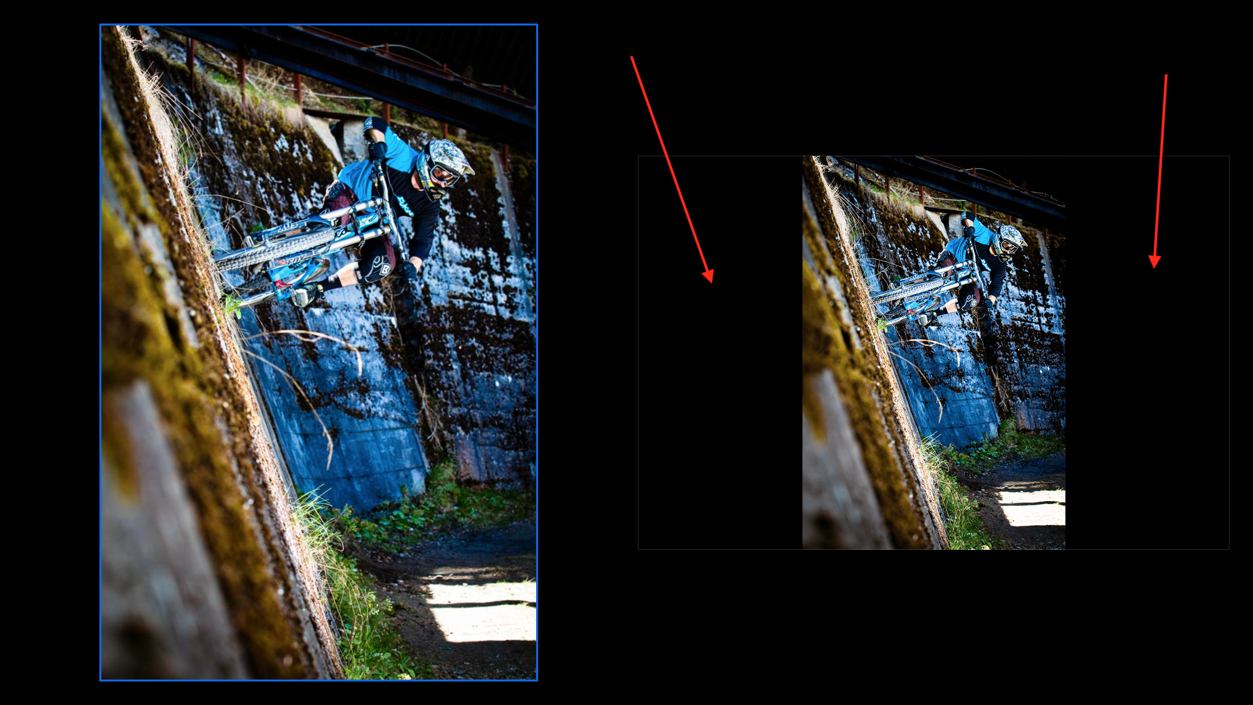
I have found no way to remove dead space in lightboxes when using non-landscape aspect images. The light box is set to “frameless”, and it looks fine with a landscape aspect image…
The lightbox doesn’t gracefully handle landscape images as you can see. I’m not sure how to address it but I think the modal needs some additional logic added in order to calculate the width.
It’s on my todo, last time I tried I couldn’t get it working right across all browsers.
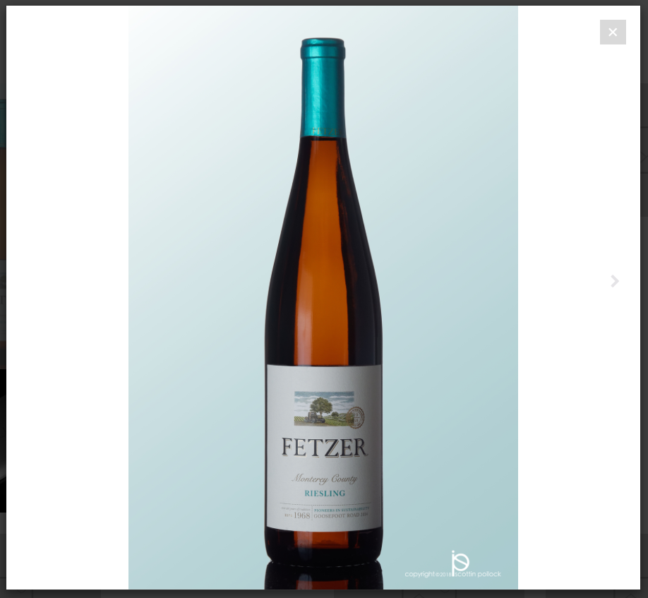
Instead of using frameless use full screen. This will keep all the areas outside of the image with a black background. It looks better that frameless for portrait images. Hopefully Norm will add a true frameless portrait either in next version of Blocs or in an update. Full screen is not perfect but I think it looks better.
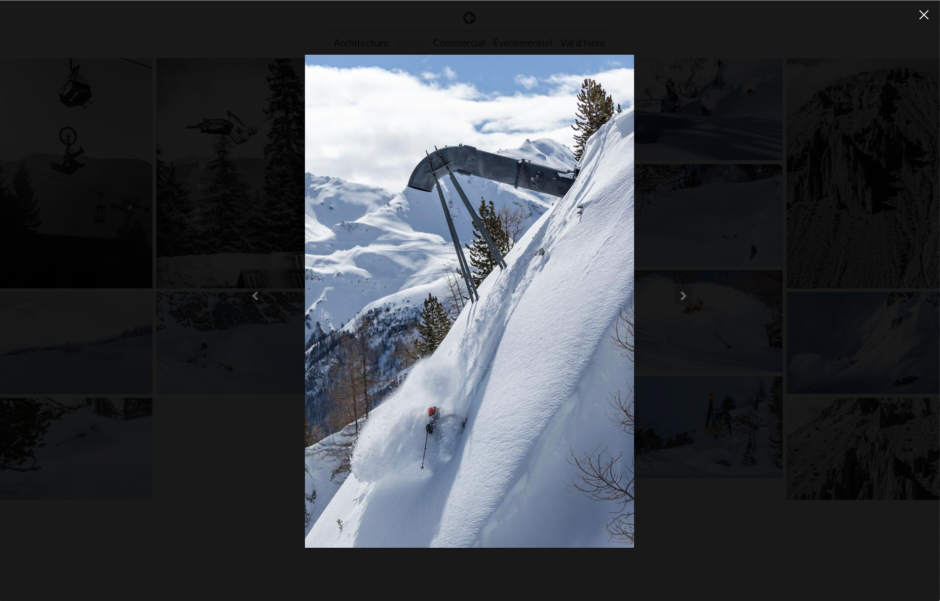
I am using fullscreen, which looks good with landscape photos, but as soon as I want to use portrait, you have to scroll down depending on your screen…
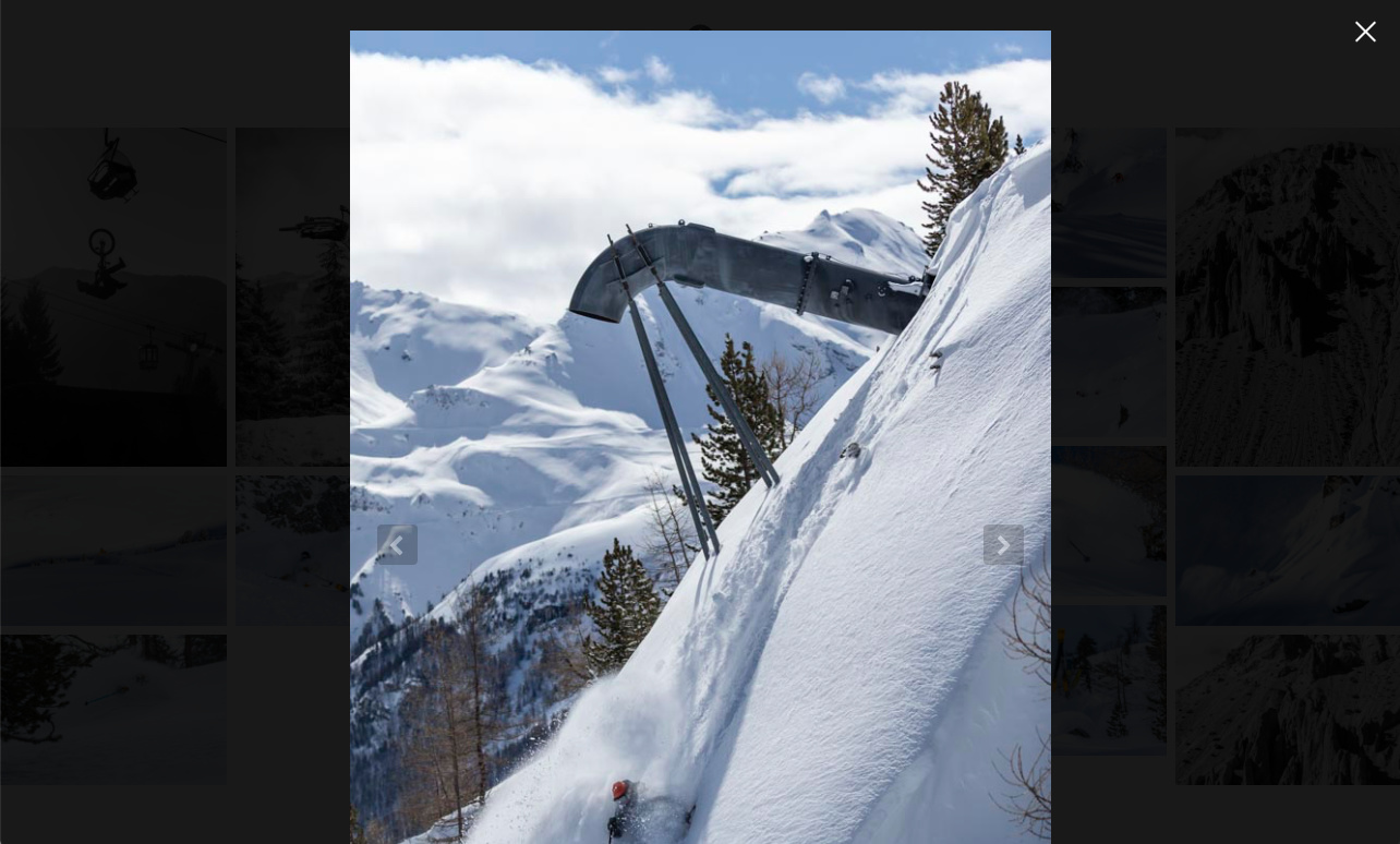
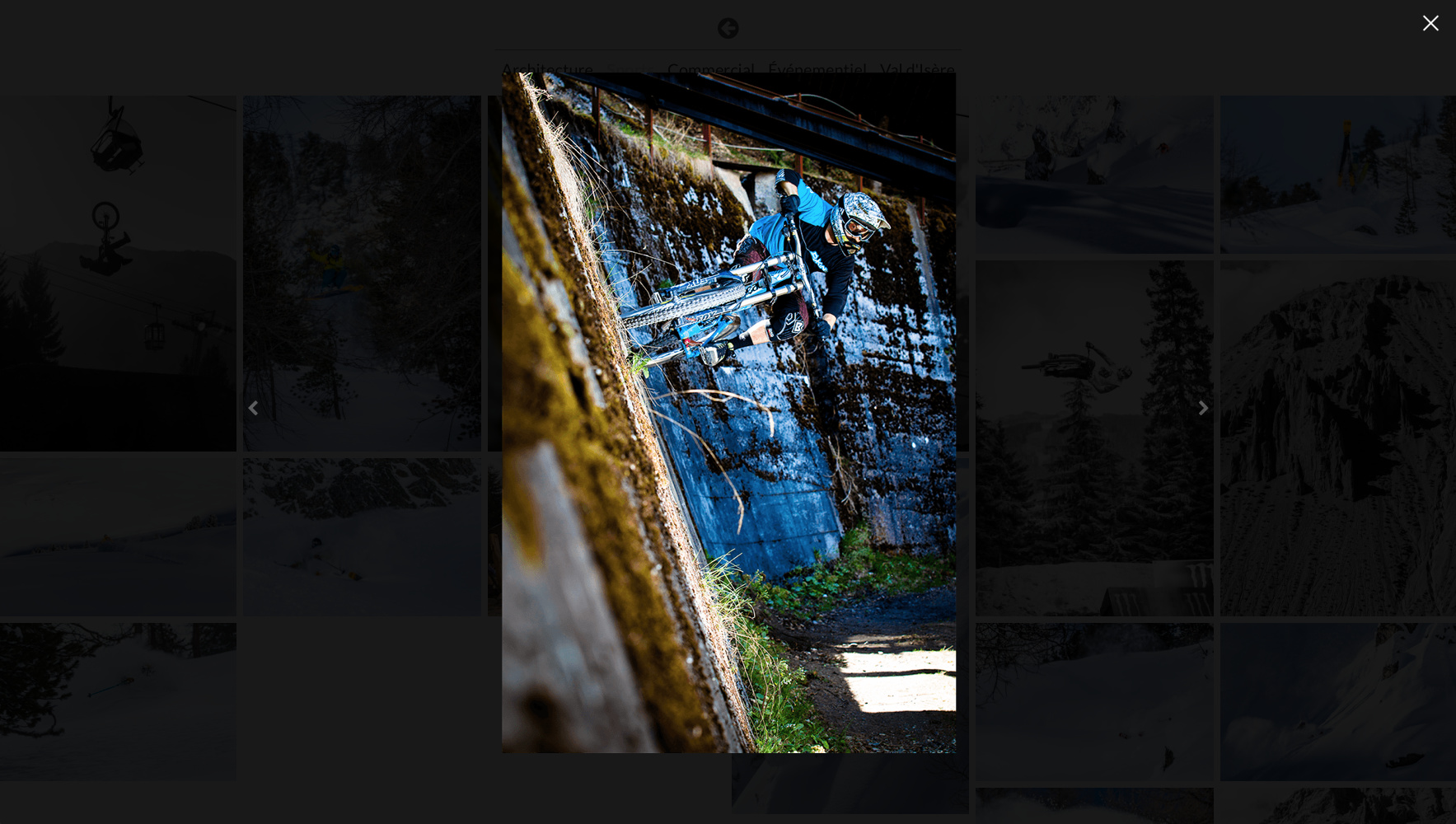
When it comes to images in landscape on mobile devices, what you are showing is actually the best practice way.
There are only two things you can do here.
accept the user experience as you see in the screenshot.
or shrink the image to fit the height of the landscape mode (not recommended)
And this is meant to help…
From a UX perspective the first option is familiar and a better alternative than the second.
also, take it from me (or not), but this “issue” shouldn’t take any more of your time. One of the trickier things about web design and development is that we are always wondering/questioning what “normal” behavior is. We can quickly lose time and energy trying to find best practice solutions. So real friends don’t let friend fixate over established patterns unless the idea is really really great!
I totally agree with you on this for mobile devices, this makes sense, but the screenshots are from computer screens in my example. I think the best option for me is to avoid portrait images, or to bring them down to about 700 to 800 px tall as @casey1823 mentioned.
That’s a good analogy from a UX perspective. I see so many users wanting features that are really not worth the effort and can have negative effects across breakpoints. There are reasons why Blocs work a certain way. For the most part, I try to work within Blocs and the tools made by developers.