Hi,
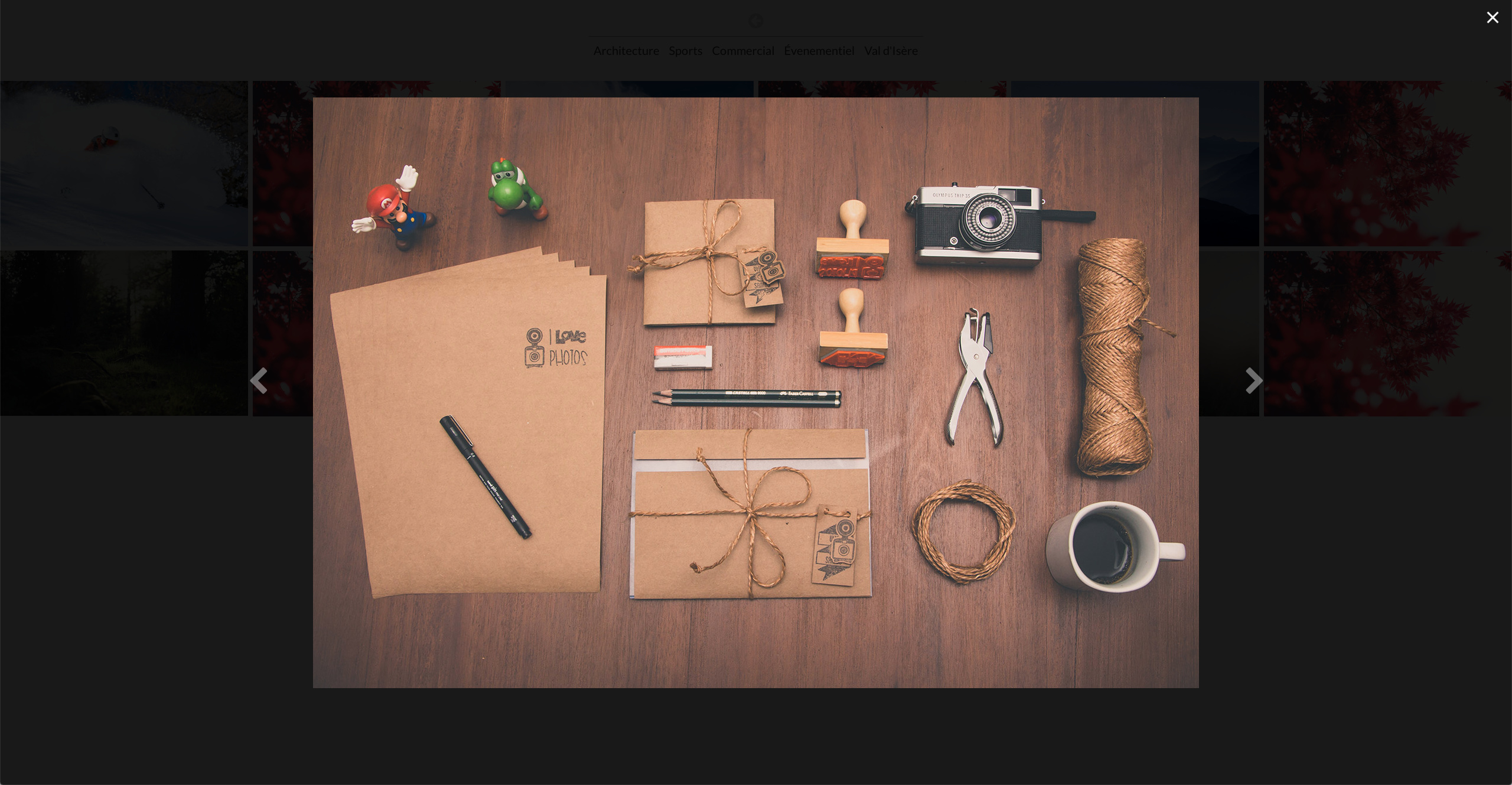
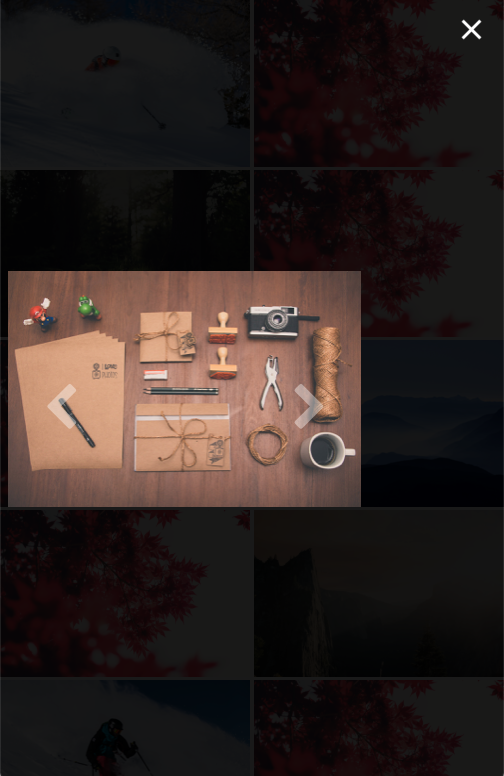
I’ve done a few modifications on Lightbox (Fullscreen), but for some reason, the slideshow isn’t centered on mobile, but totally fine otherwise…?
Here are the modifications I have made…
Anyway I can fix it ?
.fullscreen-lb{
background:rgba(0,0,0,0);
border-width:0px 0px 0px 0px;
}
.fullscreen-modal{
background:rgba(0,0,0,.8);
}
.fullscreen-modal .modal-dialog{
width:50%!important;
max-width:95%!important;
}
I did find a way to fix it, for anyone interested…
@media (max-width: 768px) {
.fullscreen-modal .modal-dialog{
width:100%!important;
max-width:95%!important;
}
}
@media (min-width: 768px) {
.fullscreen-modal .modal-dialog{
width:70%!important;
max-width:95%!important;
}
}
@media (min-width: 992px) {
.fullscreen-modal .modal-dialog{
width:70%!important;
max-width:95%!important;
}
}
@media (min-width: 1200px) {
.fullscreen-modal .modal-dialog{
width:70%!important;
max-width:95%!important;
}
}
1 Like