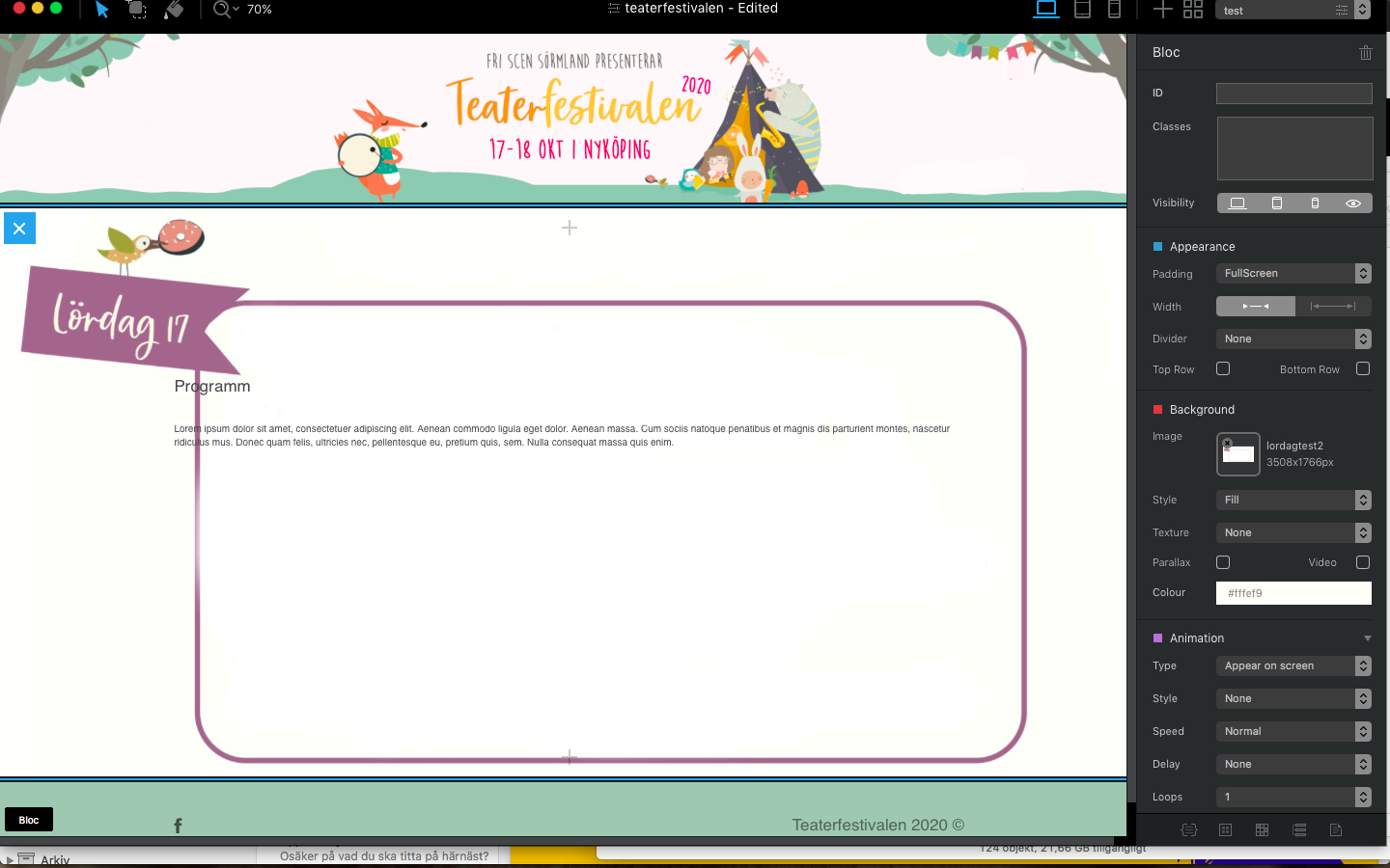
The first thing you need to do is simply add your image to the page. This will display in an image bric set to the width of the column you place it in. This is important because you need to know the HEIGHT of the image when it’s displayed in your page. In the example below, I added the image to a full width standard bloc:
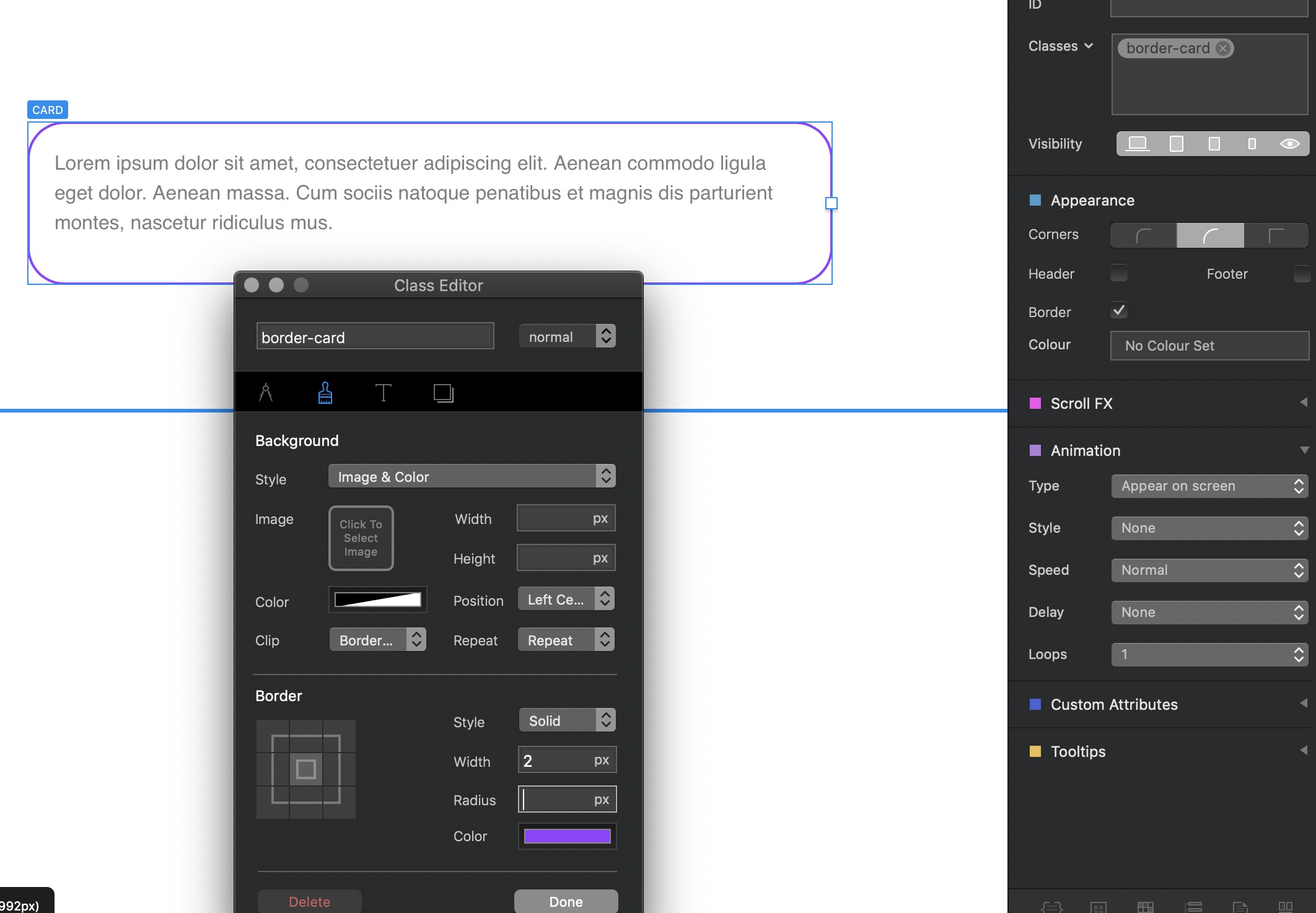
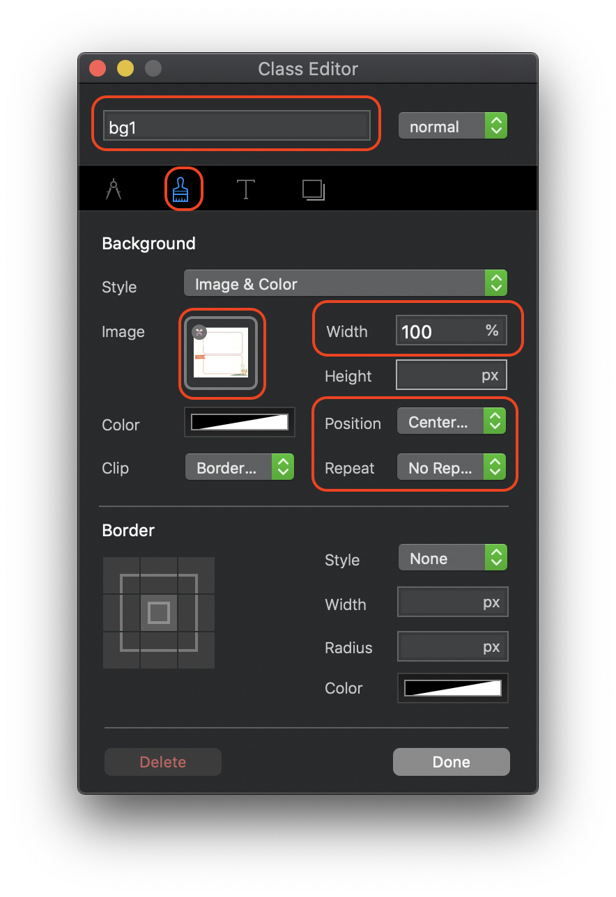
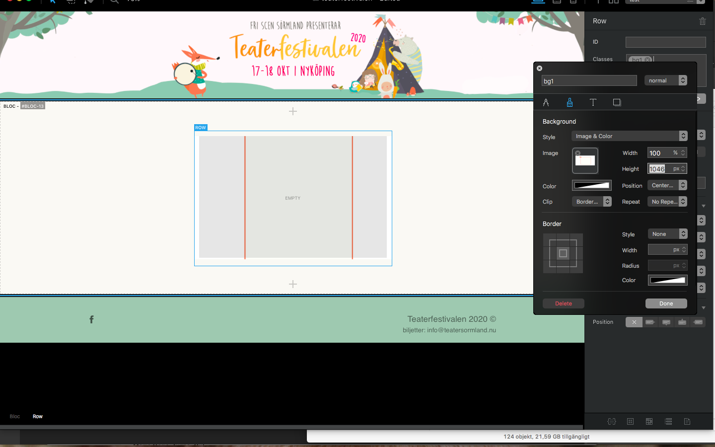
You can now delete the image from the page. Next, select the column that you want to place your image into as a background. Create a custom class (call it bg1 or similar). Double click on the class name to open the class editor and select the paintbrush tab. Drag your image into the image placeholder, then make the following settings:
This will set the image to 100% width of the column. Position should be set to centre - centre and the repeat option should be set to no repeat.
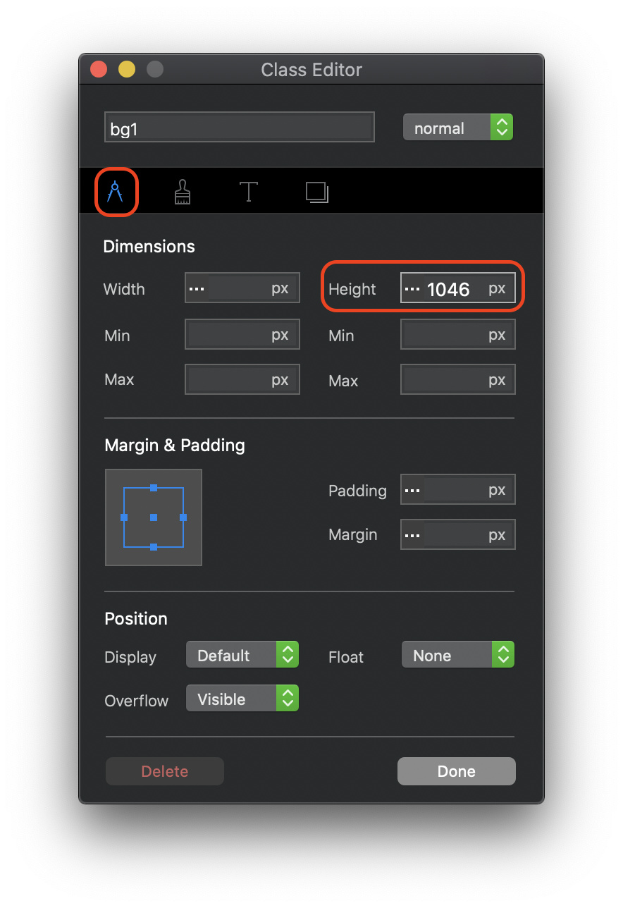
Now switch to the metrics tab and make the following settings:
I’ve set the height of the column to 1046 - you would set your height to reflect the height of the image when you paced it on the page earlier.
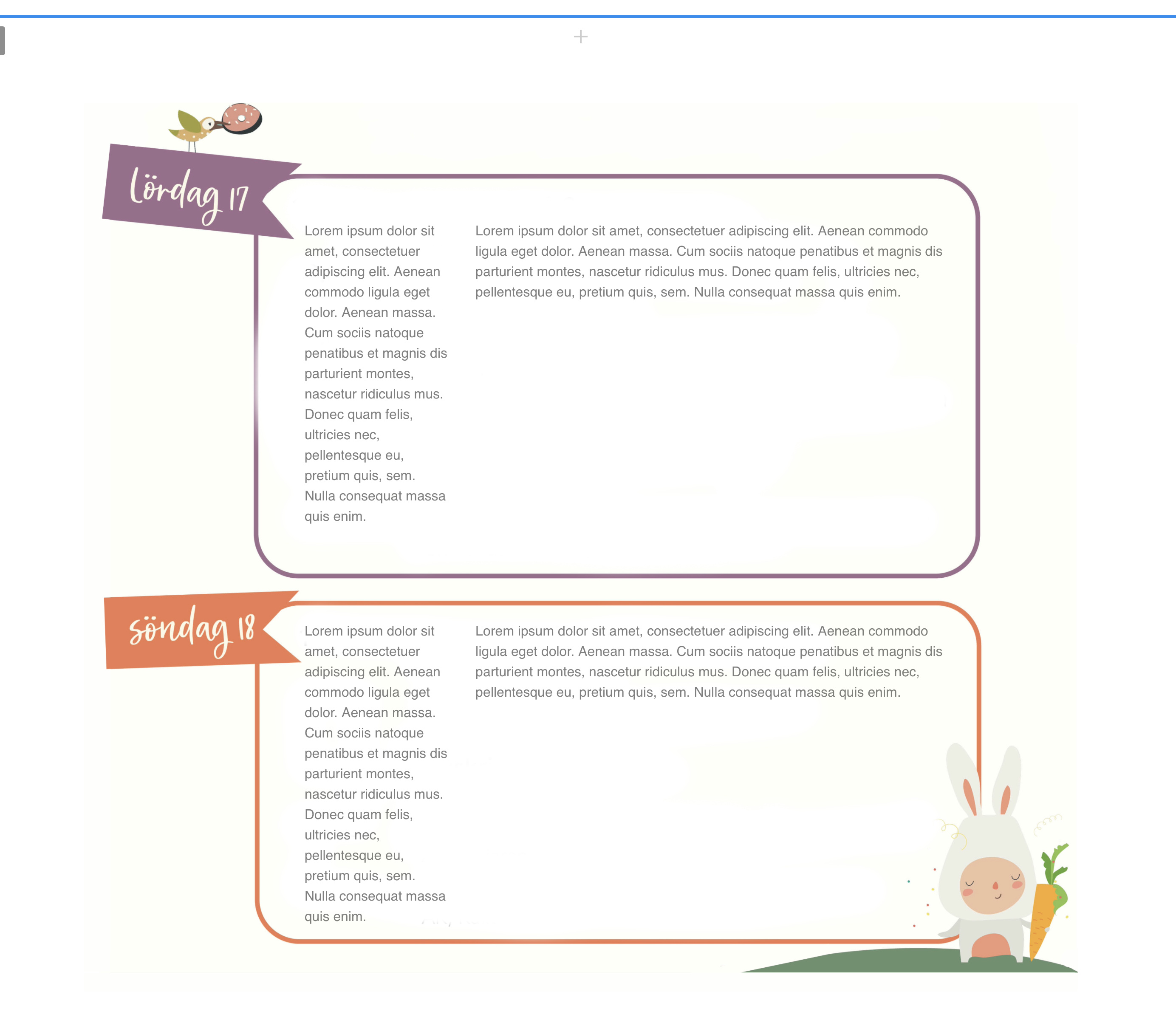
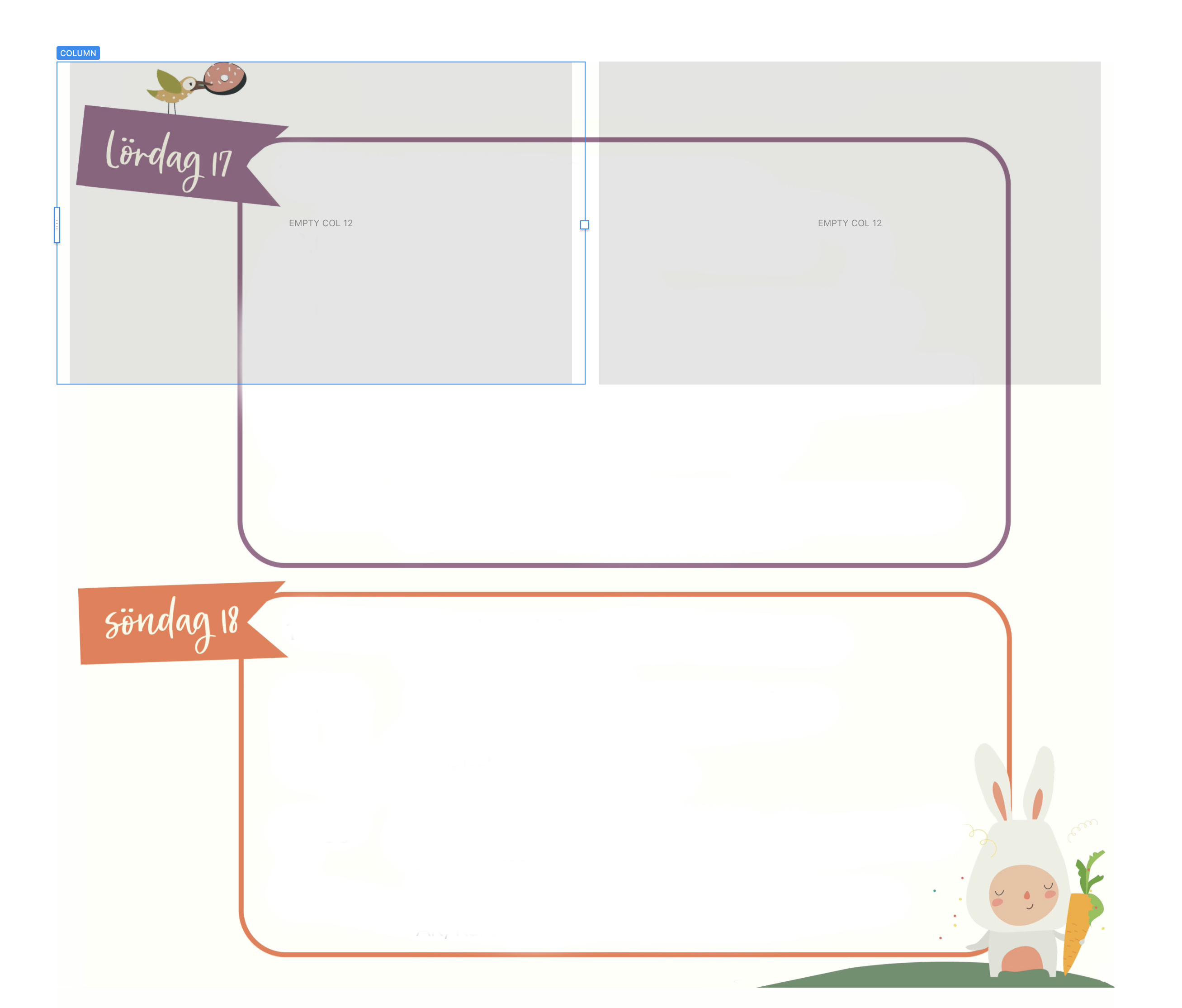
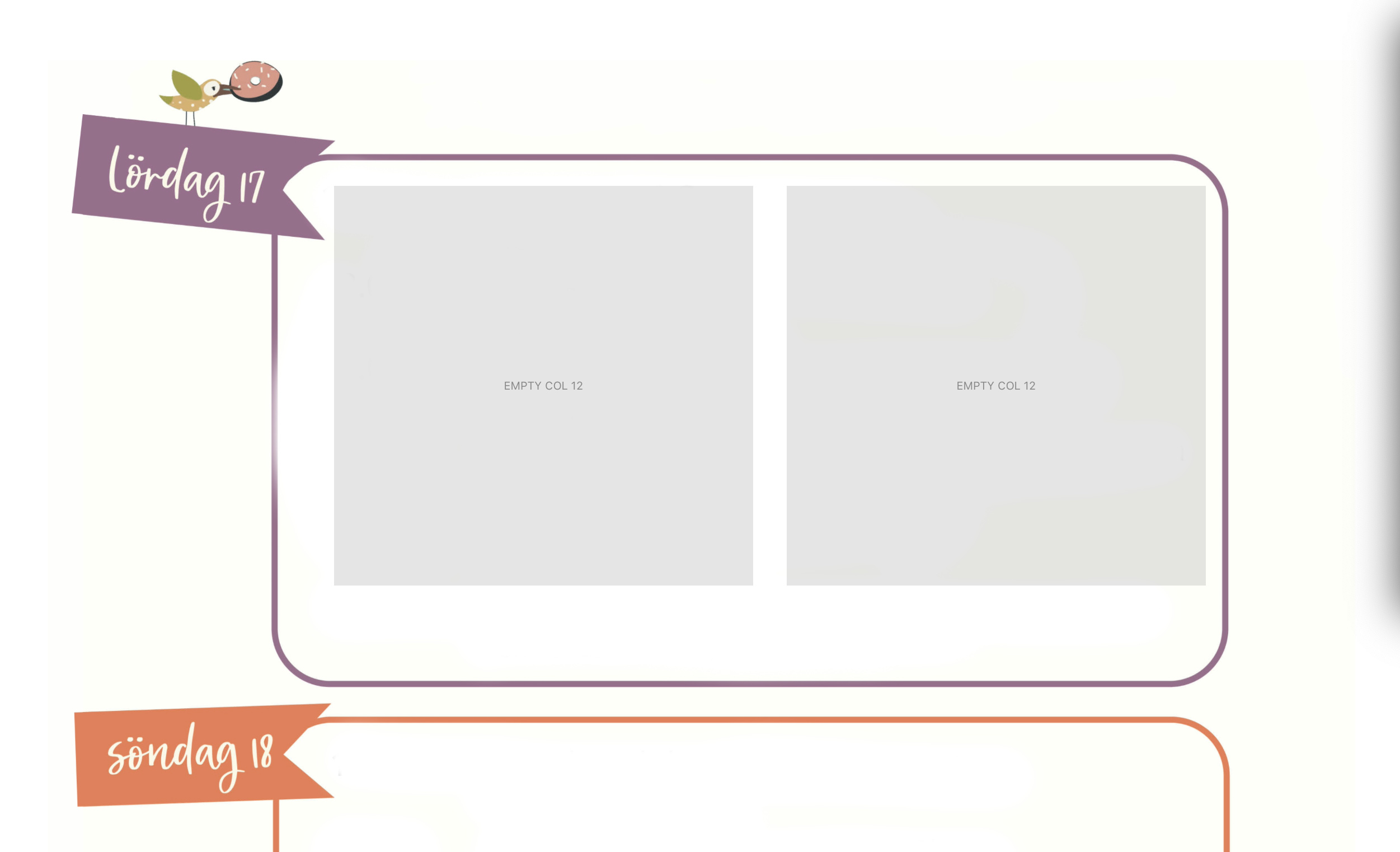
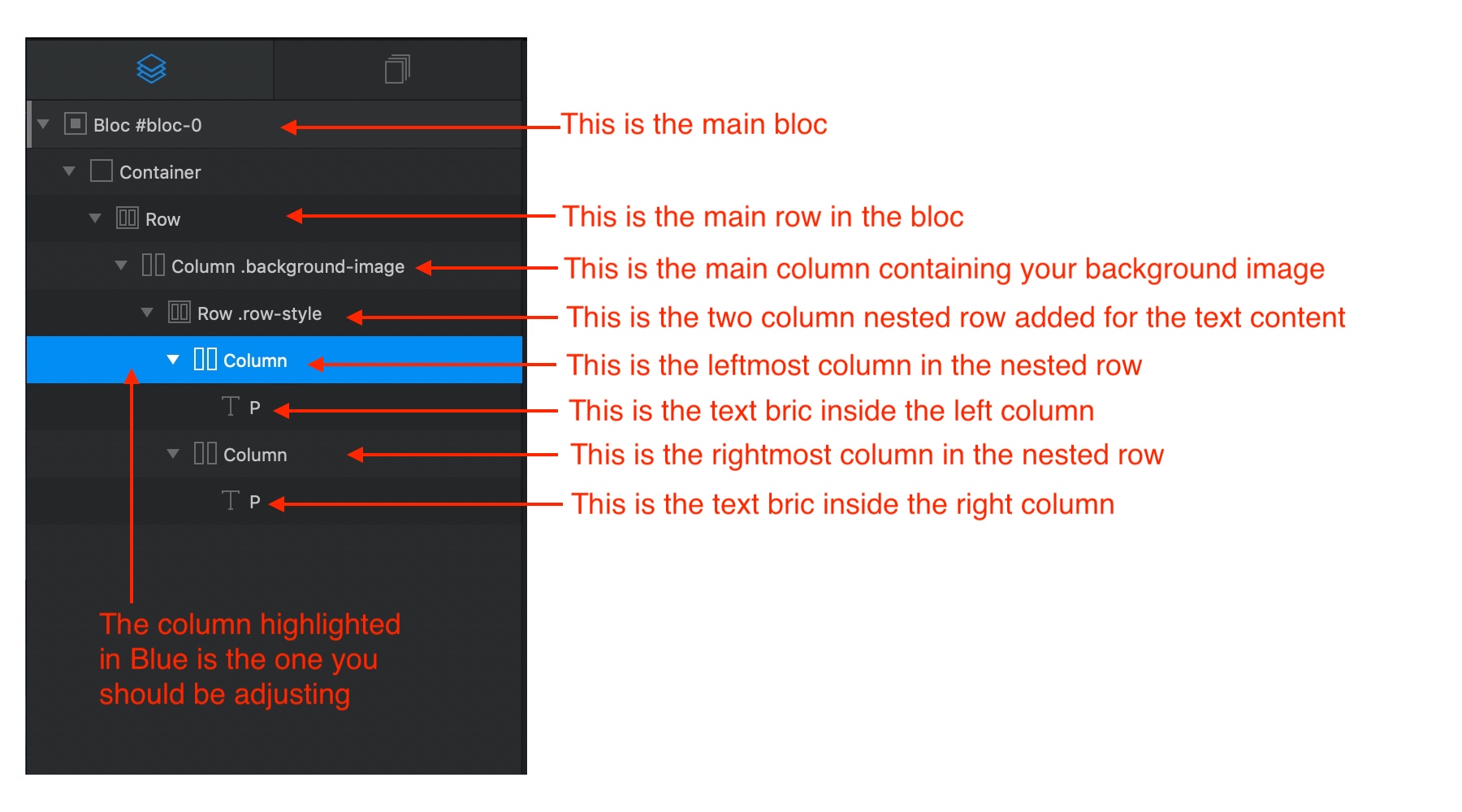
You will now have a column filled with your background image. Next, click in the centre of your column and add a two column row bric. Your page should now look like this:
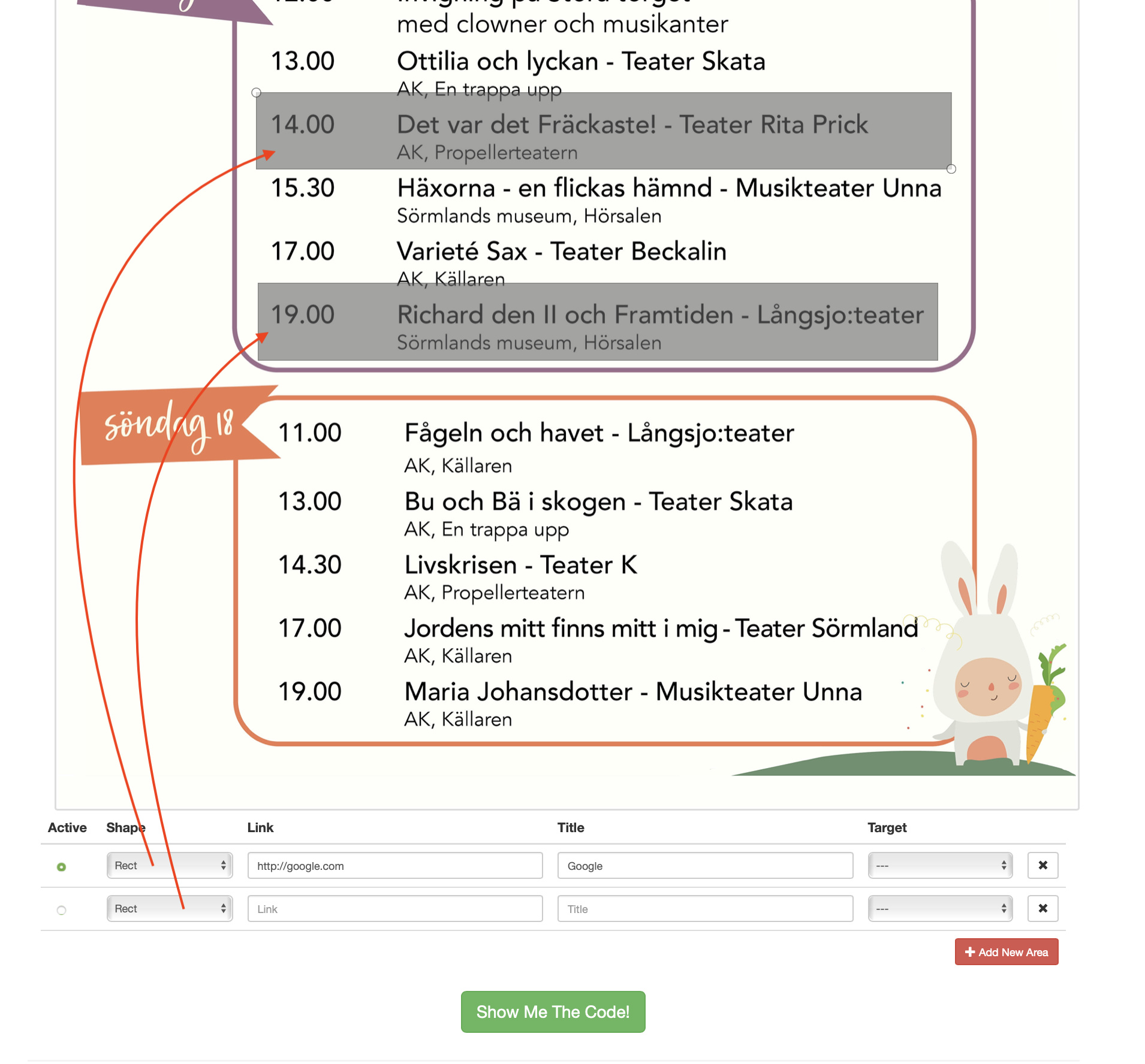
Clearly, this row now has to be adjusted to fit inside certain areas of the underlying image. You do this by creating a new custom class for this row.
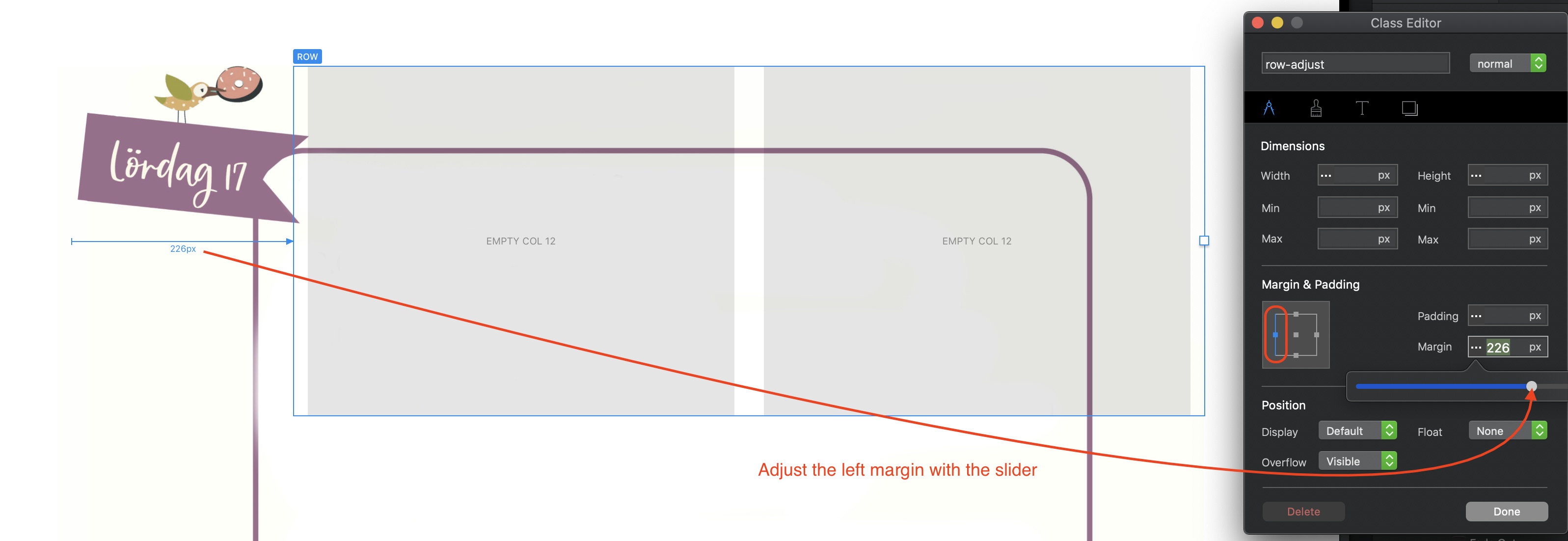
Start by adjusting the left margin as shown above. Next, select the right margin and adjust accordingly. Finally, select the top margin to bring the row down into the content area. This is the end result:
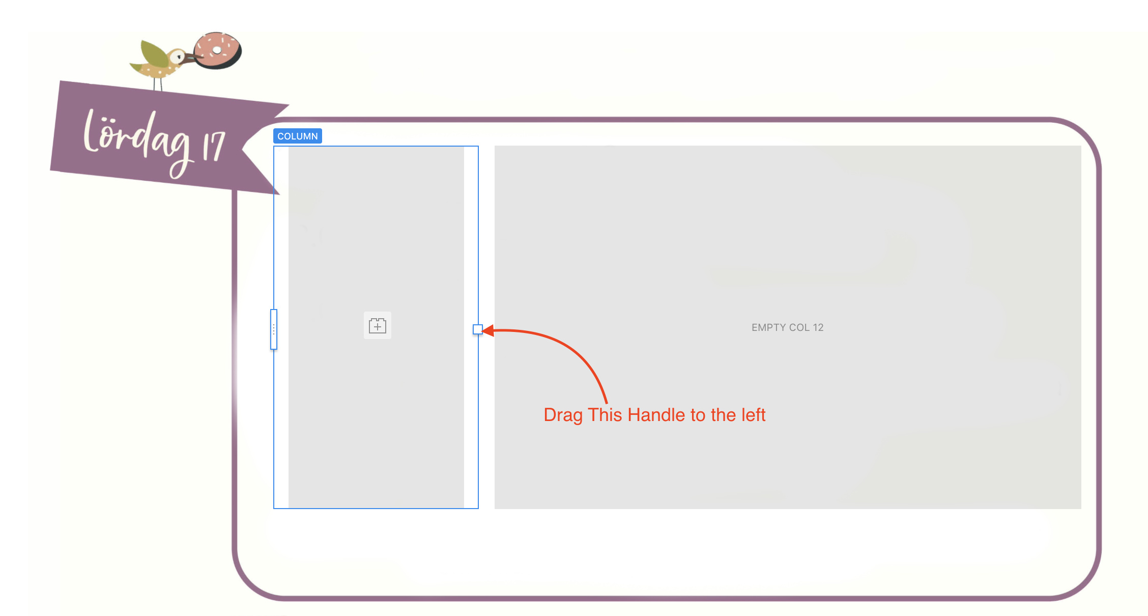
You now need to adjust the left column width so that it is narrower (for the dates/times etc). You can do this by selecting the column and dragging its resize handle:
You now have two columns into which you can place your text or heading brics to add your text content.
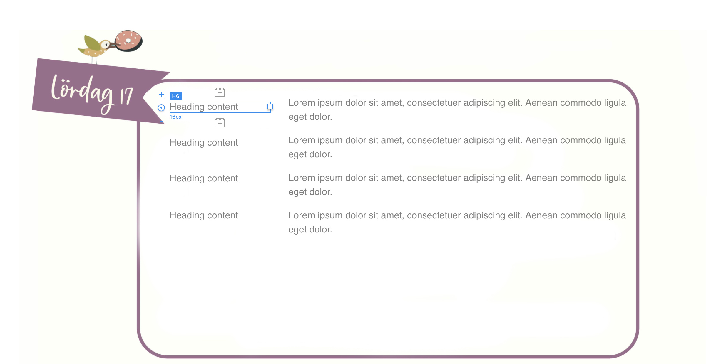
In my example, I added H6 brics in the left column and paragraph brics in the right column. I then added custom classes to the H6 brics and adjusted the top margins so that they aligned with paragraph brics. You can continue to add heading and text brics to extend the columns downwards to cover the whole image. When it comes to creating a larger space between the two date sections of the background, just increase the top margin of the relevant heading and text brics until they position in the correct date box.