Hi,
is there a way to have more than 3 columns in Mansory Container ?
Thank you !!!
Not 4 or 5. But you could double the masonry container to get 6 or any multiple of 3 (6, 9, 12 etc.) Of course the images will become smaller.
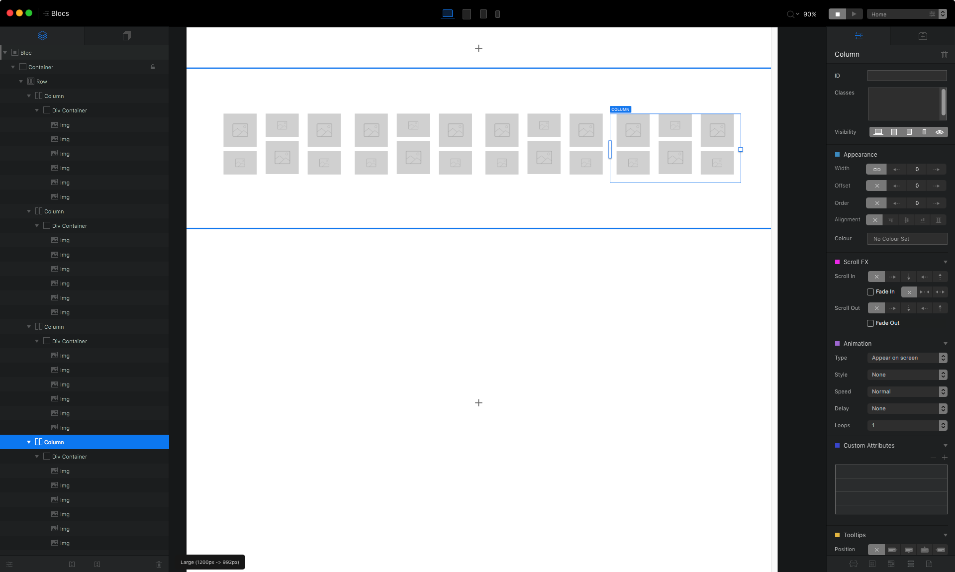
In the tree navigator go to the column and with right mouse click duplicate it.
You really want all of the images to be in the same column for it to work properly. Although @StFoldex suggestion works for a large display, the second column will stack under the first one at smaller breakpoints.
To make it responsive , and to set the number of columns you want, you need to override Bootstraps defaults with some CSS.
Add this to your page header and change the column-count to the number of column you want at each breakpoint.
<style>
@media (min-width: 576px) {
    .card-columns { column-count: 2;}
}

@media (min-width: 768px) {
    .card-columns { column-count: 3;}
}

@media (min-width: 992px) {
    .card-columns { column-count: 4;}
}

@media (min-width: 1200px) {
    .card-columns { column-count: 5; }
}
</style>
You won’t see these changes until you preview in Blocs.
Thank you @StFoldex, but all the images have to be in the same column for it to work properly I think, and also, I’d like to have the same space in between all images.
Thank you @PeteSharp, it is working, I just need to find the way to change the space in between images but it looks good already !!! 
Hey @chrishsl
You can add a style called column-gap: to the above CSS.
eg.
@media (min-width: 1200px) {
    .card-columns {
     column-count: 5;
     column-gap: 20px;
}
}
Since Bootstrap is mobile first, any gap you set on the smaller breakpoints will apply to the larger ones, unless you set the gap. So, as a suggestion, start with the smaller breakpoints when adding the spacing you want.
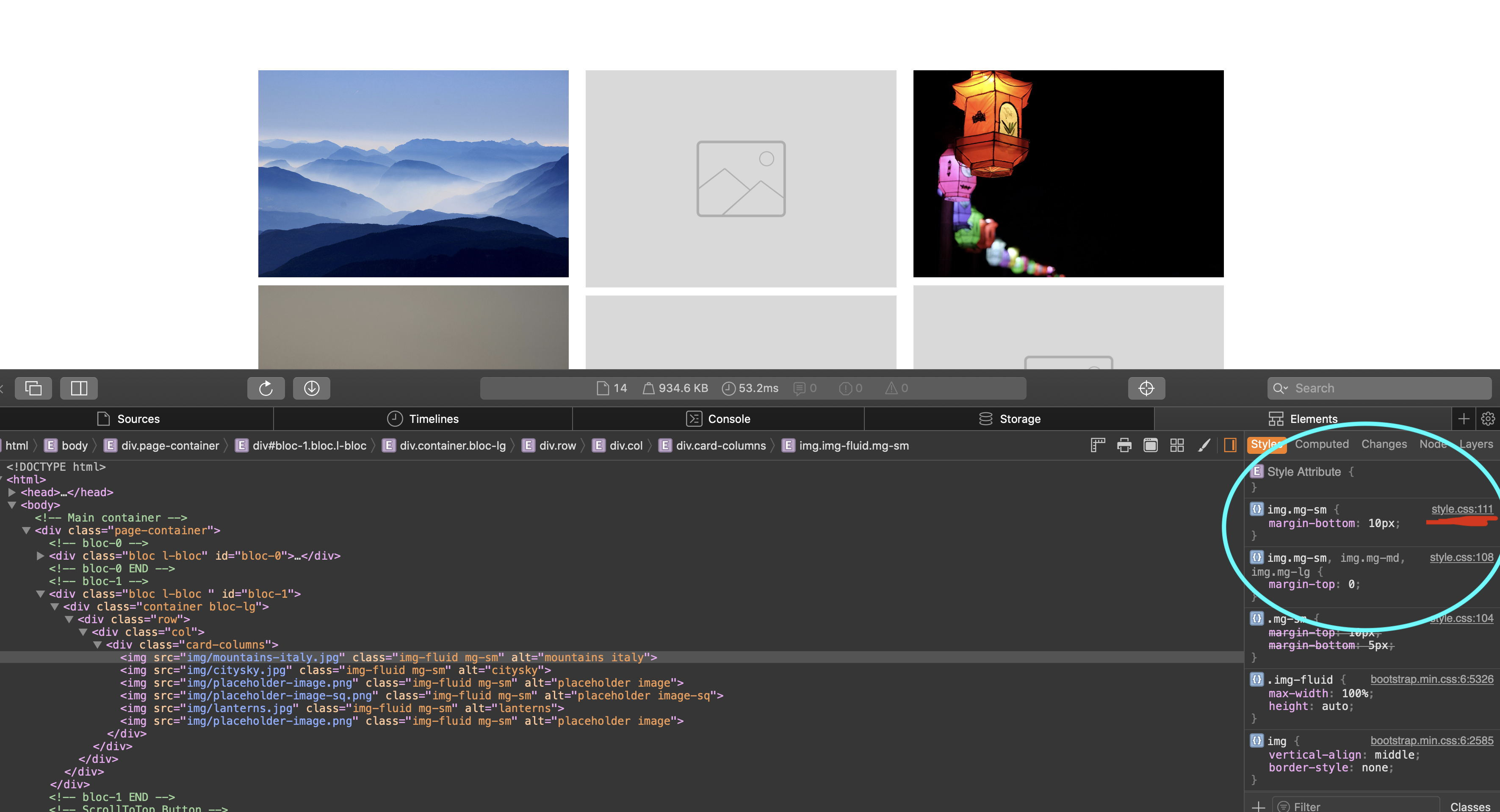
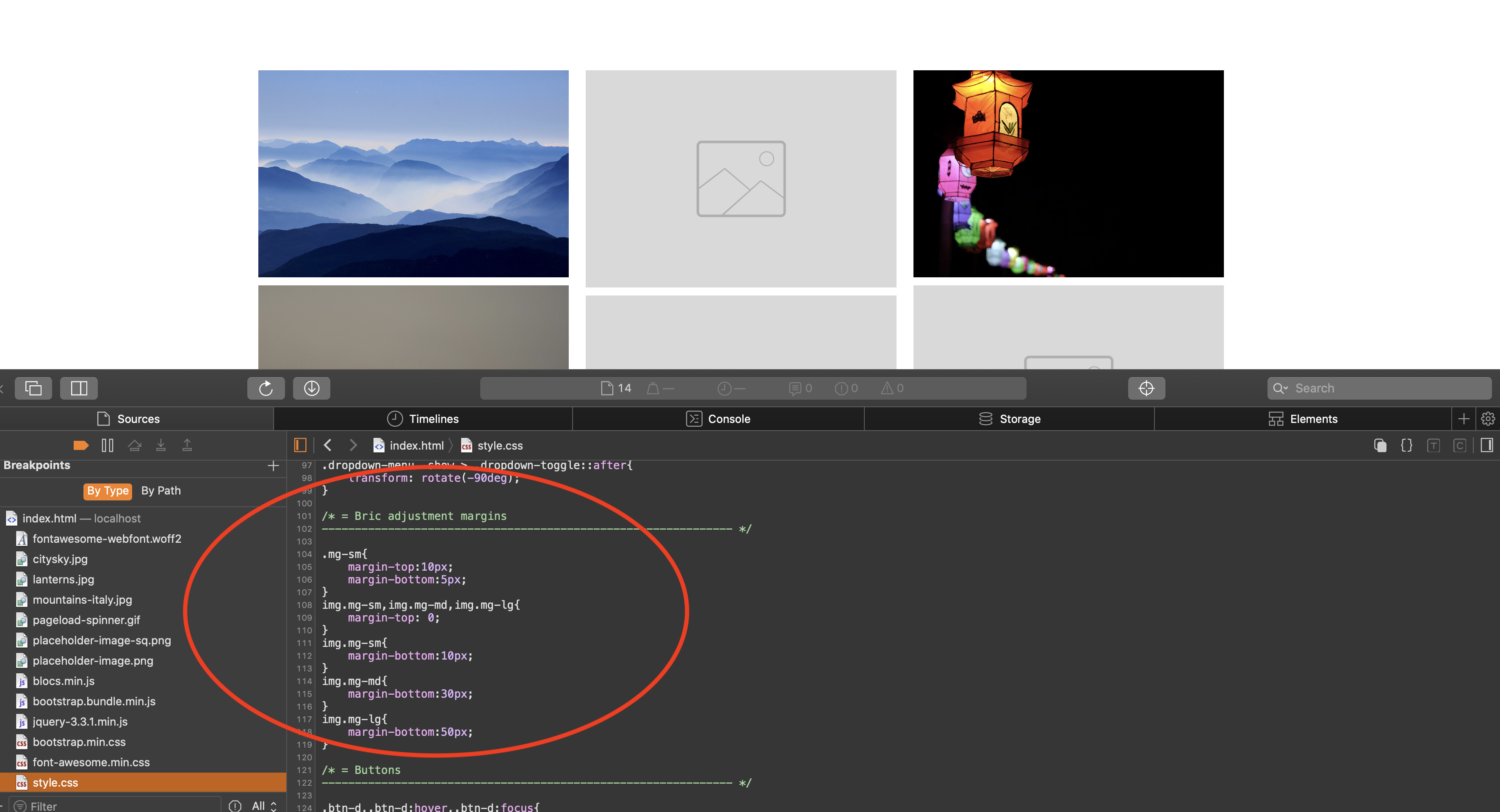
FYI, People have asked me how I know these classes and attributes. Its actually not very difficult. You can use the Safari Inspector tools to find the original Bootstrap classes that you need.
This is how I get them, if I am unsure.
Awesome, thank you ! one last question, what about the gap in between images (vertical)
Blocs is adding that. You can add these classes to the header to override them
If I were you I would add an ID to the Div wrapping the whole gallery so you can just target the classes in the gallery.
For example.
<style>

#myGallery img.mg-sm {
 margin-bottom: 20px;
}

</style>
So you could have something like this to tidy it all up @chrishsl
Change the column count, gap and the margin to suit your design.
<style>
@media (min-width: 576px) {
    .card-columns { column-count: 2; column-gap: 20px;}
    img.mg-sm { margin-bottom: 5px;}
}
@media (min-width: 768px) {
    .card-columns { column-count: 3; column-gap: 20px;}
    img.mg-sm { margin-bottom: 5px;}
}
@media (min-width: 992px) {
    .card-columns { column-count: 4; column-gap: 20px;}
    img.mg-sm { margin-bottom: 30px;}
}
@media (min-width: 1200px) {
    .card-columns { column-count: 5; column-gap: 20px;}
    img.mg-sm { margin-bottom: 50px;}
}
</style>Great, happy to help.

