Hi there,
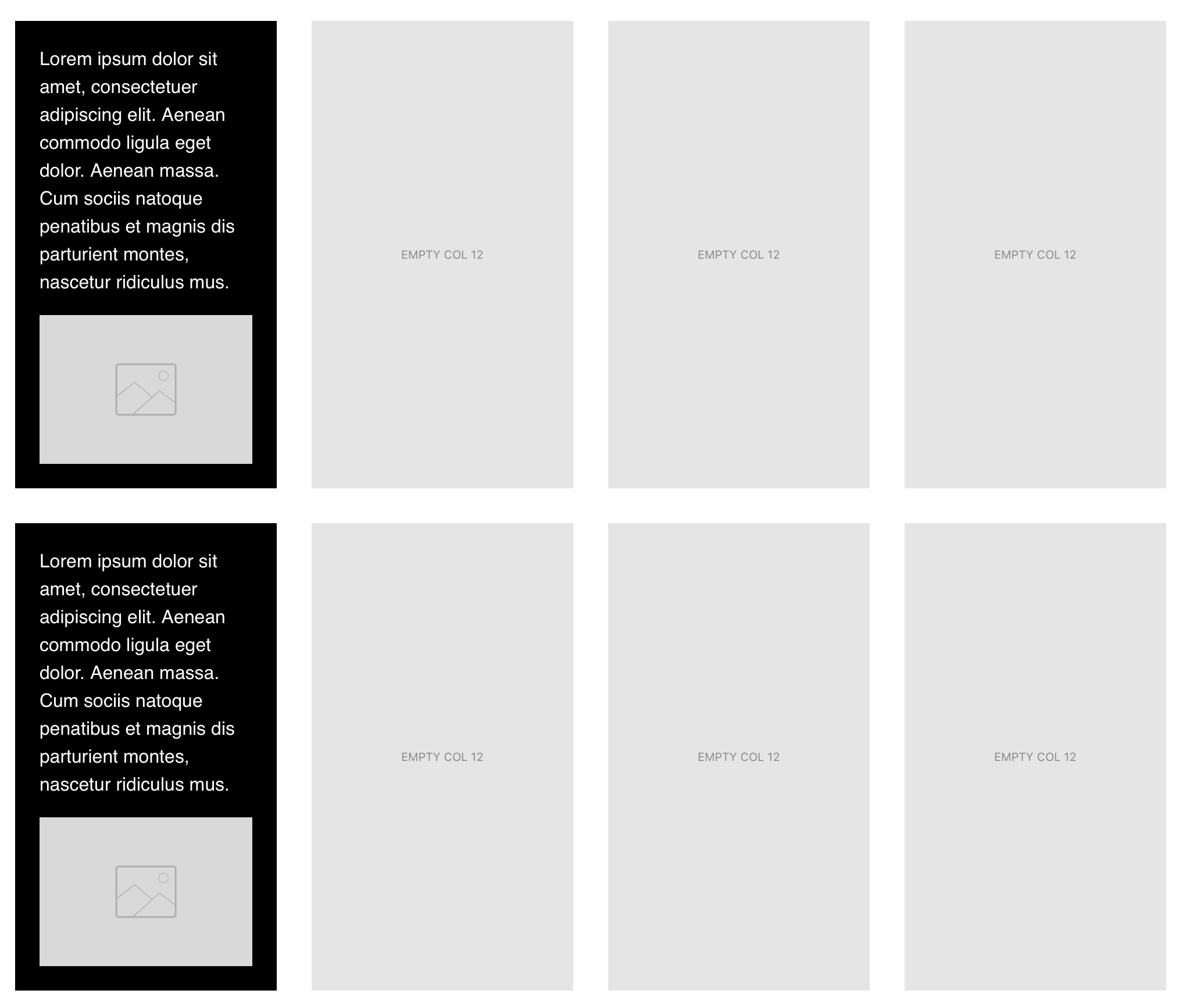
when I create a 4 column row, and want to add 12 px margin to make some space between columns.
each column is 3 x4 = 12 so I expect the column to fit in single row. but for some reason margin break the layout to have only 3 columns in 1 row
I understand that the 12px margin is the issue but is there a way to keep some empty space between columns without overriding the breakpoints.
columns have background colour and without spacing those columns looks weird.
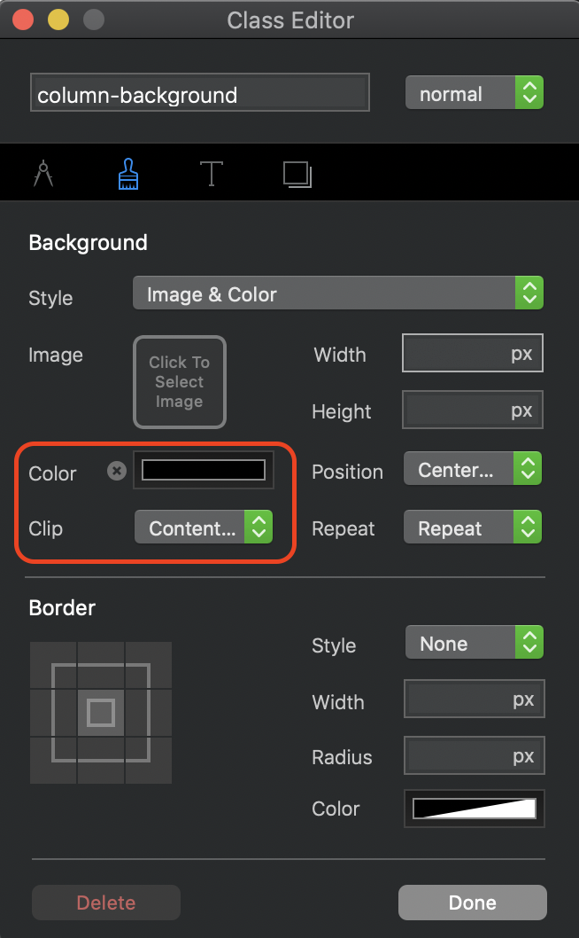
Create a custom class and set the background colour there. Also make sure that you set the “Clip” option to Content box. This is what the custom class should look like:
For subsequent rows. Select the row containing your first 4 columns and press control-d to duplicate it. With the second row selected, add padding to create the space between rows:
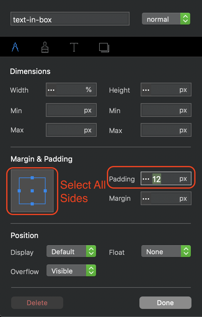
When you come to adding content into these columns, you will need to create another custom class to create padding. Here is how the custom class would look like for a text block placed inside the column.
Another (possibly simpler option) would be to just add cards to your columns and set the background colour of those. These will automatically fit to the content width, thereby leaving the required margins between columns. It will also save you having to create a custom class for the text inside a card. This is how cards would look:
1 Like
@Jannis It would be a nice option, but padding doesn’t work on backgound colours,
2 Likes
thanks @hendon52
I really appreciate your expert advice and help.
for some reason the border radius of 10 pixel is not working.
is it possible to add border radius while using the clip- content option
Thanks again for taking the time to help me.
Hi @Jannis
As @hendon52 explained padding doesn’t work with background colour
if the content box had no colour you are right I will use padding its easier
thanks
1 Like
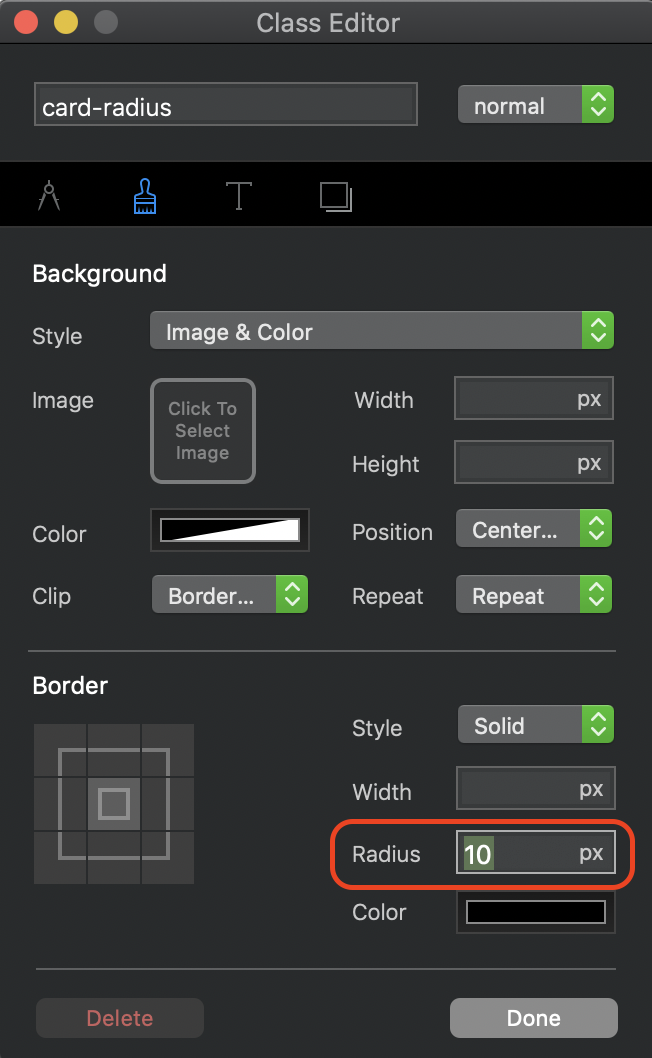
@anon34927337 If you use the card option, simply create a custom class and add it to the card. The settings for the custom class look like this.
It should be noted that you do have some corner options in the properties panel when a card is selected, but I’m not sure what the two raidius options are set at.
If you use a radius setting on the column background, the result will not be good.
In fact, the clip content option is essentially the same as the card option, but the latter does let you do more things, such as adding a radius, so go for that option and save yourself a headache