Multi Resolution Images does not work on 2010 iMac

Multi resolution images do not work on iMac (27-inch, Mid 2010) which has a 2560 x 1440 display.

I created 3 images with widths 1000px, 2000px and 3000px.

On the 2010 iMac, the 1000px image was shown and on an iPhone 6s, the 2000px image was displayed.

I then created 3 images with widths 250px 500px and 1000px.

The 2010 iMac displayed the 250px image. It seems that when viewing on a 2010 iMac you only get the image assigned to the 1x slot.

I tried this in Safari, Firefox and Chrome with the same result.

Any ideas on what the problem could be?

Has anyone else experienced multi resolution images not working on computers and devices?

Does anyone have a website with multi resolution images that I could try out, to see what image I get on the 2010 iMac?

Thank you

Does the iMac have a retina screen?

1 Like

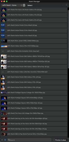
http://www.jeffriramli.com/ has images with different dimension sizes (@1, @2, @3).
See some of the thumbnails of the Blocs’ Asset Manager to identify the images on the website in the screenshot.


I look forward what results you discover.

Norm, thank you for your question.

I believe the 2010 iMac was not advertised to have a retina display, the ppi display density is 108.79ppi.

I presumed that since the width of my screen is 2560px, the browser would have chosen to display the 2000px image, but it chose the 1000px image, which does not look good.

I tested the issue further, by creating another set of images 250px, 500px and 1000px, where I presumed the 1000px image would be chosen for my screen, but it chose the 250px, which of course does not look good when scaled to a width of 2560px

I have set the image size of my pictures to 100%

I’m currently not using multi resolution

Thank you StFoldex,

the @1 images are the images that become displayed, however, it does not seem to be an issue. Though I can see some slight pixelation on the image with writing, but not to the degree that it looks bad.

I think you misunderstand how 1x 2x and 3x images work.

The use of 2x and 3x images is related to the use of retina-based screens where one screen point occupies more than one screen pixel.

If you view the website on a non-retina screen only 1x is used.
2x and 3x will be used on retina based screens - which one is used is dependent on the PPI of the device.

So your non-retina mac will only use the 1x image. This is not blocsapp related it is IOS behaviour.

If you want to use larger images on bigger screens just vary the image used according to mobile/tablet/desktop.

1 Like

Thank you Pauland for clearing that up and suggesting a solution, though that will be fairly time-consuming in my case. I will have to test for slow download times to see if it is even needed to have lower resolution images.

From my point of view that is a silly IOS behaviour, which renders the multi resolution feature pointless. In my mind, it should feed the highest resolution image to screens with a high resolution and not be dependent on if it is considered Retina or not. A behaviour I believe would avoid confusion.

Imagine if I had been working on an iMac with Retina display, my images would have looked shit to everyone without a Retina displays and I would not have known about the issue.

Since it is an IOS behaviour, then I wonder how do Windows and Linux respond to that feature?

I have always believed the Retina description to be a slight gimmick from Apple since any screen will become Retina if the viewing distance is far enough.

I guess that was my rant.

Thank you

Wow, I feel the pain!

As someone with an iPhone (all modern iPhones are retina), an iPad (Retina) and a retina MBP, I can assure you that the scheme works exactly as it should and is excellent!

Essentially the browser/screen logical resolution (ie points) is different to the physical resolution, so logically by default my screen is 1440 points wide but the screen actually has a resolution of 2880. Text will be rendered using the full 2880 resolution.

A full screen image of size 1440 will be stretched to occupy all 2880 pixels and will look less crisp than I would expect, the same would be true of say a 100x100 pixel image that occupies a 100x100 points square, but if the image was actually 200x200 it would occupy the 100x100 point square but be displayed at the full resolution - looking crisper.

In a browser window, if the image should occupy a 100x100 point area then the browser will use an image with the 2x suffix if it is available knowing it’s a higher resolution image for retina screens, so I see a crisper image. If that image isn’t available I’ll see the standard image. If the standard image is already 2x bigger than it needs to be, them that’s fine. If it’s actually 100x100 it doesn’t look as good as it could on my screen.

For people who don’t have retina screens your images won’t look shit because at the lower screen resolution those users have (ie you) it will look perfectly normal (or everything is shit as you put it).

I’m not so familiar with this technology on Windows system and I know that originally windows systems used to always use the full display resolution, so on high-resolution panels the display had small text, etc as a result, but I think that’s not the case anymore.

If you imagine I am wasting all that screen estate by viewing with a width of 1440 when the panel has 2880 pixels, that’s not the case. I can choose to adjust the point system to use the full resolution and get small text etc as if it was physically a much larger panel. I used that feature a lot when working on an app that would be used on a system with a pixel screen width closer to 6,000 pixels wide.

I also have a non-retina iMac. I once worked with another guy remotely who had a non-retina screen and we discussed image quality and it was a bit difficult because he saw those images at a lower resolution and so would see issues when I saw none if I didn’t deliberately view lower-res versions.

Retina is a brilliant system and indeed anything looks good if you are far enough away to blur detail!

It’s all a bit HD vs 4K vs 8K isn’t it?
1 Like