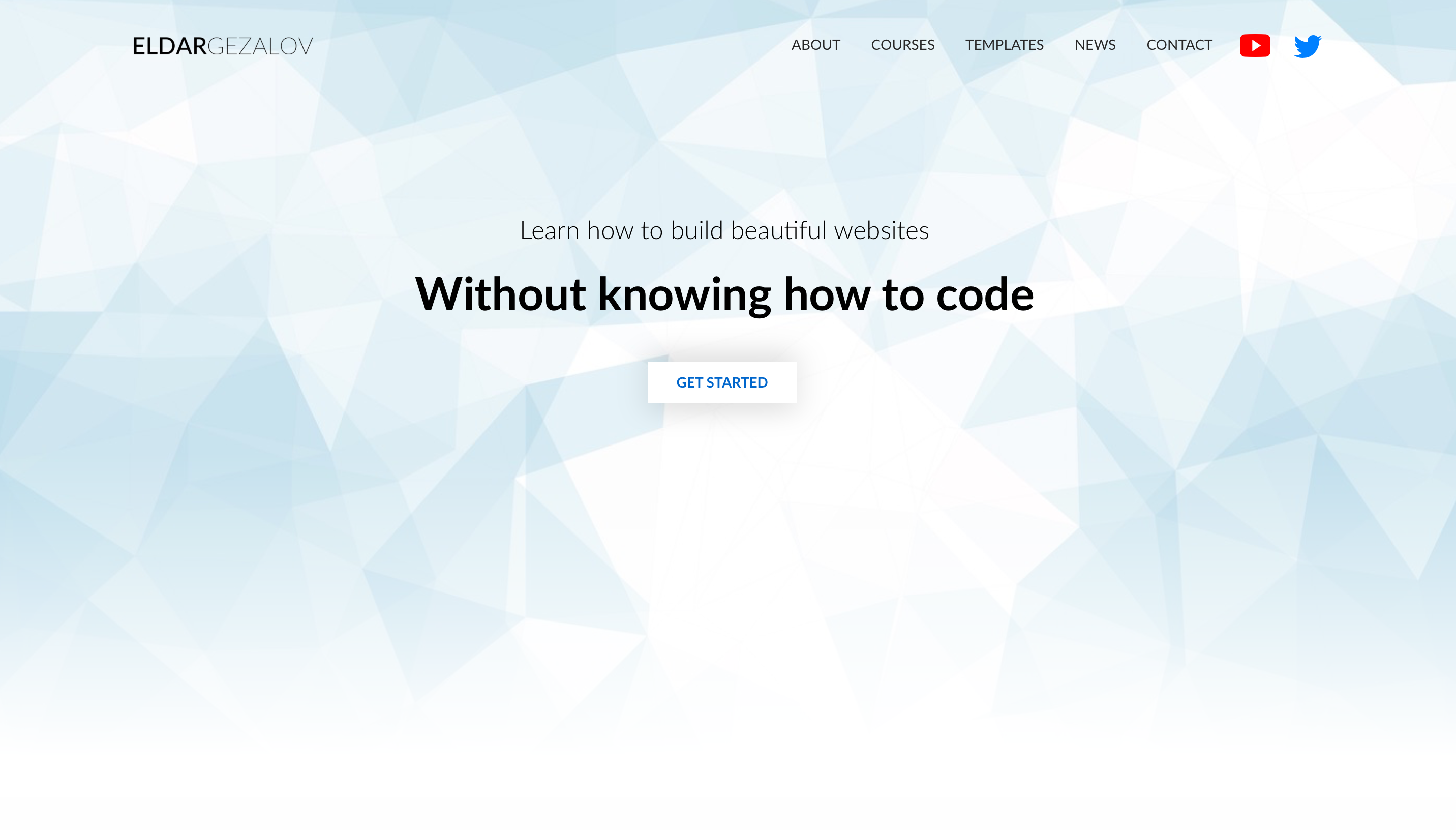
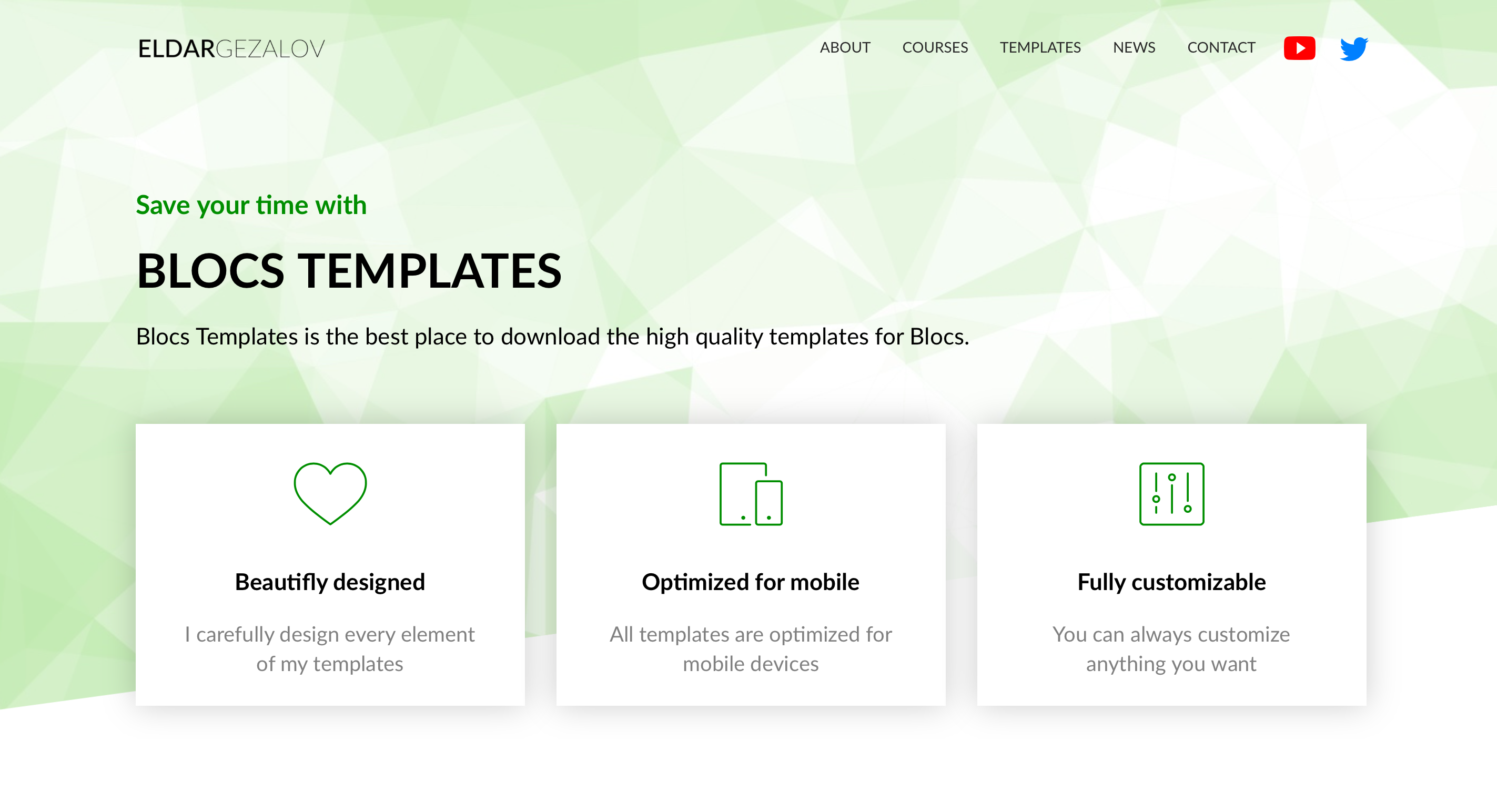
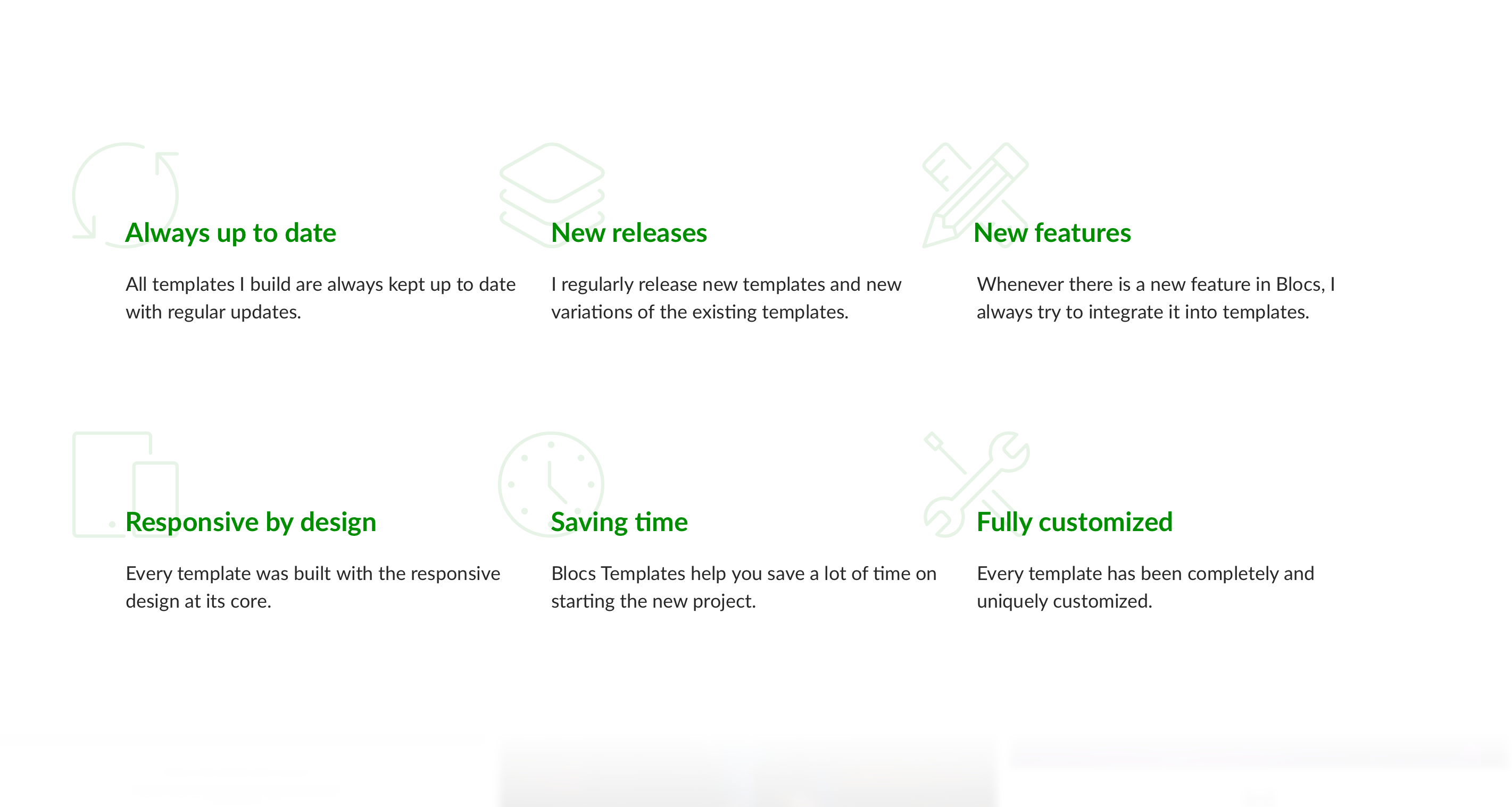
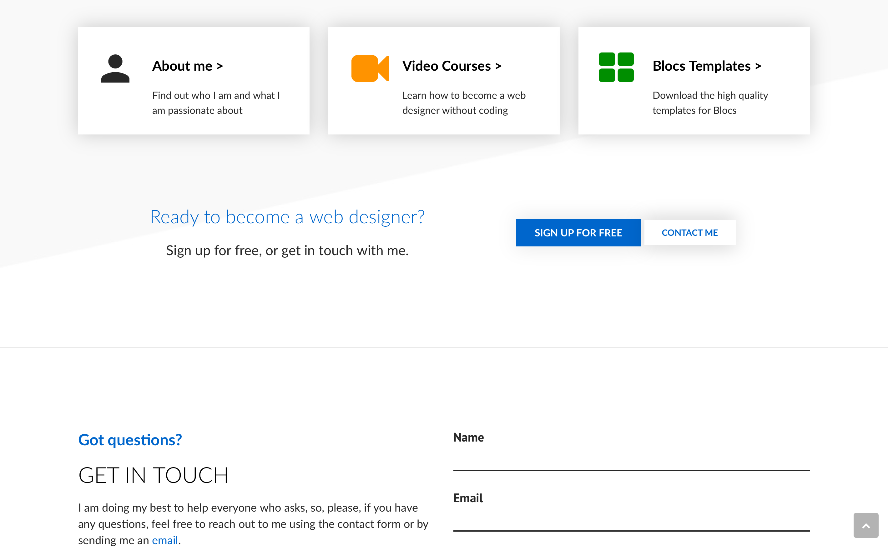
Hey guys,
I am building my new personal website with Blocs. It is not 100% ready, but the basic structure is almost complete. Any feedback is highly appreciated.
Link: http://EldarGezalov.com
Cheers,
Eldar
Hey guys,
I am building my new personal website with Blocs. It is not 100% ready, but the basic structure is almost complete. Any feedback is highly appreciated.
Link: http://EldarGezalov.com
Cheers,
Eldar
Not very technical as a response, but I’ll just say wow, that’s impressive.
Looking really good. It doesn’t look like a Blocs site - and I mean that in a good way.
Agreed, it’s nice to see a design thats thinking outside the box or should I say the Bloc… 
Thanks guys!
Very nice!
I like your new personal website! 
Awesome site! It loaded super quickly here too. Nice to see what’s possible with Blocs!
TOP Eldar, nice pictures, good contrast of colors! BRAVO
Thanks guys!
The most amazing thing for me is that I was able to build this site in just 2 days.
Now, I will work on custom styles to make it look perfect on mobile, because right now it is a mess on mobile
I will come back when it’s ready!
Cheers,
Eldar
I have noticed that sites done with Blocs seem to be particularly fast loading, which is wonderful. Sites done with Rapidweaver often suffer from more significant render blocking above the fold in my experience.
It’s really cool but to be honest some of the parallax make me a bit dizzy. Might want to tone some of it down a bit. Just a thought.
Certainly a nice design, it’s given me some ideas to play around with.
I have finally did some work on optimization for mobile, so it should look better on mobile OSs. Still not perfect, but I’m getting there!
Actually, for this site I did my best to optimize every single image to make it load faster. Sometimes, I have even sacrificed the quality of background images, which is luckily not very obvious at first sight.
Few things I noticed:
Hey guys, I have updated the site with fresh design.
Great site, well done.
The pop-up with email ‘collector’ was it done with Blocs or your expert coding?
Thanks,
Greg
Like it, especially the ‘double parallax’ effect where top and bottom layers move at different speeds. Very nice.
Just wondering though why you are utilising two top menu styles, and none at all on one page?
Can’t see the logic of that, and to me it frustrates easy navigation!