I work with music and theatre. Feel free to post comments or ideas here.
• Is it easy to get an idea on what I do?
• What would I need to do more?
Thanks!
Anders
I work with music and theatre. Feel free to post comments or ideas here.
• Is it easy to get an idea on what I do?
• What would I need to do more?
Thanks!
Anders
@Nanoq Grymt snyggt!
I really liked your page, It’s light and fresh and not a lot of disturbing elements.
Good use of Lity Lightbox as well 
Yes I think it’s easy to understand what you do
I don’t think it needs more. (less is more)
Cheers
Hey,
I agree with @Jakerlund, less is more and you have done a great job of simplifying the design of your website without losing anything.
The only thing I would suggest is using the different text styles for the page titles (videos, projects) and the project titles (Musikteater Unna, etc). But even in the current state, it looks ok.
Cheers,
Eldar
Clean and compelling composition. It leaves the audience needing to explore deeper, especially with that initial image.
Thanks for the replies! That was really nice to hear!
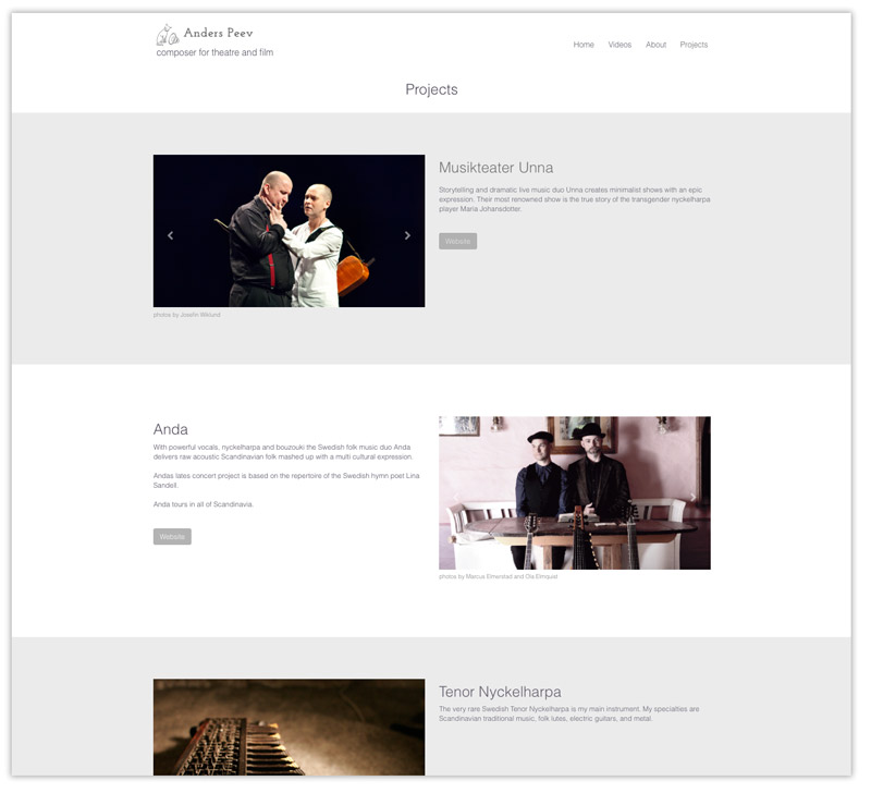
@Eldar, I will look into your suggestion and change the fonts in the page titles! Two of the projects on the projects page have their own logos, since they are a band and a theatre group ( Anda & Musikteater Unna). Should I use their logos in the projects page?
Or is it better just to have the fonts that I use now?
Anders
Tjena @Nanoq
I agree with @Eldar about the fonts, they don’t stand out enough right now.
I would include the band and theatre logos for stronger branding and recognition.
/ Johny
Tack! Det har du rätt i! / Anders
Good job!
I would agree with the earlier comments.
On the projects page I would be tempted to try two things and choose one ( or none ) of them.
I’d consider adding a line delineator between blocs, so that there is a slightly stronger ‘structure’ to the page, or
I’d consider making alternating blocs to have a slightly different colour background (very, very subtly different), so the blocs are delineated. I might even do that for the navigation. People often use that technique for table rows.
Really nice work though - on the site and your production.
Paul
Thanks @pauland!!
That’s a very good point! It would make the different projects clearly separated from each other. I will experiment with this. Thanks for the creative input!
I have also been thinking of having photo-backgrounds but can’t think of any motive that wouldn’t make the whole site messy. The idéa would perhaps be that a photo-background would add something to the storytelling of my work.
Anders
@Jakerlund!! Thanks! That looks very nice! Did you hack my site just now 
I think I will do this!