Perhaps I am missing something here and other users with more experience of Blocs know the answer, but I am having a go at a first website for a client using Blocs and the theme of the website is chocolate making.
The client wants elements of chocolate colours and if you end up with 5 varieties of chocolate brown the colour organisation becomes a bit of a headache. Simple named tags would solve that.
In Freeway I recall being able to label colours with a personal tag that made sense while building a website and I’d like to see something similar with global swatches. Changes to global colours will naturally affect other parts of a site, so to avoid this you then end up potentially creating more colours than necessary, which adds to the confusion.
This wouldn’t need to be ugly or cluttered. I am sure an elegant, but functional layout could be developed.
Yes it doesn’t really matter if we are talking blues, greys or greens, because the principle is the same. Any web design that makes use of subtle variations in tone is tricky to manage in Blocs on a multi page website, even if you have good colour vision.
It’s worth remembering that colour blindness affects up to 10% of all men and for these people it must feel impossible at times. A simple system for allocating user defined names to colours would solve all of this and make it much easier to create a website with a coherent colour scheme. We could add tags like “button orange” for example or “light blue border”. Anything that makes sense to the designer.
I think a tooltip would be fine. If the colour could use the Mac colour picker names that would be very good. Otherwise the hex code or a way to name the colours would work well.
Getting the colours fine tuned is a always a big challenge so its need all the assistance it can get.
It would certainly be better than at present, but possibly still incur an unwanted delay passing over several variations to find the right option. Like most things it would have to be tested.
At times I’ll build up a selection of similar tones simply experimenting with options. Before you know it you have five variations of light blue and not a clue where to go next. Hex codes are great up to a point but no substitute for “button orange” or “footer blue”.
Ideally I would like to select a colour and give it a name that remains visible when checking the swatches. Another advantage of giving names to colours is that it would enable us to keep things tidier by deleting unwanted colours at a later stage without the risk of affecting the design. That would make the global swatch area itself cleaner and more manageable.
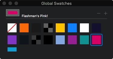
From memory, Freeway did this by having a vertical list of project colours with a small colour sample on the left, followed by a few words of user defined text. In Blocs perhaps we could keep the current layout as shown in the attachment but have a dropdown menu of global swatch colours appear when you click on colour selection. I am sure others would have some suggestions, but at the end of the day we all just want it to be fast and easy to manage.
Just an afterthought observation, but the recent trend for very subtle variations in tone between different sections and low contrast has made this more of a problem than in the past. We don’t see too many web pages these days like the one in the attachment.
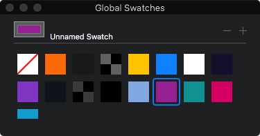
Yes please! as one of the 10% mentioned by Flashman, it would be a wonderful, even essential asset to have ‘named colour swatches’ (unless I have missed seeing how to do this). I notice the role-over comes up with ‘unnamed swatch’. As a recent Adobe Muse migrant I am wishing the Blocs developers all the best and big thank you for dedication and effort.