I am working on a one page project with buttons to toggle modals. On smaller screens (breakpoints) I would like to use a dropdown button, and the links works, but I would like to change the color on the list items as one hoover the individual links.
I have tried with custom classes, but not being able to get it to change the background color as one hoover the list items.
Anyone having a tip here.
Is it possible to use a navbar to toggle modals? Remember only one page…
And I am using the global areas, but that can change.
1 Like
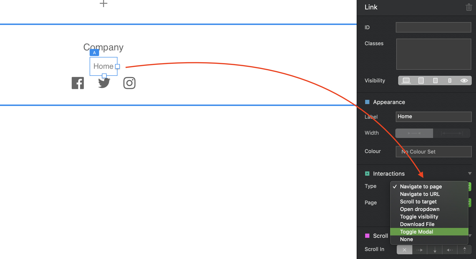
It is possible to use a navbar to toggle modals. Just change the source of the menu from Primary Menu to None. You can then select each link and set its interaction to any of the available options.
Thank you @hendon52, you are quick to help.
Now comes next question: Is it possible to make the links in the menu look like buttons? Or anything else than only text?
I’m sure it is but we need to know the classes so that they can be styled - I’m not familiar with all the built-in classes so I’m probably not the best person to answer that question - Maybe @PeteSharp will see this and come to the rescue.
An alternative may be to create a mini mega-menu. Essentially, you create a bloc directly under your main navigation and populate it with normal buttons that you can style how you like. Then, instead of using one of your main navigation links to display a dropdown, you would use it instead to toggle visibility on your sub menu. Basically, you hide the sub menu and then set the main menu item to toggle visibility.
I’m not sure if this is a suitable option, but it could be a whole lot easier to deal with if you want a button type navigation.
Edit, The main menu links can be styled like buttons by creating a custom class and adding background, margin etc. I’m not sure if the same can be done with the drop-down items.
Thanks again, @hendon52 for quick response. I have begun thinking of doing what you suggest two minutes before you came back. That could also solve another problem, with the list items from the dropdown doesn’t push content beneath it down when toggled.
As of the option of navbar menu and designing them, I hope @Norm will have a nice supprise for us in version 4. But, until that time arrive, perhaps @PeteSharp have a few cents to this question.
The dropdown seems to be difficult to do much with, but I am perhaps looking in the wrong direction here. But thanks for you input.
Hey @Solvberg
The main navigation class is (make sure you preserve the spaces)
navbar-nav li a
NOTE: This will also style the drop down menu items, but if you want them to look different, there are a couple of ways to do it… I use…
dropdown ul li a
For the breakpoints where you are using the toggle. Its easy to use the sub classes built into Blocs to add them to the Class Manager
Special navigation links = the mobile menu
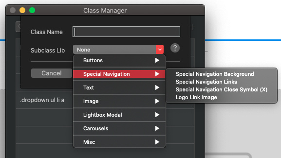
Yes, using the above classes you can set a background colour, border radius and a margin etc to create a button effect. You could also assign each item a button class, I know some people do this, but why add a class to each item when you can apply it to the whole nav with one class 
1 Like
Thanks a lot @PeteSharp. What should we novices done without you guys?