New Bric (Upgrade) Textbloc 2

TextBloc 2 is the upgrade from the free add-on. for Blocs for Mac software, a popular Mac-based responsive website design tool.

This bric makes your site’s text continuously responsive. You now have continuous responsive text in Blocs app without the need to edit code.

settings

Upgrading to this paid version helps this and other projects grow. Thanks for your support.

Improvements

This version has improved usability, improved stability and now TextBloc is stackable. Use on as many targets as you need. Also help notices and tool tips throughout make it easier to use than previous versions.

Things to consider when using TextBloc

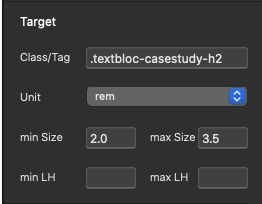
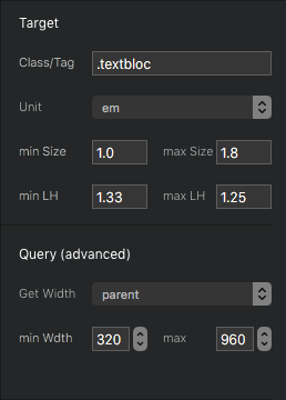
  • The min and max font-size is the simplest concept to understand. The minimum size the text will be and the largest size it will be.

Can I target more than one element?

Yes, Textbloc 2 is stackable, meaning you can have unlimited number of targets. You can also include multiple elements in each field, separated by commas. Also you can target a row or div and all text within that container will be resized.

The min-width and max-width setting (advanced)

The width is calculated from the parent container or the element itself. NOT from the width of the browser. This is important to understand. If the column is not full width across the screen you’ll likely need to adjust the min-width and max-width to be within a range of how wide that column appears.

More detail on the widths

The widths are really important. They greatly affect the end result. To get the most from TextBloc it good to understand this.

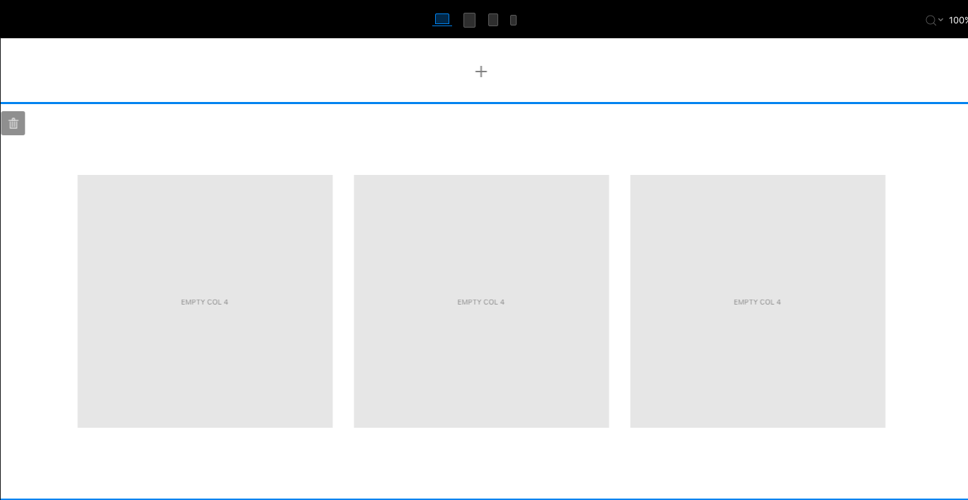
Let’s say you have 3 columns at the largest breakpoint in Blocs. By default, the width of those columns altogether is 1140px (see below). That would mean the columns themselves are no wider than 240px each at this size. The actual value and the gutters aren’t really important. These numbers don’t have to be perfect at all. we simply want an estimate of how large and how small our columns will show.

The next size we care about is small, because the columns actually get wider as they collapse into 3 rows By default that happens at 576px.

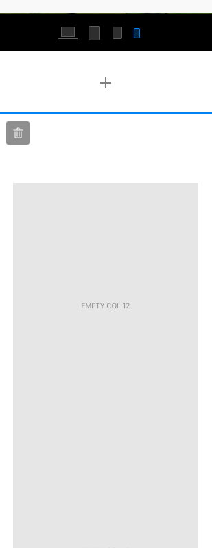
The last value we care about is the smallest width the columns will be, again approximately. This can vary greatly depending on your layout or nested columns and such. For this situation I’d go with 320px as the smallest size the column will be at any given time.

Let’s plug in the numbers? Actually a couple ways to look at it.

  • Now we know the smallest size 320 and the largest is 576. If we want to target some text in just one of these columns and have it resize how we’d expect, we can use these values and set our font sizes accordingly.

  • Alternately you could add the target class to parent row of these 3 columns. This would scale the text in the these columns according to the width of the row. The values you use for font’s will be different, but you’ll have the same control just targeting all fonts in those rows at the same time.

  • If you are using somewhat strange values for your font sizes that’s an indicator that you’re min and max-width settings are probably not ideal. Resizing still happens though, just using these strange values.

Upgrading to this paid version helps this and other projects grow. Thanks for your support.

Buy TextBloc here: TextBloc

8 Likes

Purchased, downloaded and installed.

4 Likes

Just trying this now for the first time. Any chance you could create a demo video?

5 Likes

Yes, I’ve been meaning to get one up there. I’ll make one tomorrow.

5 Likes

@Whittfield Just wondering if you are still planning on doing a video?

Casey

5 Likes

@Whittfield i have bought TB2 can I delete the TB1?

Thanks @Pealco, Yes, you can just delete it. You may need to restart Blocs after deleting it, and then do the install.

I did that just in case, but wasn’t sure if it was required.

@Whittfield This new TB2 have in app updates as you have in cards?

I’m rolling out in-app updates for all brics over the next couple of weeks. I have started adding it back and testing, it’s working well. So expect those updates soon.

OK, thank you…

Anyone have this working on a website I could have a look at, or if there is a demo of it?..thanks all.

1 Like

I am not able to guess how Textblocs works …

1 Like

I haven’t yet had a chance to try it, but I think a video would be helpful to explain the basic concept.

3 Likes

I just wanted to give a shoutout for this bric, which I have finally started using on a site for myself and it’s incredibly useful, especially with those awkward sized headers where you want some flexibility for different device sizes.

It’s now finding a place on virtually every page and in some cases multiple times. I seem to get strange results when I set the line height, so I leave those blank and just set the text sizes in rem and preview to test.

Screenshot 2021-10-01 at 11.12.38

2 Likes

Flash:

Got a link to a page where you have used this so we c an get a peek?

Thanks

Rich

Hi @Flashman i am still wondering if this is a bric I need! I do not have a clue if it’s something I need……
@Whittfield did you get round to doing a simple video of this working and showing it’s uses?..I have a feeling it could be useful……I think!

1 Like

I have nothing online with this bric. The website is still very much in development with a long way to go. It is over 100 pages and I am currently writing text before even starting with the graphics.

It essentially allows for smoother transitions with different browser widths, because the text size is changing dynamically to adjust at the same time. To give some context, normally I would adjust the width of the the header manually and verify using Blocs preview, but sometimes found later on that it might be cropped or fall awkwardly on a mobile or tablet with a narrower view. Sometimes you also see that snap change as well when the browser window is narrowed manually on a desktop.

When you fix the text sizes normally in Blocs they are set for specific breakpoints, but this is more flexible because it allows you set a range of sizes and it just floats dynamically within that range, so in my previous post for example you can see I allow the text size to vary between 2 and 3.5 rem. The second part of this video should give you an idea. It’s subtle but it just produces smoother transitions from very small to large browser widths.

1 Like

Thanks for the video and explanation.
Not being a programming, it helps to see something visual.

Rich

1 Like

There’s a working demo on their website.

1 Like

I have left the parent max at the default 960, but I see you have used 1400 on the demo. This bric has almost been like a hidden gem that needs to be highlighted more. I think a video tutorial would really help Blocs users who have not been clear on how it works or what it can achieve. It should really be in the essential list of must have brics. :slightly_smiling_face:

I did actually wonder if it would be possible to set size ranges at each breakpoint, but perhaps that defeats the object. I have found it excellent for creating big text headers for desktop that shrink seamlessly to smaller sizes.

1 Like