So, having taken some advice, forgotten some, remembered it, I decided to rework my photography site. You will be please to know that the pink has got lol.
I like it, it’s simple and to the point.
Casey
I feel it’s definitely lacking in the pink department…
I can feel a bit downcast when I see sites with a very dark background and so that’s not a vibe I’m totally happy with here.
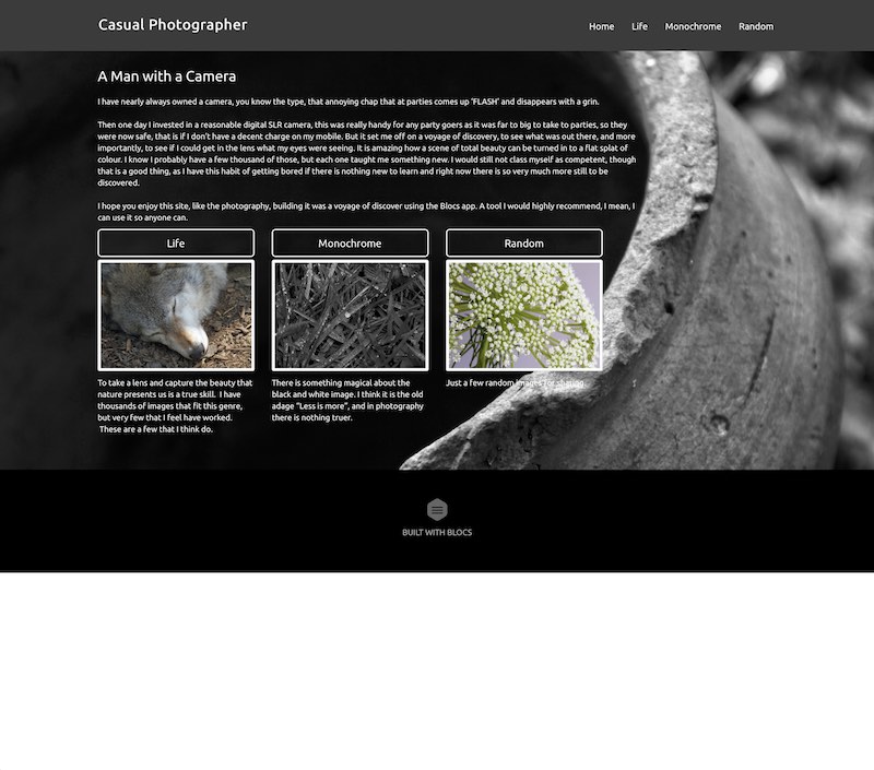
The menu says ‘monochrome’ the home page says ‘black and white’. Be nice if menu and content agreed!
The monochrome gallery is not working properly for me - choosing a thumbnail does not bring up the image.
For a personal gallery, I wish there was some narrative about the images - “I saw this cute spider on a leaf in the local park and thought it would make a great subject”.
A bit of a narrative makes things more engaging sometimes. Depends if you want the images to do the talking or invite people to your world.
Thanks Pauland,
Version three will take onboard your comments, like the idea of the narrative.
Corrected the text mismatch, so everything on ‘Monochrome’ now.
Tested the monochrome gallery and it works fine for me on Safari (might have had something cached), failed totally under Firefox & Chrome. Anyway, I re-uploaded and they all work for me after a clear down of the cache. Thanks for spotting that, I really need to start multiple browser testing.
Thanks Casey, I’m getting there 
Looks good. But on My iMac there is a white space at the bottom of the pages.
It may not show in my screen shot as this forum has a white background.
Thanks, I missed that, I’ll get that sorted.
Sometimes when I preview my Blocs sites in Safari I see the white space at the very bottom too, but not always. It seems almost random. @MartinC, how did you fix that white space problem?
I added a background colour to match the site that seemed to work. But the issues is a little random and as my sites were not for professional use I didn’t really look further in to it.