Check out the new website. Trainingsmacher
Hope you like it.
2 Likes

Hey Macky! Thanks! Actually, I have already checked this out and even posted to Built with Blocs twitter! ))
@RME Great work! Looking forward to your next projects!
Cheers,
Eldar
1 Like
Excellent.
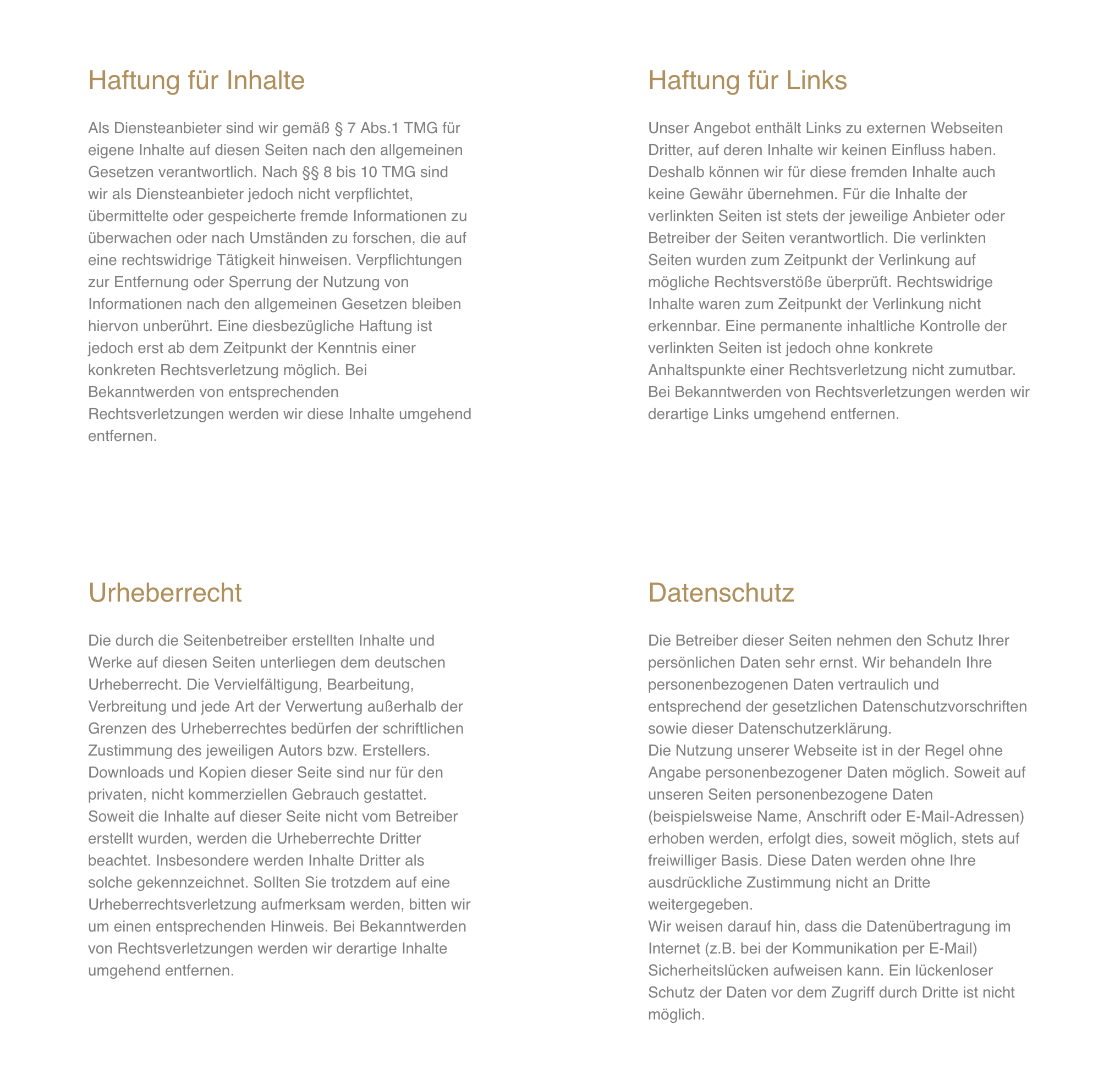
I think maybe you ran out of enthusiasm on the last page.
Thanks for your feedback. what do you mean? what can I improve?
Usually I suggest to people not to have text that flows from one side of the page to another because it can be hard to read. In several of your pages you have wide text, but it’s not small type and there’s plenty of white space so I think it works.
You also split up the pages with different sections headings, colour differentiation - all of which helps people navigate through the content.
When it comes to the last page you abandon those techniques and have
Dense slabs of centralised text stretching from one side of the page to another
Headings at the same weight and colour as the body text
So my impression was that “Imprint” was a page that hadn’t be finished.
I usually hate text that has centralised text with ragged edges if it’s more than a few lines, but for some reason I’m tolerating it on your site. I often flag it as bad practice.
Paul
Thanks for the detailed feedback. do you mean the side impressum? this is just the disclaimer and not a “regular” page.
I do not like a centered page with centered heading and a left-aligned text. Should I use justified text? What do you think?
Sadly no, I don’t see an improvement.
It’s your site, if you are happy with it, then good and I’m the only one to pick that page up as needing changes. There’s no need to please me!
I gladly accept hints. However, the disclaimer page is not that important to me.
I think there’s no reason for any page to be unimportant!
It’s a great site.
Excellent site. Another excellent example of what can be built with Blocs App on its own.
1 Like
Hey @RME,
Maybe you didn’t noticed this:
the text isn’t showed the right way when scaling the browser window.
I looked again - good job!
Superb site.
 keep up the good work. Your websites look very good.
1 Like
Nice looking Professional website.
1 Like
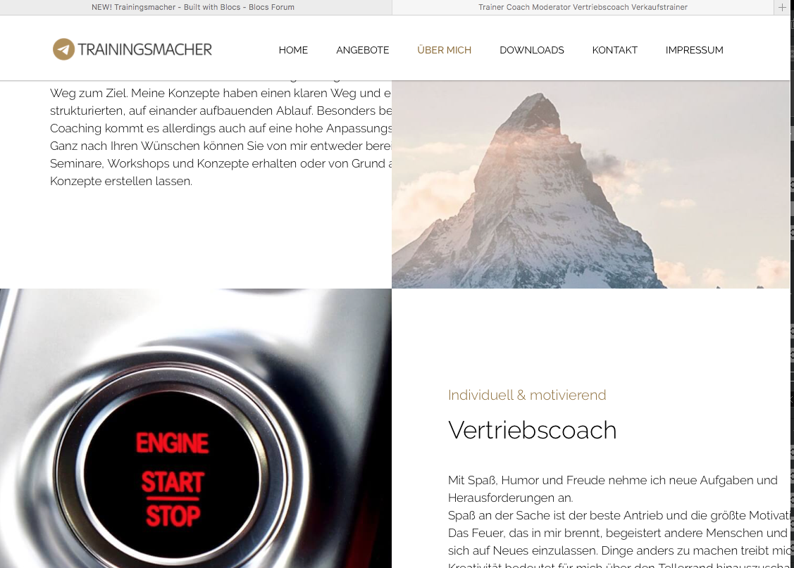
@RME Ralf, excuse the silly questions but what effect did you apply to the appearing text on the first site?
I somehow can’t find a similarly working effect. Am I just being blind?