Hey guys, the next project is finished. The new website is for a guesthouse. Have a look. Hope you like what you see ![]()
(SSL is not ready yet)
Hey guys, the next project is finished. The new website is for a guesthouse. Have a look. Hope you like what you see ![]()
(SSL is not ready yet)
It’s completely blocked here on Safari with my adblocker Wipr, but it looks good in Brave. I very much like the clean black & white feel offset by the colour of the locations. It shows that website designs do not have to be complicated to be effective.
Very nice! Classy and High-end. The parallax effect with the white bars on the side looks really neat!
And the one-time-only modal in place, cool.
Great job as always!
Cheers,
Alberto
Nice work, very clean, well written. Personally, I think it should have more pictures.
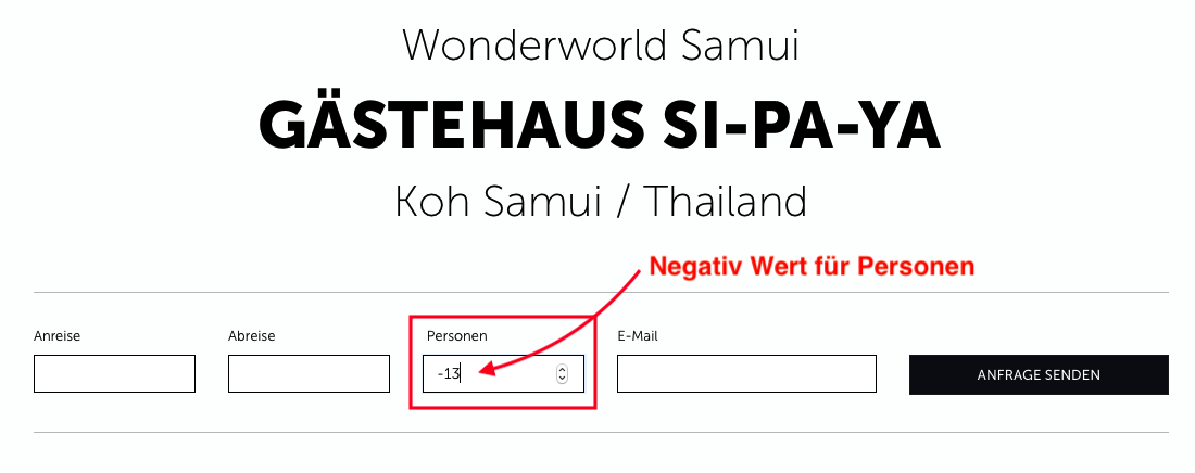
Hi, some remarks.
Minus count for guests?!
SAWATDIKAA it is two words (Sawatdi kha). The word kha is put at the end of a sentence when a woman spoke the sentence. And khrap if a man finished the sentence (unless a man feels he should be a woman, then a man would use kha). I never saw in any brochure the kha or khrap after the Sawatdi. Sawatdi (often also as Sawasdee = well being, Hallo, Welcome, stands both for greeting or farewell).
I think the images in the picture gallery for the area (Impressionen) should be larger when viewed as single pictures and definitely should be reworked in a photo editing application to make them look more ‘appetising’. After all they shall be ‘verkaufsfördernd’.
I personally do not like the white frame around them. It makes them look like cheap polaroids.
Whereas it is a nice difference to other websites and have the parallax images framed left and right.
This webpage needs a lot of super beautiful images. For example for:
Ausflugsziele auf Koh Samui
Koh Samui erleben
The google map navigates the visitor away from the website and the House itself (Gästehaus Si-Pa-Ya) is not shown by name - only by coordinates (assuming they are right, which I doubt for there is no swimming pool on the map). Instead what jumps into the eye is the Hotel Soi Kaopra, because they have created a google entry.
Es scheint da haste noch 'ne Menge Arbeit. Gutes Gelingen!
Thanks for your opinion.
Don’t know what does it mean.
How can I make it better? I agree with the images. But the pictures are given by the owner.
This it the location. The pool is new and the owner changed the name. What is your idea?
thanks for the correction. Do you have a better solution?
I would like to learn to get better.
So I changed some points:
The gallery (Impressionen) is now a slider with larger images. The pictures have a better quality. The map is an image now. It shows the correct position. And the word sawatdikaa is gone 
Thanks @StFoldex
It also loads for me in Safari now.
Yes, that’s always kind of a problem with the clients. I always tell them that I need every image in the best possible quality and largest size they have, because to make a picture worse in quality is no problem but to make an image better if it was in low quality in the first place – is not possible. Unfortunately nevertheless clients deliver these low quality images that then are impossible to enlarge quality-wise. Some clients just take images from their mobile phones (Handys). Those images always look nice on the small screens, but show their bad quality on large screens (blurred from hand shaking, wrong and low quality camera app adjustment, not professional depth of fields or motives, etc.).
I use an Adobe Photoshop replacement software that is outrageous cheap in compare to Photoshop with no subscription (~ 70 €) named Affinity Photo. With this I rework the clients images or even those I took for the client’s website.
[I do freelance work on images. I rework on them and return them in the same dimension and resolution I received them. Only the file size is larger and they will be uncompressed tiff files in the highest possible quality. (unless the client would like me to compress them or change the dimensions and/or resolution).]
All right, the images do look better now. Solely in my personal opinion the black frame looks better than the white frame, however, I do not like it either because the first thought that popped into my head was “oh, funeral images”. Sorry, for this, but if you really, really need to frame the images I would try a grey shade and see if one works. But this is just my personal aesthetic opinion. Maybe, just a try-out possibility to darken the background more when the carousel is open might work to focus the eye/s more on the image without a frame.
OK, it was a clever idea to create a picture of the location in this case. However, I would then have used 2 map images – the one you used and another one that is more zoomed in and shows clearly the street names. Or maybe one larger image, whereas the island (= Koh) Samui aerial view is overexposed on the street map.
If the owner or respectively you for the owner created a location pin and name the pin properly (Guesthouse Si-Pa-Ya) it would be fine to then embed the google map into the page. Just don’t link to it to avoid that the website viewer leaves the website (unless the viewer wants to see the map on google itself in an other tab). Or use the other free map some of the forum members suggested (I don’t know the name and I also would have to research that).
Yes, the word “Sawatdee” is not missed. I also would create an English version for the website IF your client is willing to pay you for this in order to reach a larger share of prospects. (German, Austrian, Swiss clientele dwarfs in comparison with English speaking prospects.
Well, that’s so far a lot I wrote, but maybe other forum members have also some input. Otherwise nice website already. Und Danke für das Interview. ![]()
I really like the site. One suggestion: the button “Fotos” underneath the apartment description is overlooked then scrolling a bit faster through the site. I would use a picture here to open the lightbox.
About cookies: the cookie warning you use is not allowed any longer (imho) as it does not offer to decline or select cookies and does not distinguish between essential and other cookies. In the privacy declaration you mention facebook, but I do not see any share or like buttons - if your client is using a facebook profile, you need a different text. The links in the privacy page are not clickable - which is important for the opt-out.
Thank you for your ideas.
For me, the “minus for guests” is not a big problem. I use Pixelmator Pro for image editing. But bad pictures are still bad pictures. Later the customer will take better ones. It is important that the website is online and some images can be changed after a few weeks.
I am happy with the black frame. I like this.
Your idea with the map is good. I ll make it.
Maybe we’ll add a page in English. But not now.
Danke für Deine ausführlichen Antworten. Ich schätze konstruktive Kritik. Ich habe explizit nach Deinen Ideen gefragt, denn nur wenn Du Vorschläge machst, wie es besser werden kann, ist es hilfreich. Danke Dir. 

Hey @Fuellemann You shouldn’t scroll quickly through the page
Do you have an idea, how a better cookie consent works in blocs? I don’t know how.
Übrigens in der Datenschutzerklärung stehen viele Dinge drinnen, die gar nicht nötig sind. Es gibt auf der Seite keine GoogleWebFonts, kein Facebook, kein Matomo usw. Dennoch wird darauf hingewiesen. Viel hilft viel. Daher erwähne ich alles was möglich ist, um nichts zu vergessen Alleine an der Verordnung bei Cookies und der DSGVO sieht man wie bescheuert die EU ist.
By the way, i like your website but there is no cookie warning on your own website, and there is no warning for your current project.
Yes, I do not use cookies on my website. I do not think the benefit of add-ons which require cookies are worth having to use a cookie banner. I just hate these things ![]() The DSGVO states you should not over-inform visitors so I try to keep this as slim as required. E. g. if you use just essential cookies like a language selection or a CMS log in, you will never need a cookie banner.
The DSGVO states you should not over-inform visitors so I try to keep this as slim as required. E. g. if you use just essential cookies like a language selection or a CMS log in, you will never need a cookie banner.
About the consent tool, there are several. Free for small business sites up to 7.500 unique visitors monthly is: https://www.osano.com/ and here the consent tool.
I doubt that.
There are different opinions.
And yes, I hate these stupid cookie banners also.
Nobody reads the privacy policy. But it is the law.
Ralph, I begged Norm for a better cookie consent bric and he promised to work on that problem.
But that’s a couple of weeks now and I heard nothing from him.
This damn cookie consent is so important here in Germany so I think this matter should be on the number one to do list for Norm.
You need info in the privacy note but since you do not need consent for essential cookies, you do not need banner for those, imho