We love to here your feed back on this…
still in beta, we still need to translate some words to arabic.
@eldar tutorials regarding the different logo on different navs is a big help.
Old (made with Adobe Muse)
http://citywok-sa.com/
We love to here your feed back on this…
still in beta, we still need to translate some words to arabic.
@eldar tutorials regarding the different logo on different navs is a big help.
Old (made with Adobe Muse)
http://citywok-sa.com/
Nice job. I’d be inclined to make the image of the restaurant behind the About Us section a bit darker, so that the text is easier to read. I prefer the way you’ve done it in the phone app section.
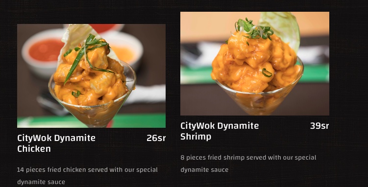
On the menu page, some of the items are not properly aligned, so they appear higher on one side than the other.
Thank you for your insight… might have been overlook the aligning, we’re more focused on mobile view, but will check it…
Thanks…
yes… i think its happen on small screen… its ok on our end… we’ll check again…
I find the social media menu appearing in the middle of pages to be a bit odd.
One (at least) of the social media menus has rounded corners allowing white to show through at the edges.
In English we don’t write “soups” in a menu but use “soup”.
I had to look really carefully at my monitor when looking at the menus. I thought my screen might be dirty or something because some of background looked black and some of the page looked off-black. It wasn’t my monitor - your alternate non-black colour is too close to black for my liking. I eventually worked out it’s a texture.
Kung Pao Chicken is not level with the left General Tso’s Chicken if Chilli Chicken needs two lines. You should use two blocs to stop this from happening.
“We have a cozy & comfortable place to dine inn for you and your family.” should be “We have a cozy & comfortable place to dine for you and your family.”
Definitely, the “inn” is not right and “Dine in” or “Dine-in” aren’t quite right either ( I’d expect a dine-in restaurant to be in a hotel, for it’s guests). I understand it’s a nuance of English, but what you have right now is definitely wrong. “Inn” is totally unrelated to “in” but they sound the same.
Why does the twitter feed have curved edges and everything else square?
Why doe the twitter feed have an embed link (nobody will use it)?
That’s a lot of nit-picking, but you’ve done a great job. Some dishes will be very popular - they are free.
It’s not. I can reproduce this mis-alignment. It’s caused by stacking multiple text sections in the same bloc. As the width varies the text can spread to more lines. This causes the left and right columns to mis-align. Use multiple blocs to stop this. Unfortunately, this will also change the order of presentation in a mobile view (unless you have a specific mobile version of that section).
If you don’t wish to use separate blocs, set the text paragraph height so multiple lines don’t break the layout. This technique would allow some of your mis-aligned buttons to be level.
thank you for your honest feedback… we really appreciate it… thanks also for your suggestions on how to make our site look better…
Thank you so much…
A better wording might be: “We have a cozy & comfortable place for you and your family to dine.”
Strange how these things stick in the mind. I’m sure a “real” copywriter would know!