Be honest - tell me what you think.
This is my website for photo restoration and colourization:
Be honest - tell me what you think.
This is my website for photo restoration and colourization:
Way cool!!!
Overall not bad. I thought the text on mobile looked a bit small. Text on the terms & conditions page is tiny as well, even on desktop. For the general text you could possibly go a little darker with the grey for better legibility.
I’d almost like to see the huge areas of white broken up somehow with a little more contrast to separate the different sections.
I didn’t go all the way through your pricing form, but I wonder if you should add a consent option for GDPR purposes, since you are asking visitors to supply information. Good domain name for your service.
Thanks for your reply.
Great review - thanks - will look at the text. Which huge areas of white are you referring to? There shouldn’t be any but a few of the clever ‘before and after’ slider images take a few seconds to load. Some white areas are a bit big on mobile view particularly and I will look to reduce them where I can but I do want the site to be white and kind of minimalist. 'I will be using Mailchimp for supplied information storage and their excellent GDPR support. The pricing form is created using Machform (wonderful wonderful system) so will look to possibly add some specific GDPR consent field to that.
Very helpful reply 
Regards
Rob
I think it is brilliant and perfect for your intended market.
When I saw the image of the granny on the motorbike I was instantly sold on the service. That’s the killer image for me.
Great job.
LOL. That was my late mum. Her joy of life and sense of humour stayed with her until she passed away at 96 nearly three years ago.
Well what a fantastic memory you have of her right there.
I have made some alterations as per your suggestions. Thanks again.
Rob
No worries and good luck with it. I was a photographer for many years before getting into web design more recently and still do some for web clients, so it caught my attention. BTW You should really add an SSL certificate.
Thanks. It does have a SSL cert - I just need to force it to activate in .htaccess
Very nice site! I would center the items in the menu. Looks better on a mobile. Also can not see the phone number in the footer.
What device are you looking at it on? The menu items should be centered on all devices. Full menu on desktop and mobile menu (three lines) on mobile devices.
I thought I had sorted that number dammit It is very strange but it is white text for the tel number, it seems that on my iphone this is changed to a black hyperlink. Any suggestions as to how to overcome this would be welcome.
Nice website and great imaginary!
I don’t like the centered contact form on pricing page, but overall great work!
Cheers,
Eldar
Thank Eldar - used a great template
Bit confused about your ‘centered’ comment as the contact form on the pricing page (enquiry form) is not centered but left justified with each field having a pop up information box to the right. Any suggestions to make it look better appreciated but it is an iframe so not sure how to change it.
PS: We went for Podia
Rob
Sorry, mistyped what I meant.
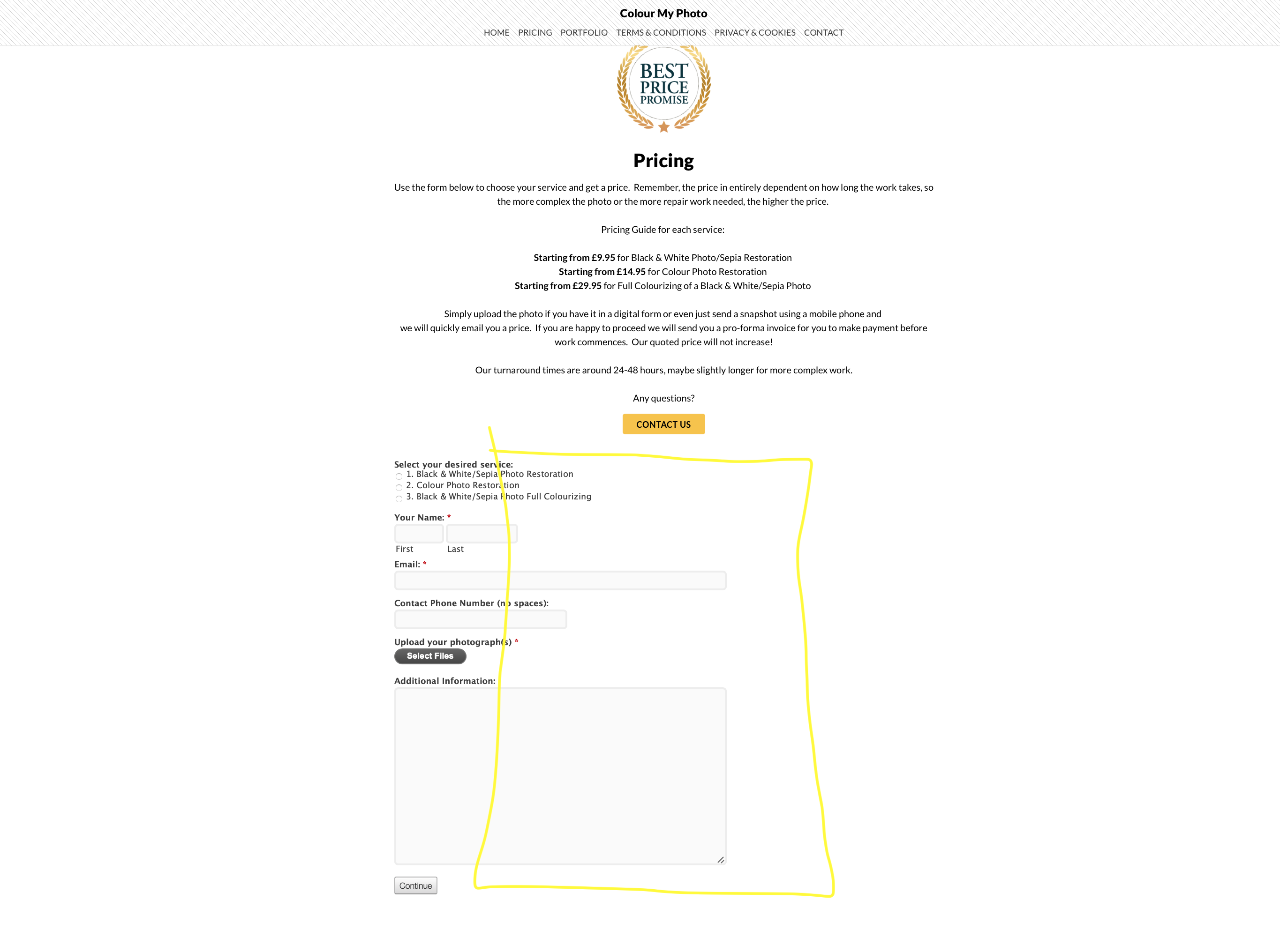
I mean that I don’t like that it is aligned to the left. Not the text, but the iframe itself.
This is what I would have done (marked in yellow).
Podia is great! They are adding more and more awesome features all the time.
Yeah I wanted that but couldn’t work out how to do it. It is actually near enough in the middle but allows for the pop up info boxes when you hover over some fields.
Select the column with iframe and add the margin ‘auto’ to left and right sides.
And make sure that it has the width you want to have for the form.
Ah, I see! Well, I guess it’s centered fine then!
Great work!
Sorted. I slapped a 310px left margin on desktop view - left the mobile settings as they were.
Thanks again for your kind words and help.
Rob