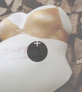
Hey, a new website is online. have a look ![]() www.einzigartig-gipsabdruck.ch
www.einzigartig-gipsabdruck.ch
What do you think about it? What can i do better?
Hey, a new website is online. have a look ![]() www.einzigartig-gipsabdruck.ch
www.einzigartig-gipsabdruck.ch
What do you think about it? What can i do better?
Nothing, it’s perfect. Love the colors and layout. Another great example of less can be more. Simple yet elegant. Well done.
Casey
Excellent.
Hi @RME
Looks clean and fresh 
I’ve noticed that the “scroll to top” button on mobile and tablet (in portrait view) only shows on the start page.
On the other pages it’s not there.
It shows on mobile and tablet in landscape view though.
Cheers / Johny
Great work as always!
The only thing I don’t like (and I think I had this issue with some of my blocs website as well) is the Lightbox trigger button on mobile. The plus symbol is not aligned perfectly.
EDIT: Actually, I get the same result on the desktop as well.
Cheers,
Eldar
Excellent overall impression. Nice choice of images and fonts. For clarification purposes I’d add the hint (PDF) on the “Preisliste” button to make clear it’s not a link that opens but a download instead.
Otherwise great work, I’m stunned once more…
PS: Do you allow a short technical digression here guys? If not, I’ll gladly post it over in Need help!
Anyway, as a newbie I was wondering how Ralf achieved the beautiful delicate white border around the four text blocks on the starting page. My own workaround was to use panel bric in the first place and attach classes to both the paragraph and the panel alike.
Then set the opacity of the panel’s background color to zero and apply both a positive padding and a subtle negative margin to the paragraph to get the border closer to the text.
This gets the job done nicely… but is it the smartest way?
Apart from that, this isn’t the bounce-in animation you use here, is it? It (luckily) lacks the final cushioning effect. But what was it then?
Hi @Flix
He seem to use a div with a 10px padding and a 1px border.
And inside that another div with a 15px padding, this div contains the white solid background and content.
panels-outline.bloc (204.1 KB)
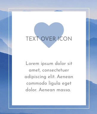
Cheers / Johny
That was so very helpful, Johny! Thanks so much, I had no idea this can be achieved by the use of divs. Sweet!
Thanks for your nice feedback. @Eldar i dont know why the plus Symbol is not in the middle. I dont use a custom class for the Lightbox.
Hey Johny, this is strange. ok i found the mistake. thanks for your help.