First of all I am not a web designer by trade and the subject matter may be a bit controversial for some. But this is what I have achieved so far using Blocs. I quite like how everything collapses to mobile and back again to desktop. It’s been a learning curve and still requires work to be done. Adding to the site as I go along and amending things after I change my mind. Take the design for what it is (not the content) the layout works. https://mrbonusbet.com. Cheers @Norm for a fantastic product.
1 Like
very nice site. also nice on mobile devices.
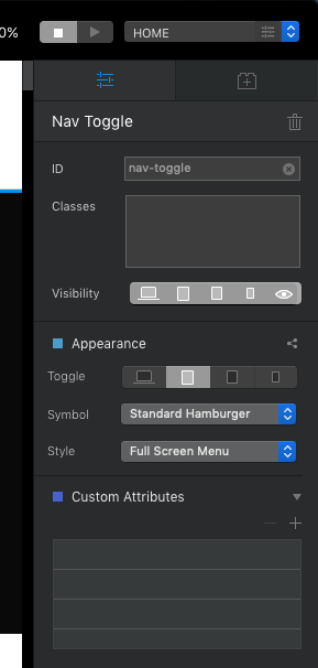
how did you get the hamburger menu effect on mobile
Well done! Looks Very professional!
If you go to nav toggle you have various options. You can find it when you look at your items within the bloc for the header
1 Like
nice i completely missed that
Looks good! Works good on mobile 
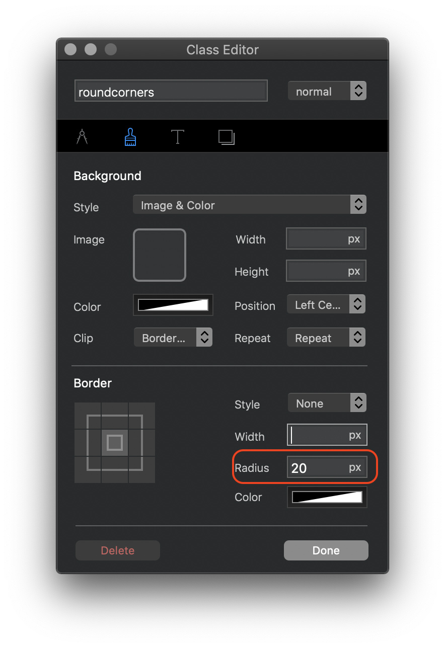
Add a structure bloc. Select the content area (the column). With the column selected set a colour using the colour option in the appearance section of the properties panel. With the column still selected, create a custom class (with a name something like “roundedCorners”. In the class editor select the paintbrush tab and set a radius in the border section (illustrated below). Be sure to add some content to the content area otherwise you won’t see anything when you preview.
2 Likes