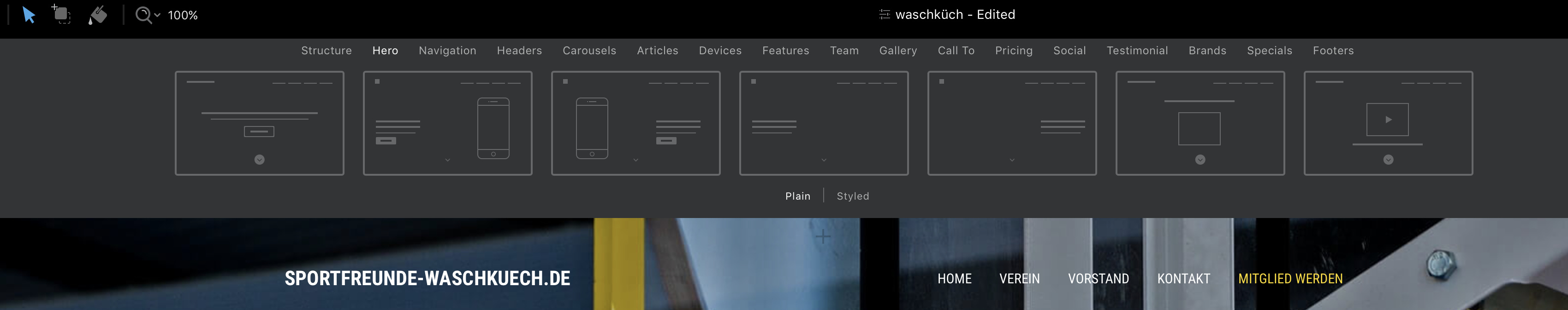
@RME, I really like what you have done from the first version.
I like the smaller white borders a lot better.
I see you also changed the blocs to a smaller text area and used the whole row with darken background and a stroke. I like this effect a lot better, it makes it read easier and keeps the text content together.
It also looks really good on the mobile side. I love it when a designer takes the time to make the mobile version look as good as the desktop.
Overall the site is a great step forward from the original that I have come across, but I’m trying to put myself in the targeted audience’s shoes and the site feels more corporate than sporty, sorry…
Other then the transitions the images mostly used is of non-action so it is hard for me to picture myself in these images having fun in an active activity.
find out if they want to change their logo to more work in where you’d like to take them… at the moment the logo is simple, comical, youthful, and simplistic which clashes with the website image for now
if not use the logo as the founding theme plus aim the images towards the targeted audience… images of having fun, images of people in action of the activity, maybe even introduce an action video as the hero image to set the emotional agenda of the site… you could even gif the logo kicking ball or dribbling a basketball, etc…?
see if you can soften the square/rectangle look (to me it conveys structure, authority, establishment) to make the whole site experience more inviting and fun-like, unless that is what they want to convey?
I think I should stop it there because maybe you are following a brief they have outlined to you and I’m just stepping on your toes making these suggestions, but if not I hope it is of help!
hello, thanks for your ideas. The customer has given many things. I can not change the logo. The pictures should be like that. So, I understand your opinion. But I can’t change it. I will leave the page that way.
When choosing colours for your website, this infographic might be helpful in deciding the dominant colour because that indicates the “feel” of your website.
In this context, see what it says about black and grey.
RME, that is AOK…
I understand that when a client talks us web designers have to listen, and then we need to continue educating our clients because they do not know web design and online marketing - we do! Plus they always see it from their point of view and not their targeted market!
Good luck with it, but I have to add it is great to see how you have a handle on Blocs!
Recently I made an IOS and Android App and initially I told the (then potential client) that their design sucked and that they should redo the (in-house) design.
I was only able to influence small changes, but the client gave me the development job because I was the only developer that they had approached that had been honest about the bad design (unchangeable for internal reasons we shall say). So I made an app that could have been a lot better but the client is pleased.
In my experience clients are open to criticism if it’s explained and not just based on personal preference but on reason. Sometimes they listen. Sometimes they don’t. That’s OK and sometimes the client is right and I learn something I didn’t know before.
Just remember…sometimes YOU are the client…and do you listen?
I’ve run companies (as CEO) with 200 people or more. Often we had inhouse art dept. as they were called. Now creative.
More often than not graphics (now developers, web designers, code writers, engineers) people didn’t listen. Yet we had built or were running a multimillion dollar business but they knew better.
The best sanario is when both sides listen and have spect for each other. Explain “Why” you think what you 5hink. It doesn’t have to be a whole class! LOL.
Often a client is choosing between options and choices.
Just like there are so many visual design applications out now and we the clients or customers have “chosen” Blocs. We could pick anything but we like this one maybe a couple others. We like Blocs especially because the developer listens and does a great job responding.
Adobe is not doing a great job at listening and it’s showing. Affinity and others are taking a bite out of them. Not to mention all the visual web builders. I suspect many Muse users are, have or will be migrating to Blocs. With 100,000 plus known users of Muse. Blocs could be in a great position to gain some of those users since the announcement of Muse is at EOL. Keep this in mind next time you are across the table from a prospective customer.
I agree…
What I meant by “continue educating” is that there is far more that we know (a good example is your colour infographic) and can be of help to the client to better their online stance. I also agree there are times that a client opens my mind to possibilities that can be far more productive with my support and knowledge base.
Hi, I like the discussion. in this case the customer is happy and I am too. I chose yellow because the color brings a freshness to the site. The big pictures are not darkened. For better readability of the text, I chose darkened boxes with a white line. this symbolizes a playing field. surely i can design the website differently. I opted for this design. thanks for your good ideas. I think, the page is much better now.
RME, just one thing…
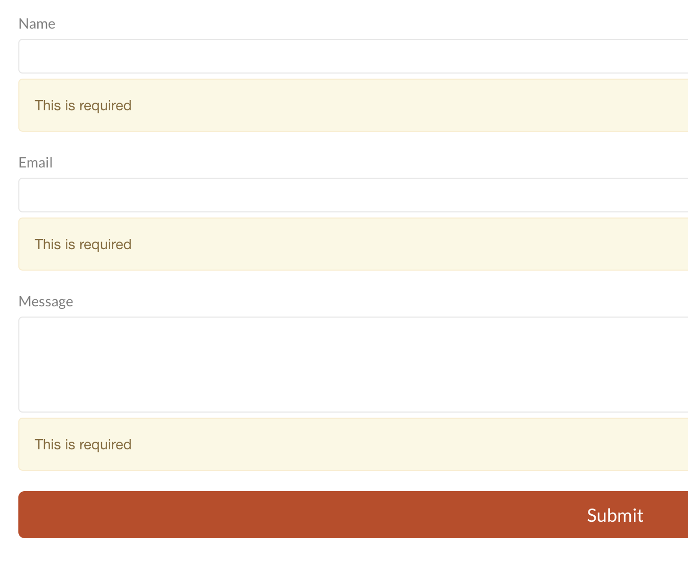
When I checked your form and clicked send it automatically thanked me for sending the form without me entering anything. Is that a Blocs thing?
Also your link at the bottom of the site to your website isn’t going to where it should?..
I don’t think it’s a Blocs thing - I guess none of the fields were designated as required. If you designate required fields, the form will display error messages if it’s submitted empty.