I’m looking for a way to create responsive pages, with a number of blocs in them consisting of one or two images, a header, and some text (+ either a button or a link to a full text version of the same article).
If I have, say, 20 of these on a page, making the browser les or mine should reorganise them, so that one can see one or two or three of them in the same horizontal level. I have spent some time trying to figure out how that is done, but no success so far. This, a multi-language spell checker and a simple way to create stick sidebars (with a lot of lines) is what I’m missing right now. This page actually shows something pretty close to what I’m wanting to create. Can anyone point me to articles or videos which explain how this should be done?
This is your second post on basically the same thing.
I would suggest you either sign up to @Eldar’s tutorial videos (which are highly acclaimed and you linked too) or you end up paying someone to do the work for you.
Hi, first I need to decide if I’ll buy the app or not. And - the other thread was about reorganizing bloc positions manually, this one is about responsive behavior.
I considered Blocs a year ago, but went for a more self-explanatory app instead. My new tests with Blocs 3 has made me interested in buying it again, but there are 2-3 things I need to sort out before buying it.
They also need to have the same height and width, because if I create a page with has a with of eg. 750, I can have three of them next to each other (horizontally), and have them automatically be reorganised into two next to each other, or only one on mobiles phones, without ending up looking messy. Is this doable?
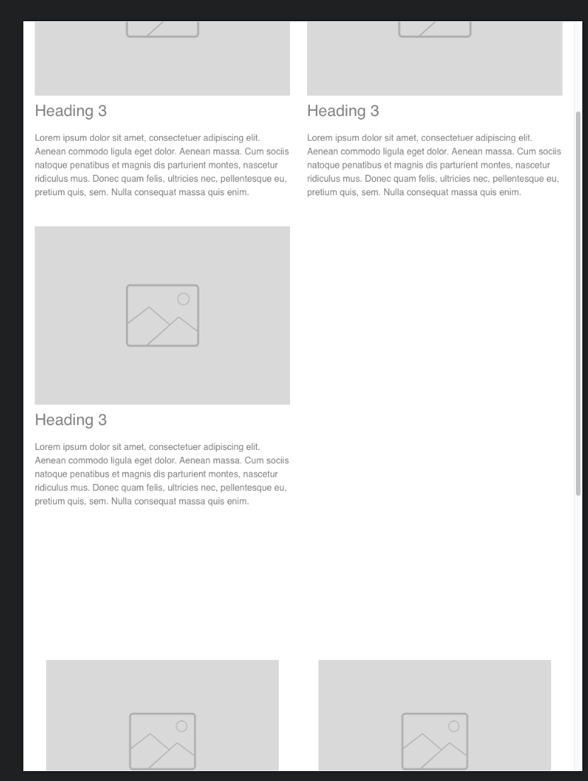
Here is a basic example of how you could do it. The second bloc uses cards (which is the way I would actually do it as a personal preference) and obviously this is un-styled.
Thanks, that’s very helpful. When I open this file in Blocs, and change to Preview mode (preview in Safari is disabled in the demo version), I see the same problem I had when I tried this on my own: the six blocs, when
making the window less wide, don’t show up as expected. With six blocs in a wide window, making it a little less wide should display two blocs on the same horzontoal line, on three different rows.
You have to set up the columns correctly for each breakpoint but that only takes seconds. If you manually narrow a browser window there will be a brief transition where something is out of alignment until it hits the breakpoint. This is the case with any responsive website, even if you use an alternative web design app. Just pick some websites at random on the internet and try it.
Thanks, I’ll look more into this. Personally, I’d prefer to simply put all these blocs into a container which was defined as responsive, and that this would result in the blocs reorganising themselves best as they can. This would probably show me that I’d have to change the width or the height of all the blocs for optimum results, and then I could experiment a little until it looked right.
But when I try this with blocs, I don’t even get the same results if I perform the same action twice in a row. By performing the exact same action twice (changing the Blocs window’s widths in preview mode), I get either of these two results:
Here’s a newspaper which has a concept pretty close to what I’m thinking of. https://www.gp.se
Changing the browser width leads to more or less immediate changes here. But maybe you were thinking about a delay when I change the width of a preview? The situation I posted an example of just above this post isn’t about a delay, as your probably know - it’s about me not really understanding the workflow. Or maybe a bug - or maybe both?
That’s a very different layout than the three column version we were discussing. I would need some time to work through how that is done. I am rushing to finish four client websites before Christmas, so I am a bit busy at the moment. You might find @Norm is able to help you.
I recommend to you to watch the video below. You will learn how to use Column Width and Offset settings to create almost any type of the magazine structure. In the video, I am showing the Image Grid, but same can be easily done to blog grid (just like on my website you have mentioned in the first post).
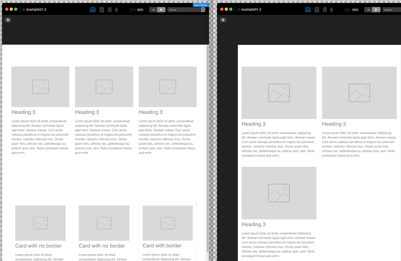
@NowHere as mentioned above the example project has two different blocs. Two ways it can be made. They won’t flow together into three rows on the smaller view. (Maybe in my attempt to show you options I complicated it for you)
If you duplicate the columns on one of the blocs it will flow. It’s been set up for 3 columns 2 columns and 1 column based on breakpoint.
Well, I have a lot of experience with producing responsive pages, but not with Blocs - and that may be the culprit. I’ve seen his video and when I try the same thing, the blocs keep popping up above/under each other, but I’ll sort that out.
Here’s another, simple example of responsive behaviour
The coloured boxes on this page (scroll down a little) are also doing what I’m looking for on Blocs, and this is done without a grid, without making three or more different versions for different devices - etc. It’s just fixed text blocs that all have the same height/width - which are placed inside a responsive “row”/container. Since they have the same height/width, and they all are inside the same responsive area, the workflow is quite simple. But I’ll keep exploring Blocs and check out the various ways to achieve this kind of behaviour. A grid based solution (as opposed to one which is made on that page above) has some important benefits too, of course.
“They won’t flow together into three rows on the smaller view. (Maybe in my attempt to show you options I complicated it for you)”. I see - and have to figure our the difference between doing it with cards and doing it without cards. In general, Blocs have become more user friendly that when I tried Blocs 2, and maybe it will continue in the direction I like (a more or less self-explanatory with idiot-proof use of words and help options everywhere). Who knows, maybe Blocs will get regular master pages and spell checking by the time I jump in.
But even if I still miss stuff and find the UI confusing compared with other apps I have used, this has been helpful!