How does Blocs handle the need for larger to smaller breakpoint images?
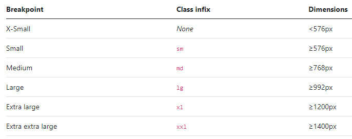
Example: xxxl 1400 px
Does Blocs take that, 200 KB and use that same size image for X–Small?
Wouldn’t there be better performance loading a web page that has three different size images for each Breakpoint?
Is there software or online sources that would take an HQ image and reduce multiple images for each media query (breakpoints) while maintaining the quality of the images?
@PeteSharp, That’s a lot of work to make images for every Breakpoint. Not only that you can’t just add them to the image widget. Would you have to create a custom kind of image class and then add a different images for each one? If that’s true, you can see how much time consuming arduous work that can be. There’s got to be a simpler way, Is not what blocks is all about.
@PeteSharp, that’s it all of us “want to control…”. The amount of work it takes to do that in is time consuming. I know, why do you or someone with those skill come up with a Bric or something that would take care of that for us.
Didn’t Muse do this ‘on the fly’ and generate different size images for breakpoints?
This, and the ability to move your image around within the constraining picture box are 2 things about amuse I miss.
One or the other would be a handy feature to have!
Yes, that would be great if “blocs” made it easier. Another article suggested “sirv”. You only need to upload 1 HighRes photo and the correct format and quality will always be displayed. - But it costs - (I haven’t used it myself yet)
Foundation did this as standard using a system called Interchange. It does involve a bit more work from the user preparing alternative sized images, however the idea is sound.
Taking a mobile first approach, you would essentially have an image bric and then select a mobile sized image by default in the side panel, however larger sizes would be optional and only loaded if available and appropriate to that breakpoint.
Everything just happens automatically as the page loads and I think it makes sense, but I am not sure Bootstrap can easily accommodate this solution by itself.
I haven’t had a chance to try this yet, but intended to do so on a site I am about to build for myself. @Whittfield has a bric for media queries that may help.
Preparing the correct images for each breakpoint is just part of the job. The crop for a mobile image is likely to be different to the image used for a desktop because on mobile with a smaller image the content should be properly edited.
Of course in some circumstances it can be one crop fits all.
I previously used SIRV and whilst it is a good service, I’ve recently found any sites that use this system fail Google’s new page experience rules. As a result my search results/traffic have declined.
I’m in the process of replacing all images using SIRV to locally hosted images.
It’s too early to know what difference this makes to Google, as it takes 28 days for their data to update.