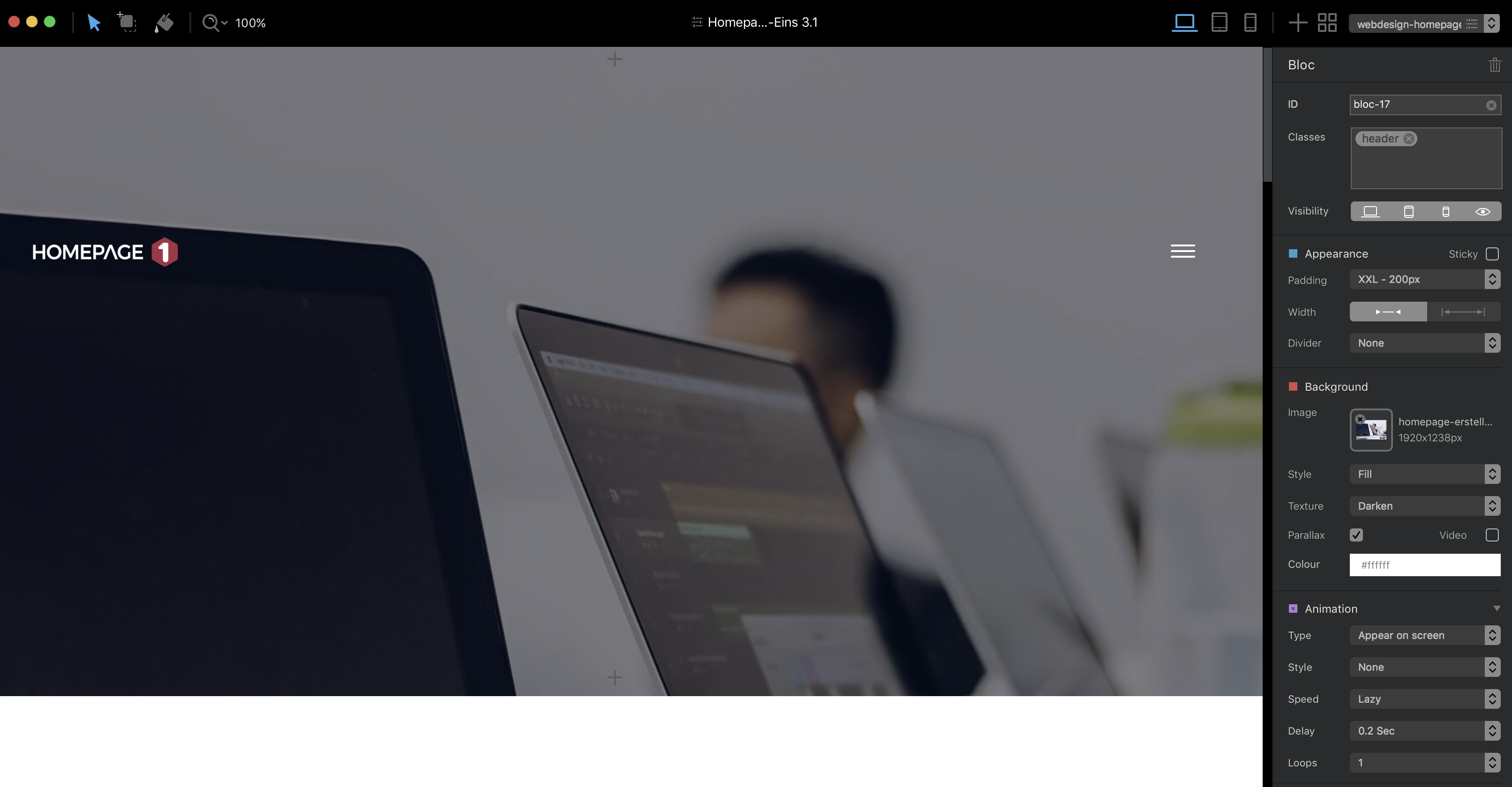
I’m currently evaluating Blocs and the trial period is only seven days, and two have already gone. I need to be sure it’s right for me so I’m working flat out, as I have had no end of trouble with responsive websites from other software, and being allergic to code I’m struggling to work with the straightjacket approach that so many web site builders impose. I’m a graphics pro with decades of experience, and can find answers to most problems with a bit of trial and error. However, I can’f find any obvious way of having an image in the header to page width (not hero) and overlaying a menu.
I’ve tried the obvious blocs and couldn’t find what I want, so a tried to make it up with brics within a single container. A menu over an image is very common these days, yet I just can’t make it work here. I’m sure I’m missing the obvious but I just can’t see it.
Can you not just insert the image as the background to the bloc in the header that also contains the menu? I am using the main menu automatically generated by Blocs over an otherwise empty bloc (except for an image bric also inserted in the bloc)
It works here although the actual insertion is a little glitchy (bug reported) so you may have to experiment a bit. Setting Preview in Place in the Asset Manager may help. This area does seem to be a little flaky at times: that’s unusual in my experience since Blocs is usually rock-solid.
Many thanks for the advice. I did try that initially, but the header photo is my logo. If I use it as the background photo it goes full width. If I could manage this, I would use a version of the logo with more room above to accommodate the menu text.
Thus far, I’ve had to settle for a regular menu bar below, but that’s got too much black above and below, and that’s with no padding at all.
Always it seems, with responsive sites, I never seem to be able to design what I want, and have to settle for something that is rather less than I wanted. I have got further with Blocs than with Freeway and Muse, but I’m still not happy with the result.
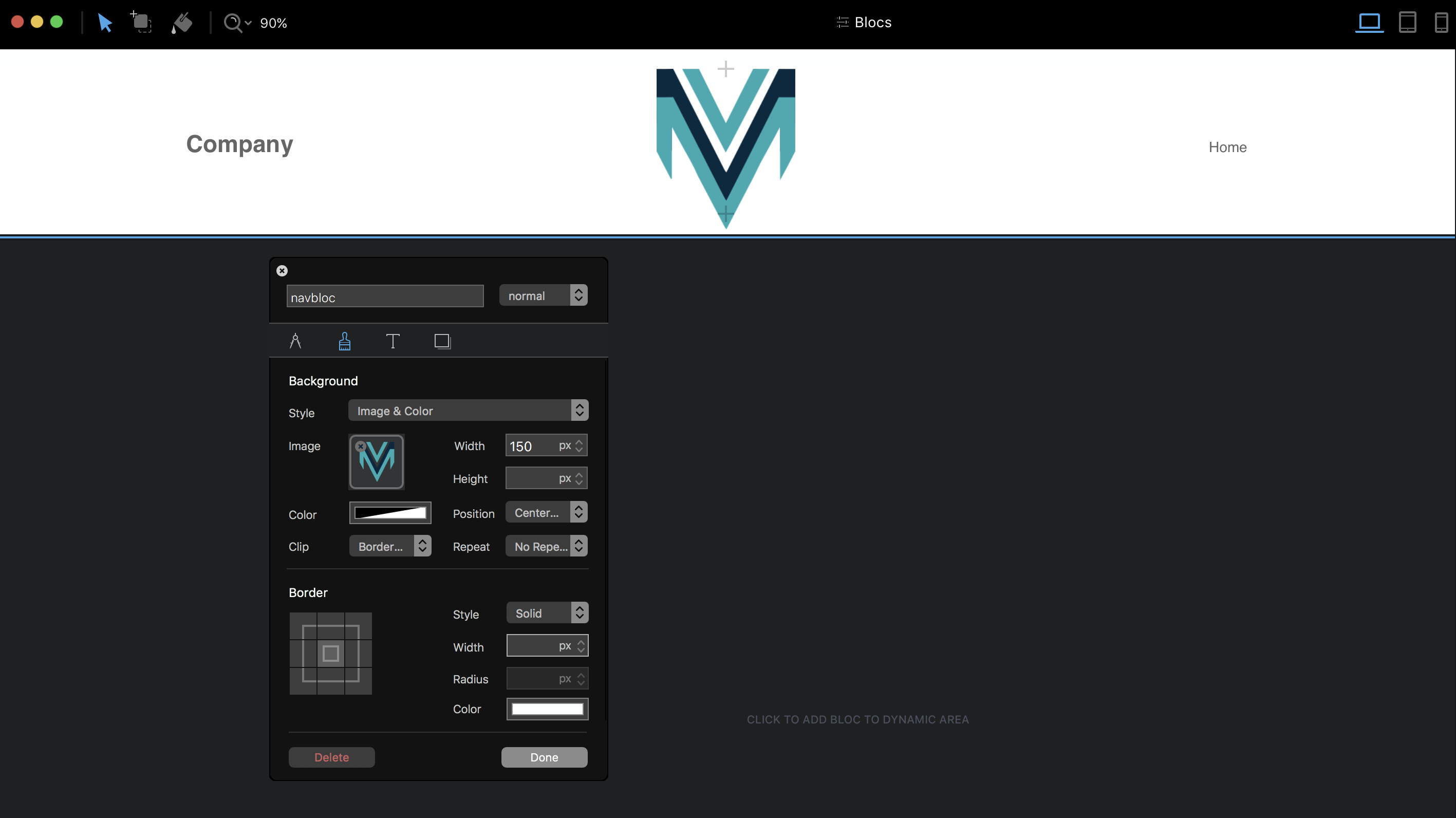
You can add a background image to a navigation block through a custom class. This will allow you to scale and position the image to your needs. In the example below, I used a simple logo centred in the navigation bar. Clearly, if you use a wide image in the background, your navigation and site name elements will be placed on top of the image background so you may have to create custom classes to reposition those element below your background image.
Unfortunately it doesn’t work with the hamburger bar and a image with a lage height. the icon disappear when i use a custom class to move the navbar.
why is it so complicated to use a menu in front of an image? I don’t understand that. So anyone has a solution for this porblem?
It’s better to add the background image via a special class made for the menu navigation block - don’t add the image as a normal background to the navigation block. This prevents the menu from disappearing when creating a custom class on the navigation element. The class you create for the nav block allows you to set it’s hieght as well as background image size and placement. Once that has been done, you can then create a class that repositions your menu.
@ hendon52 Hello, thanks for your tip. I’ve tried this before. the problem is the parallax effect. This is not possible with your solution.
My way of solving the problem is to use a hero and move the next bric up with a custom class. So I can reduce the height of the hero. not very cool, but helpful.

 So anyone has a solution for this porblem?