What do you think? Witch navigation looks better for you?
No. 1
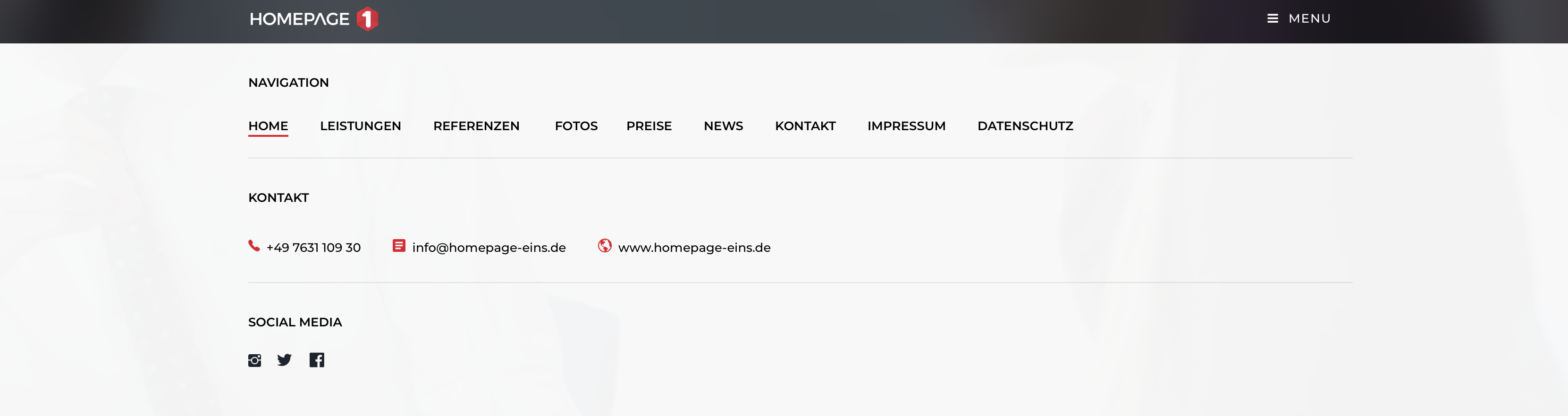
No. 2
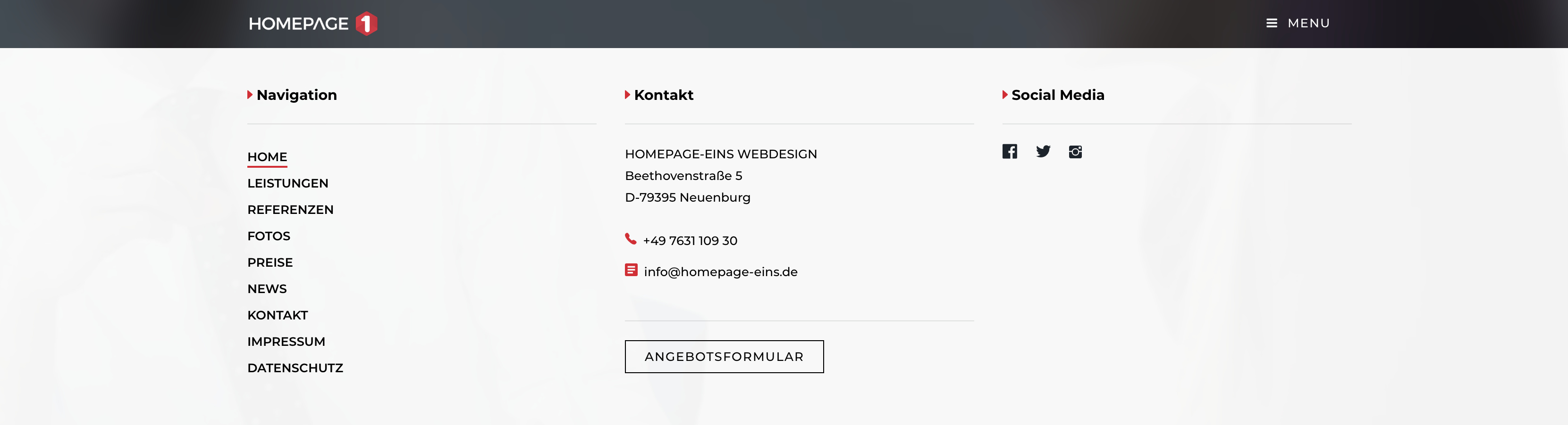
- No.1
- No.2
0 voters
Hey guys thanks for your vote. The result is clear.
See the new desktop navigation at my website www.homepage-eins.de
Perfect. As always.
Ehrlich gesagt bin ich der Meinung, dass es für diese Seite kein so. Megamenu braucht.
Das klassische menu reicht. Also eher Nummer 1, owohl da dann der Kontakt doppelt vorkommt.
RME I really like the dropdown menu. I’ve used them on a couple of my sites and they provide a little different user experience. When you have a lot of menu items it works well.
I normally use a image as the icon and use it on all three breakpoints. I noticed that you used a standard button and use it for desktop and tablet but used the standard mobile icon menu for mobile.
I’ve never been able to make this work but after thinking about how you did this I think you have a standard menu and then added the button menu. Hide the regular menu in desktop/tablet and the hide the menu button in the mobile mode. Very cool method without using an image menu button. Am I correct?
Casey
Number one, its cleaner and you can place the social media on the upper row and have 2 rows for a better data arrangement
Looks good but functions a little “jerky” on scroll. Jitter. Was it your intention to maintain a “mobile menu” rather than desktop on horizontal iPad view?
Also, I noticed that you have a button that links to say websites on the images but the image itself does not link to the same url. Buttons are great for a CTA but so are images. Much larger “target” good UI.