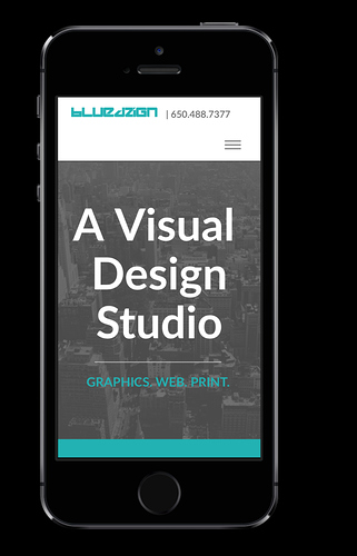
Preview and Live mode are totally different. Any help?
Preview (in blocs) is just that, a preview that helps you visualize what your site will look like in the three break points. It does not give you a totally accurate view of what a site will look like live.
You can purchase the app Solis that works within Blocs to view what your site will look like on different devices.
You can also just preview your site in your browser of choice using the shortcut Apple/Option and the letter B. You can then resize your browser to see what it will look like.
Casey
It’s worth remembering there are huge numbers of screen sizes and different resolutions, so a preview of one will never tell you exactly how it will look on others, even when checking on a real phone. There are various services (free or paid) of differing quality where you can preview how a site will look, but most are not 100% accurate.
I have a website that was done with Rapidweaver and I was convinced everything was fine, until a few months later, when I picked up a new phone with a fairly large screen and found it looked like a pigs ear when viewed in landscape mode…
Lots of messing around ensued to fix that and I discovered it’s just about impossible to have something looking exactly the way you plan across 100% of devices, especially if your design is at all complex. There is a degree of overlap now between the biggest phones and smallest tablets, so three breakpoints is just a base guideline.
This is a key reason why I am struggling with the price expectations of clients and think I should be charging more for websites, due to the endless messing about in this regard. Prices are effectively no more than they were several years ago before responsive designs even existed, yet we are doing a lot more work. Imagine if you asked a builder to build you three different sized houses for the price of one and all them must be perfect with the same features?
Nicely spoken 
I tell my clients up front that I configure my websites for the three points, and I will try to make them look as good as possible. Disclaimer: with all the different computer types, screen size, screen, resolution, and browsers it may look different on some devices.
In todays web design we all spend a lot of time doing this and there are limitations when making complex designs. Sometimes what frustrates me the most is the desktop and say the iPad landscape, it thinks it’s a desktop, yet it still looks a little different.
I don’t think most clients realize how complex this can be or for that matter even care until someone may point out something on a live site.
Casey
A better option may be to use responsive design mode in your browser (in Safari it’s under the Develop menu) This save you having to resize for different devices - just choose a device from the icons at the top of the screen to see what the site will render like. To view a landscape version of each device, click the device icon a second time.

