Hi, I would like to add some font of montserrat. I can not select the fonts when opening the window. as soon as I press the open button, only the top font will added. Is that a mistake or where is the problem?
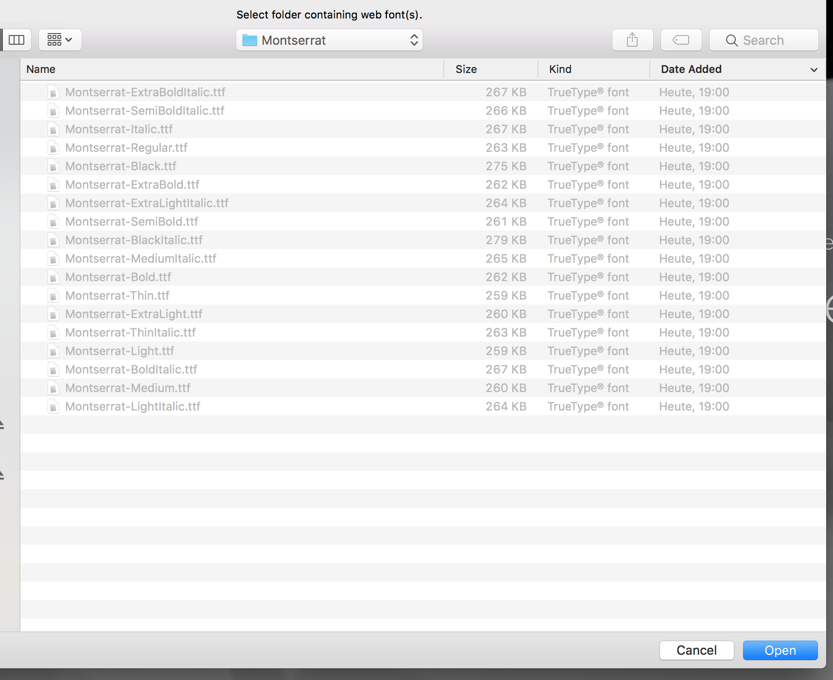

The local webfont importer is not setup to handle multiple weights etc all from a single directory.
Each weight should be placed in its own folder and I’d recommend including a woff or eot version to go along with each one.
I’ll be adding woff2 support and a few other improvements next week at some point.
3 Likes
 But some fonts are not integrated correctly.
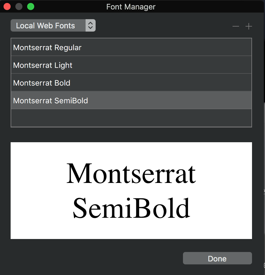
Poop, ok I’ll take a look, and try and get this ready for the next beta.
4 Likes
Ok this is fixed and ready for build 6 
Im hoping to work on the multi import support too, but that might take a little longer.
2 Likes
I’ve just finished adding support for multiple font weight import from a single directory. Build 6 tomorrow
8 Likes
Hi Norm, it looks like that same issue still persists:
I’m not able to select any of the local web fonts.
I’m using Blocs 3.1.2
It’s still not fixed.
All fonts are declared incorrectly. In the generated CSS file Bold and Italic all have font-style: normal set. Which obviously is wrong. Also I can’t find any way within Blocs to manually set it appropriately. The only way to use web fonts with Blocs right now is to fly blind during layout and attach a CSS file manually.
Blocs version: 4.5.2
I was curious about this, so I just had a look at some exported CSS and yes the font-style is listed as normal, however the fonts show correctly inside the web browser. If I choose a bold font in Blocs it appears as bold on the web page as the font designer intended. Likewise if I choose italic or semi bold fonts etc.
Now if I select some text inside Blocs and right click I can set styling like bold etc. Alternatively in custom classes I can change the weight to bold etc, however it artificially distorts that existing bold font to become extra bold and we don’t want that.
From past testing with fonts if I ever tried to take a regular font and make it italic or bold it leads to unpredictable results across different browsers in how they interpret that CSS, so I want to use the right font for the job without artificially manipulating it. That would fit with keeping it on normal and I don’t actually need to make any selection at all in the typography settings. I simply choose the right font.
If I am misunderstanding this perhaps @Norm can look at this but from my regular usage of Blocs it seems to deliver the results I want.
You can set the weight in the class if you want that on top of the font selection.
Seriously? That really is the most infuriating answer you could’ve come up with. Your suggestion makes exactly zero sense. This workaround means we would need to add it to every single container that could possibly end up having an emphasis within it because it might get overridden by something upstream eventually. Or even worse, use span tags instead of emphases, causing a complete semantic mess. All to avoid a couple minutes of work?
If it’s such a bother to do properly, please let me know what language you’ve written Blocs in and I’ll learn enough of it to write that section myself and send you the function.
Emphases are the foundation of textual communication. It’s how we convey intent, contrast and tone. It is beyond me how this was deemed totally fine to leave unfixed for over three years. Absolutely baffling.
Especially since it’s at the very basic level a matter of a regex match to set it properly in the font section of the style.css.
As for @Flashman’s suggestion that setting everything to normal being OK. It really is not. It is an error that needs to be corrected. Either manually by the user after each erroneous export or by the developer in a couple of minutes. You just need to look at the font name and set the CSS property correctly like it should have been in the first place. I don’t see why this is a three year endeavour.
Edit Maybe this helps: setfont.swift.zip (915 Bytes)
Sorry, I may have missed something here.
You assign a font with a class, you want the weight rule also set in the class? So set it using the class editor.
But please relax a little, I’d simply like to help.
4 Likes
My point is that if I alter those settings in the custom class they physically change the font to give it an incorrect appearance. If I select a regular font and set the styling to bold or apply a weight of 600 the font is artificially changed to render differently. When left alone the font itself has the correct name and carries the necessary information for the browser to show them correctly.
Several years ago I beta tested a plugin called Font Pro for another web design app and going back there just now it appears to work the same way as Blocs. Indeed, I vaguely recall an option to do as you suggest was removed during development due to way it lead to unpredictable results between web browsers. I could literally open the same page in Firefox alongside Chrome and the fonts looked different.
I just visited the demo page for that product and in developer tools it showed every font as font-style: normal whether they were italic, bold or normal. It did list the font weight e.g 400 or 700 as does Blocs.
1 Like
I was talking about the @font-face declaration.
Please at least give us direct control of the most basic tags then (i, strong, p) in the editor. It’s a major annoyance to only see the external corrections upon rendering a preview. Especially because Blocs doesn’t have a way to set any value to !important to override anything set in areas beyond user access.
Also please consider replacing
<i>with the more appropriate<em>.
And @Flashman font weight isn’t font style. Weight just describes the stem thickness of a font. Style (currently) the angle.
1 Like
This is in the pipe line. I’ll chat more about the others in your support ticket.
1 Like
I’m jumping back into Blocs and was about to post a question along these lines.
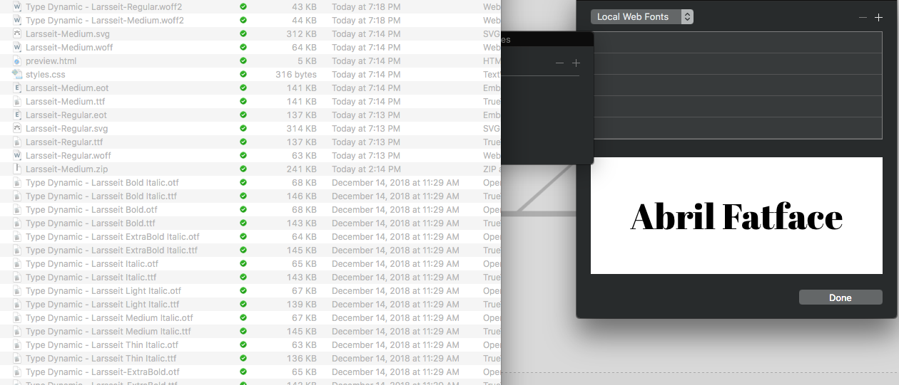
I tend to save all of my web fonts in folders with all of the versions that I am likely to use. I loaded OpenSans400Regular.woff2 as a local font, which was in a folder together with:
OpenSan400Italic.woff2
OpenSan600.woff2
OpenSan700.woff2
To my surprise, when I checked the Font Manager, I saw the following loaded:
Open San Regular
Open San Italic
Open San Semi Bold
Open San Bold
On examining the Peview with Inspector, I found the correct fontface declaration for each of the above.
The correct fonts appear in Preview and Edit mode by selecting the correct font. E.g. for the Italic font, I am NOT selecting Italic for the text and I am just selecting the Italic version of the local font.
So it all works fine from my experience, but I would say it is a bit non intuitive.
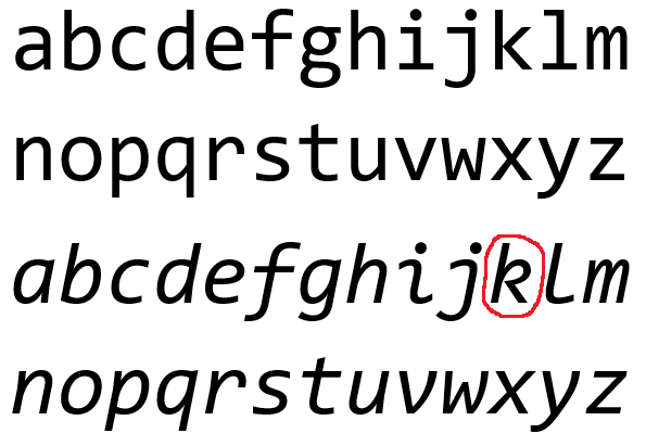
I think most users don’t understand that selecting Bold or Italic, without providing those font versions, renders a faux version of that font, by thickening or slanting. This can sometimes look unpleasant on some font/monitor combinations. The font purists will scream when they don’t see the correct Italics characters which can be completely different from the normal characters.
See the examples below for the Consolas font:
3 Likes
@webdeersign I would suggest loading your fonts like below.
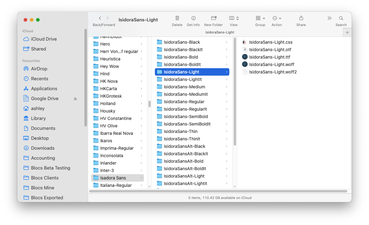
Blocs will automatically load the fastest format version supported by the web browser in use, so in most cases that will be woff2 with woff as a fallback and ttf if all else fails. You can also load multiple font variations at the same time and no need to restart Blocs now before they become available.
N.B You don’t need otf or the CSS file shown in that screenshot and Blocs will ignore them.
Absolutely. It does nasty things potentially if you attempt to style the font rather than using the correct font version. This is why it makes sense to choose fonts with lots of style variations if that is needed.
I would only use woff2 as the days of needing the fallback fonts are long over IMHO.
I actually like the way the font loading works now so you could create different folders of the fonts you use for specific sites. Mixing say regular and italic fonts would need a span with a class to add the italic font, but I’m OK with that.
It’s pretty close for sure:
Woff still covers IE if that is a concern
I see some adding SVG or Eot, which are both unnecessary. In any case, Blocs would load the Woff2 by default and only make use of the others if needed, so there is no harm in adding them.
For the rest, yes you are doing it right. The system works and you can add a span if you want to mix font styles in a single paragraph or header.